bio.viz gsm.bio release review 2026-10-03
What v0.1.0 of bio.viz and gsm.bio adds, annotated
bio.viz is a new chart library for biomarker data and gsm.bio is the R package behind it: four charts that compare groups and relate variables, where every test, coefficient and fitted line is computed by R, either started inside your browser or run at a desk and stored in the page. Below, each chart is shown on its live demo with the numbers you should see when you try it, followed by the R side.
4 charts, built on safety.viz v1.9.0’s shared parts 7 statistics functions and 4 widgets in R made-up study: 200 participants, 12 biomarkers, 5 visits R in the browser: 13.26 MB, once bio.viz dev at 8054114, gsm.bio dev at f4b1392
What to look at
- On the group comparison, open IL-6 and set Value to Change from baseline. At Week 4, R’s Welch test prints p < 0.001 for Placebo n = 95 against Treatment n = 91, with a difference in means of 1.235 (0.844 to 1.626). The made-up study planted a difference of 1.5.
- The biomarker screen puts IL-6 at the top at 0.9133, and clicking its row opens that same test with the same numbers.
- On the R check page, press the button: R in the browser gives the same answers as desktop R in all 6 values of one test and all 20 of the other.
- A gsm.bio widget saved as one file opens with the network off and still shows R’s numbers, with a line saying which R computed them. Move a filter and it says statistics are unavailable rather than showing another view’s numbers.
The four charts
Each demo runs on gsm.bio’s made-up biomarker study, where three effects were planted and every other biomarker is null. A chart draws and lists participants; it never computes a test. The first time a demo needs a statistic, it starts R in your browser, which takes a few seconds and happens once per visit.
Group comparison
Does this biomarker differ between these groups? It opens on every biomarker at every visit and prints no test there, so a page never shows dozens of unadjusted p-values at once, and R is not started until you open one biomarker.
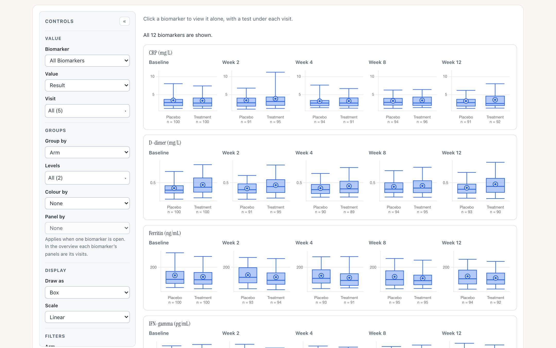
The overview: a row per biomarker, a panel per visit, the count in each group beneath. The page reads “All 12 biomarkers are shown.” No R had been downloaded at this point.
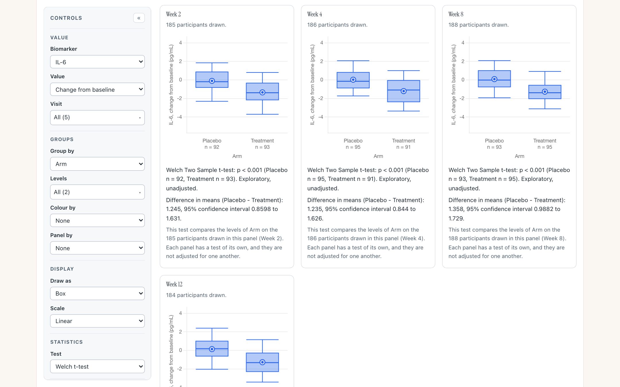
IL-6, change from baseline, by arm. Under each visit is R’s Welch test of the participants drawn in that panel, with its method and counts, labelled exploratory and unadjusted. The Baseline panel is not drawn, because every participant’s change there is nought.
What you should see
- Week 2: difference 1.245 (0.8598 to 1.631), Placebo n = 92, Treatment n = 93.
- Week 4: 1.235 (0.844 to 1.626), n = 95 and 91.
- Week 8: 1.358 (0.9882 to 1.729), n = 93 and 95.
- Week 12: 1.419 (1.016 to 1.822), n = 92 and 92.
- Every one p < 0.001. Desktop R running gsm.bio on the same rows gives the same numbers.
Try it
Open the group comparison- Click IL-6 in the overview, or choose it in the Biomarker control.
- Set Value to Change from baseline, and wait a few seconds for R to start.
- Change the Test control to the Wilcoxon rank-sum test: each line clears, says it is waiting for R, and prints the new answer.
- Click a box to list its participants, then a row to open the participant profile.
Association scatter
Do these two variables move together? It opens on the pair the study planted a correlation of 0.6 in: TNF-alpha against IL-10 at Baseline, coloured by arm, with R’s straight-line fit.
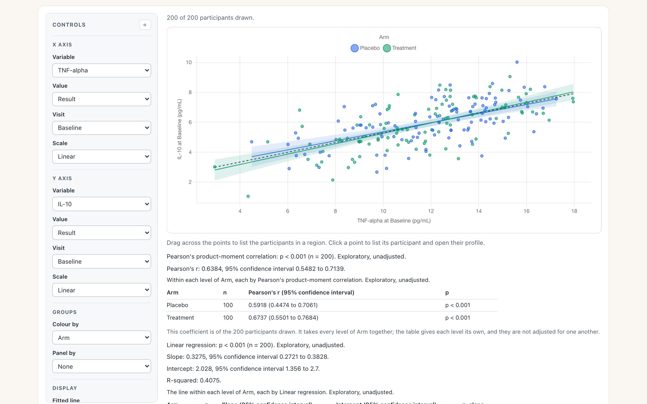
Every point of each fitted line, and its band, is R’s. With no R attached, the points and the y = x line still draw and the chart says the rest is unavailable.
What you should see
- Pearson’s r 0.6384, 95% interval 0.5482 to 0.7139, n = 200, p < 0.001.
- Within each arm: Placebo 0.5918, Treatment 0.6737, 100 participants each.
- Linear fit: slope 0.3275 (0.2721 to 0.3828), intercept 2.028, R-squared 0.4075.
Try it
Open the association scatter- Switch Method to Spearman: R gives a coefficient with no interval, because R has none for it, and the page invents none.
- Set Fitted line to Smooth: R’s curve and its band replace the straight line.
- Drag across a cluster of points to list those participants. On a phone, tap Select a region first.
Correlation matrix
Which of these biomarkers are related? Below the diagonal each pair is a mark, wider and darker the stronger R’s coefficient; above it is the number. It prints no p-values, by design.
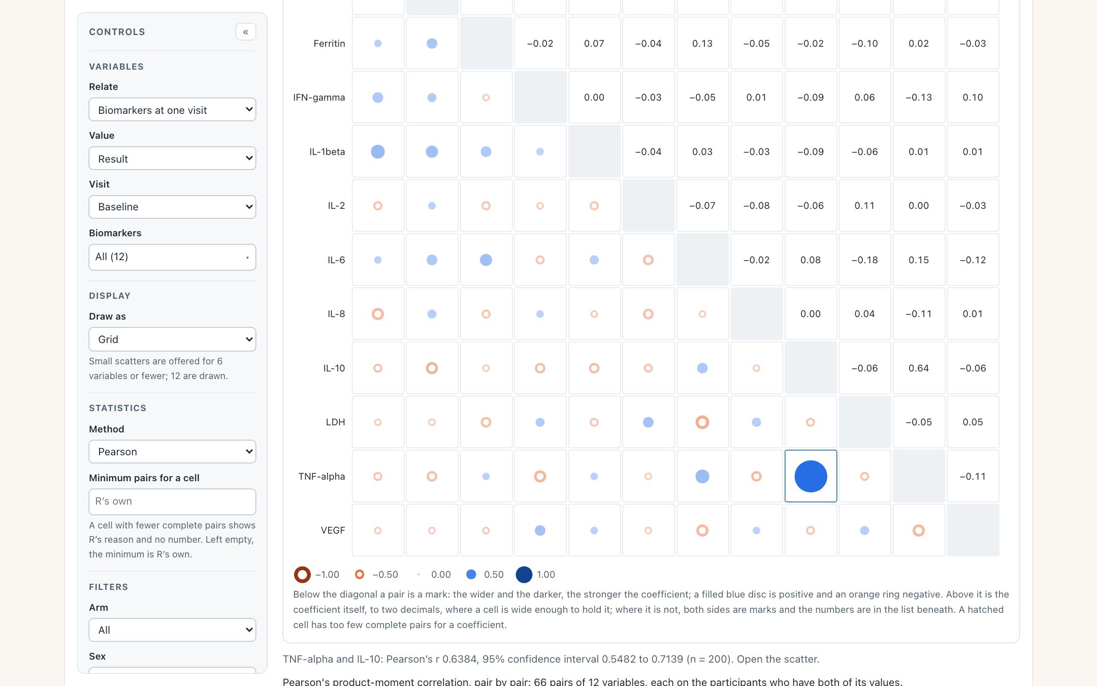
Twelve biomarkers at Baseline: 66 pairs, each with its own pair count. The planted pair is the one large mark. Pointing at it prints its coefficient, interval and count under the grid.
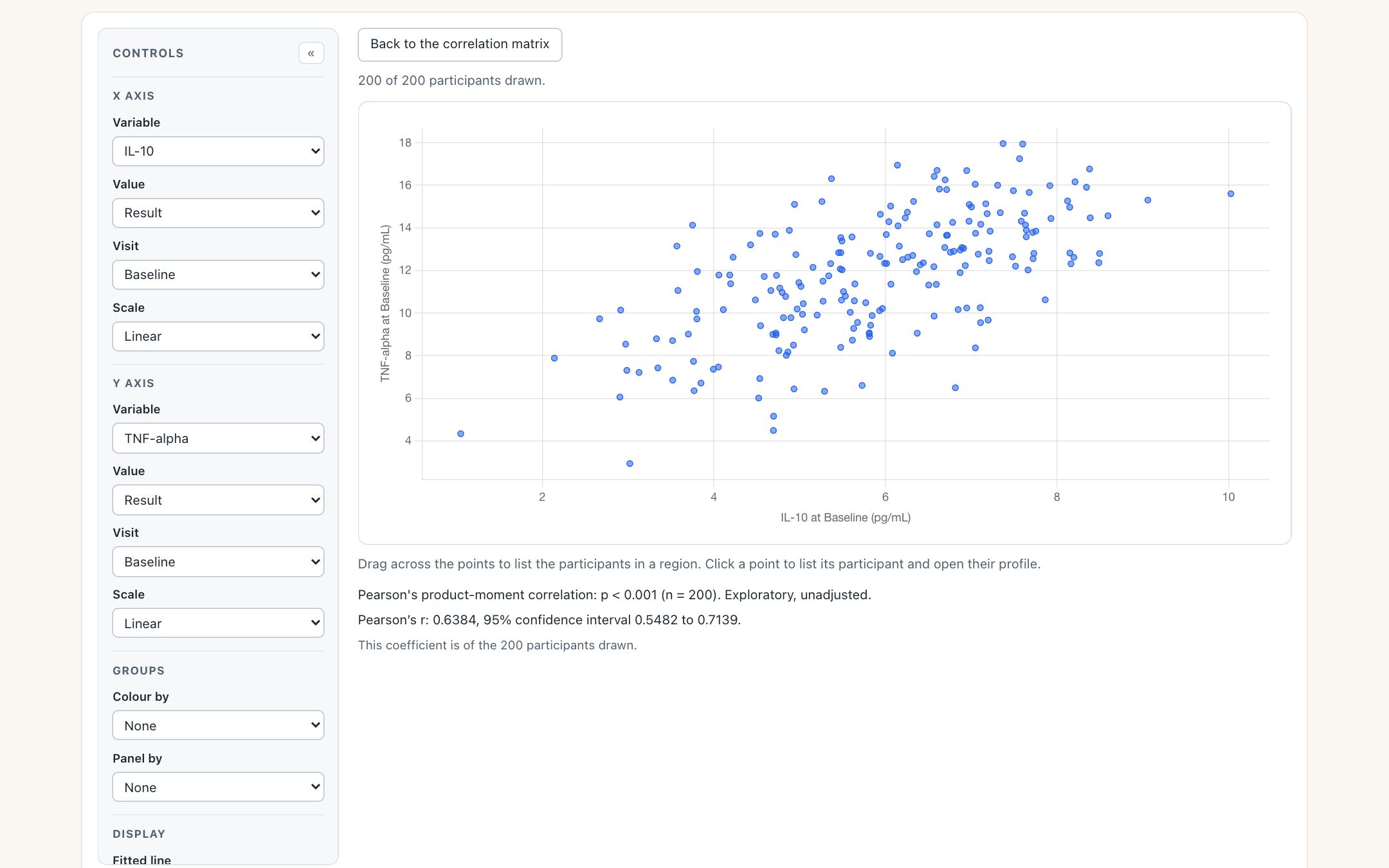
Clicking the cell opens that pair in the association scatter, in place, with the same R, method and filters. Back returns to the grid as it was without asking R again.
What you should see
- The cell for TNF-alpha with IL-10 reads 0.64. Pointing at it gives 0.6384 (0.5482 to 0.7139), n = 200.
- The scatter it opens prints the same 0.6384, now with its p-value: p < 0.001.
- No other pair at Baseline reaches 0.2 either way.
Try it
Open the correlation matrix- Find the large blue disc in the TNF-alpha row and the IL-10 column.
- Click it, or move to it with the arrow keys and press Enter.
- Press Back to the correlation matrix.
- Under the grid, open the list of every pair and download it as CSV.
Biomarker screen
Which biomarkers differ between the arms? One comparison, run by R across every biomarker, one row each: the standardised difference with its interval, and the p-value unadjusted and adjusted across the rows.
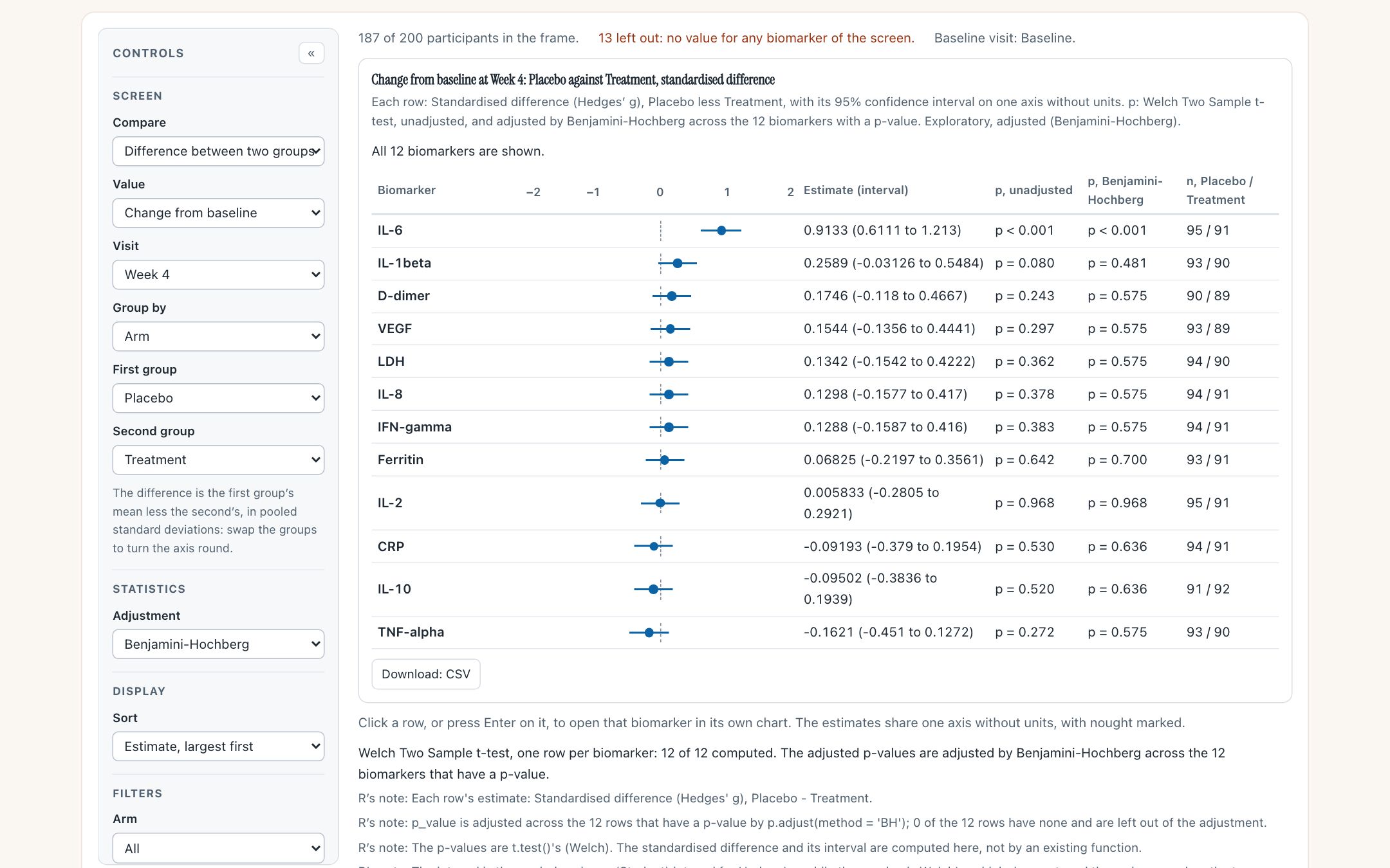
Change from baseline at Week 4, Placebo against Treatment, sorted by R’s estimate. IL-6 is the top row; every other interval crosses nought. 187 of the 200 participants have a value for at least one biomarker, and each row has its own counts.
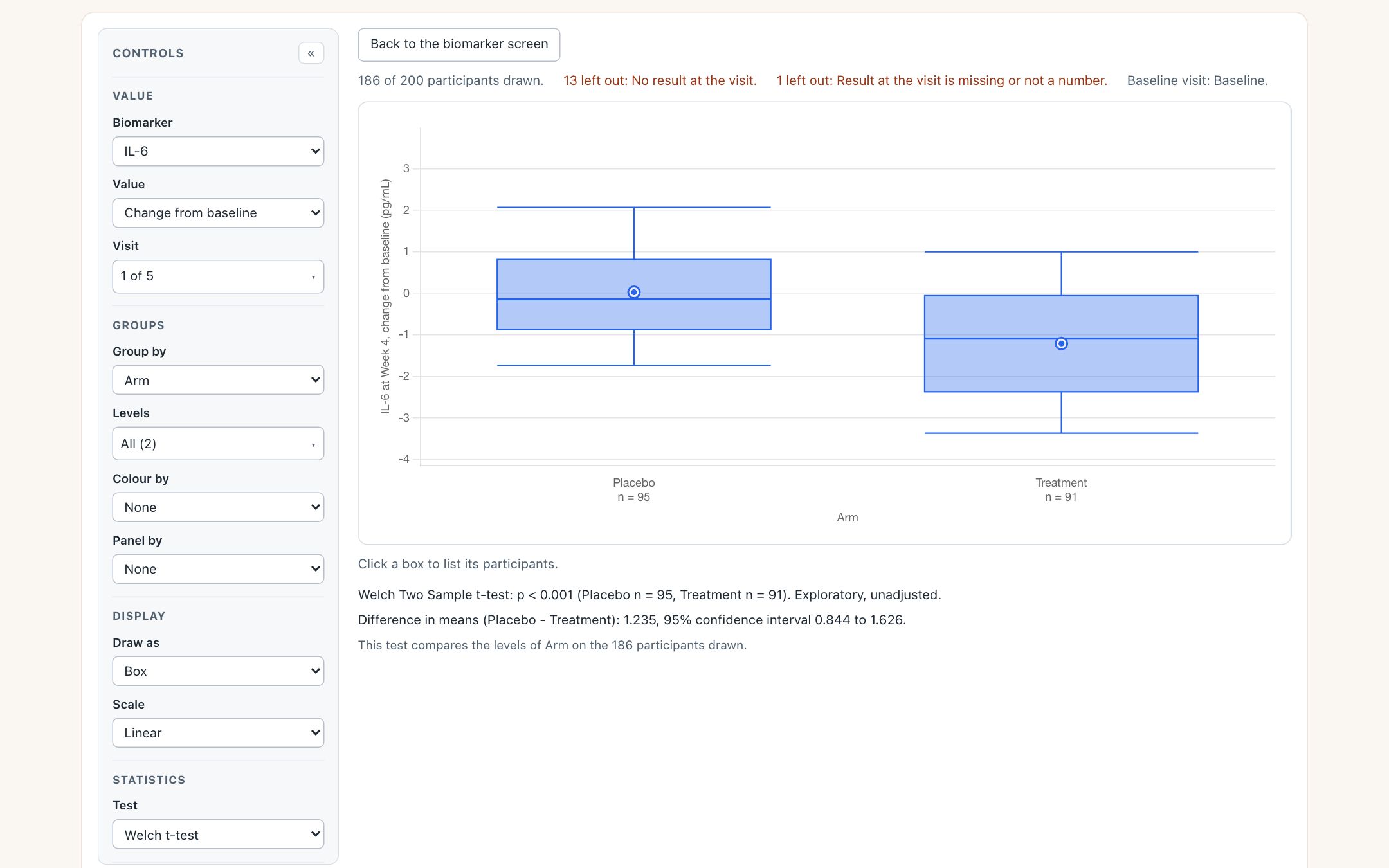
Clicking the IL-6 row opens IL-6 in the group comparison, at the same visit and value, with the same two groups and Welch’s test. Its p-value is the one the screen’s row was built from.

The line under the screen’s rows. Every note is R’s own, passed through as R wrote it. The fourth is new in this release candidate: the interval and the p-value come from different assumptions about the two groups’ spread, and R says so.
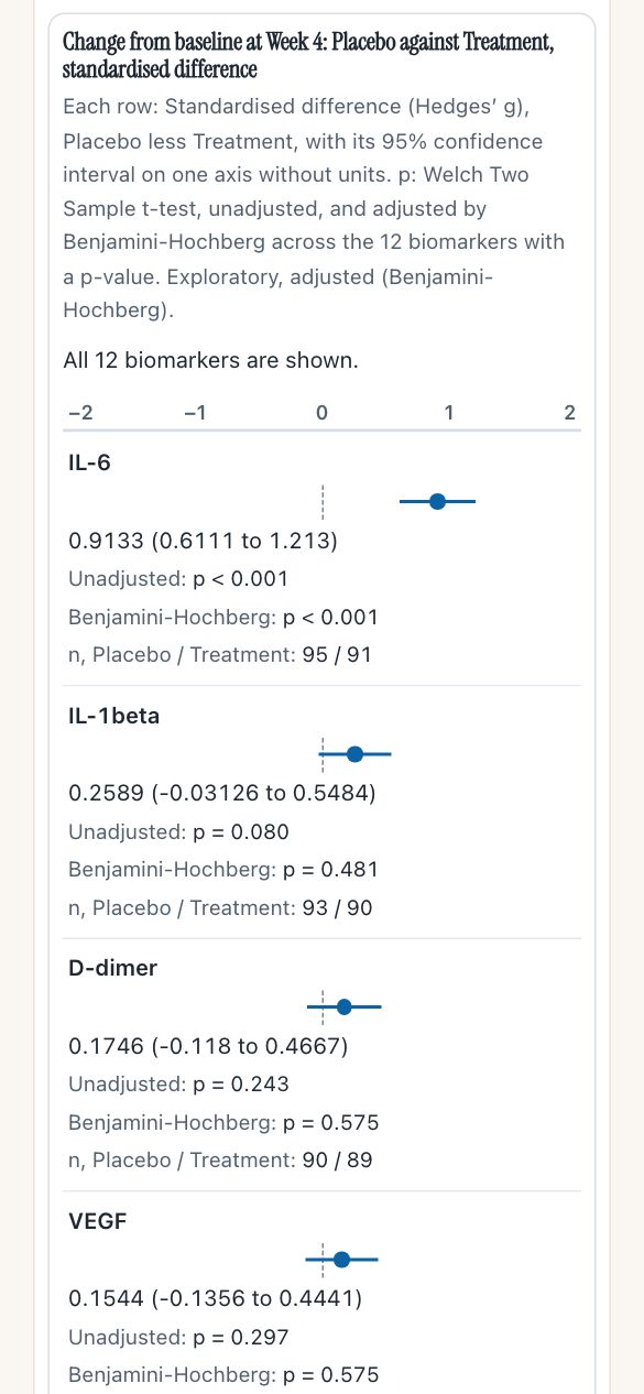
The screen at 390 px: each row stacks, and nothing scrolls sideways.
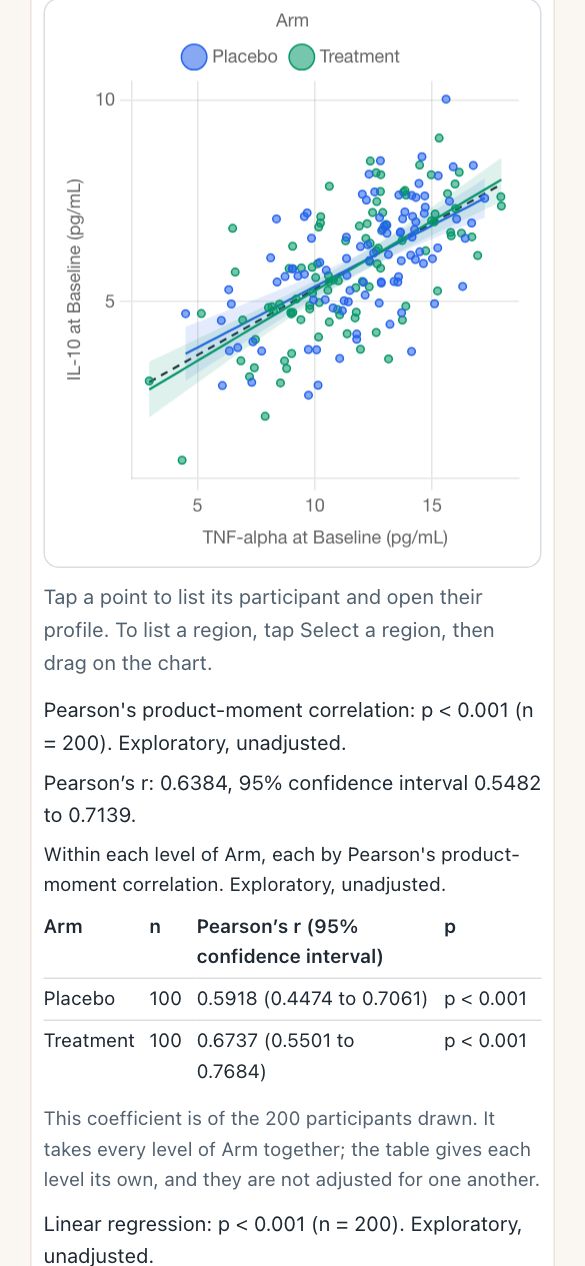
The scatter at 390 px, with the phone’s own hint: tap Select a region before dragging.
What you should see
- IL-6 first: 0.9133 (0.6111 to 1.213), p < 0.001 unadjusted and after Benjamini-Hochberg, n = 95 and 91.
- Second, IL-1beta at 0.2589: p = 0.080 unadjusted and 0.481 adjusted.
- The IL-6 row opens to 1.235 (0.844 to 1.626), the same as the group comparison at Week 4.
- Under the rows, four notes from R. The fourth says the interval pools the two groups’ variances while the p-value is Welch’s, which does not, so a row’s interval and its p-value can disagree about nought when the spreads differ.
Try it
Open the biomarker screen- Set Sort to Adjusted p-value, smallest first.
- Switch Adjustment to Holm: the adjusted column changes and the caption names the method.
- Click the IL-6 row, then Back to the biomarker screen.
- Set Compare to Correlation with one variable to screen every biomarker against one number.
R in the browser
A chart asks R for a statistic through one call, which always answers: with what R returned, with a statement that statistics are unavailable and why, or with R’s own error. Behind it, answers worked out ahead of time can ship with the page; otherwise R itself, built for the browser (webR 0.6.0), is fetched from its public host the first time an answer is needed. The R check page runs two tests on two small public tables and puts each browser answer beside desktop R’s, in full.
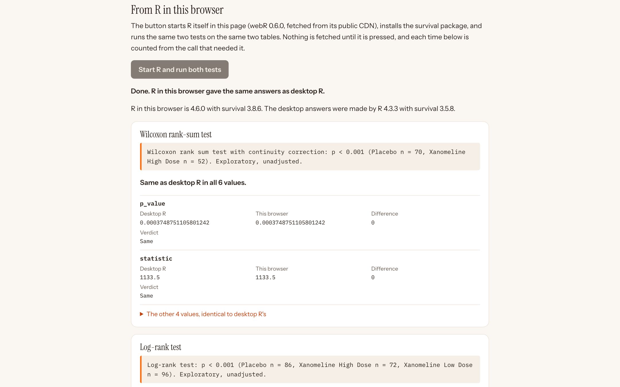
After pressing the button. R in the browser is a different version, built by a different compiler, from the desktop R that wrote the expected answers, and the two agree. The tables are cut from the public CDISC pilot study data.
| What starting R cost | Megabytes | Seconds |
|---|---|---|
| First visit, nothing cached: recorded on the page | 26.22 | 3.568 |
| Reload, R’s files cached: recorded on the page | 0.00 | 2.143 |
| Second call, R already running: recorded on the page | 0.00 | 0.004 |
| First visit, this capture | 26.22 | 3.7 |
| Group comparison demo, first test, this capture | 13.26 | 1.5 |
The check page installs R’s survival package for its log-rank test; the chart demos do not need it, which is why opening a biomarker costs about half. Seconds depend on the network: headless Chromium on this capture’s network, which was not measured. At 10 megabits a second, the page notes, the 26.2 MB alone would take about 21 seconds to arrive.
Statistics come from R only
- bio.viz contains no inference code. Each chart decides which test to ask for and prints what R returns, through one set of formatting rules: the method, the counts, “Exploratory, unadjusted” unless an adjustment is named, no stars, no verdict.
- The R functions the browser runs are gsm.bio’s own source file, copied into bio.viz byte for byte with a checksum, so the browser and a desk run the same lines.
- Where R declines to compute, such as a group that is too small, the chart prints R’s reason, not a number.
What you should see
- “Done. R in this browser gave the same answers as desktop R.”
- Same as desktop R in all 6 values of the rank-sum test and all 20 of the log-rank test.
- A first result in a few seconds; a repeated call in a few milliseconds (4 ms here).
Try it
Open the R check page- Read the first two answers: one with no R attached, one from results shipped with the page. Nothing has been downloaded yet.
- Press Start R and run both tests.
- Open “The other 4 values” to see every member compared.
gsm.bio
The R package the charts ask. Each function wraps a test from base R’s stats package or the survival package, called with R’s defaults, and returns the same plain result: method, estimates, counts, p-value, and a reason in place of the numbers when it cannot compute. It also carries the made-up study the demos use, with the true size of each planted effect.
- Analyze_GroupDifference
- A value between groups: Welch t-test, Wilcoxon rank-sum, one-way ANOVA or Kruskal-Wallis, with Holm-adjusted pairs.
- Analyze_Correlation
- Pearson or Spearman correlation of one pair, overall and within each group.
- Analyze_CorrelationMatrix
- The correlation of every pair of several variables, with each pair’s count and no p-values.
- Analyze_Fit
- A straight line from
lm()or a smooth fromloess(), with its band as points a chart draws as they are. - Analyze_Contingency
- A two-way table by chi-squared, flagging small expected counts, or Fisher’s exact test.
- Analyze_Survival
- Time to an event between groups: log-rank test, each group’s median, and the hazard ratio for two groups.
- Analyze_Screen
- One comparison across every biomarker, a row each, with the p-values adjusted across the rows.
The four charts from R
Widget_GroupComparison, Widget_AssociationScatter, Widget_CorrelationMatrix and Widget_BiomarkerScreen draw the same charts from R. When a widget is made, R computes every statistic the chart will ask for on the views it opens on, including the chart behind every matrix cell and every screen row, and stores them in the page. A page saved as one file then needs no R and no network.
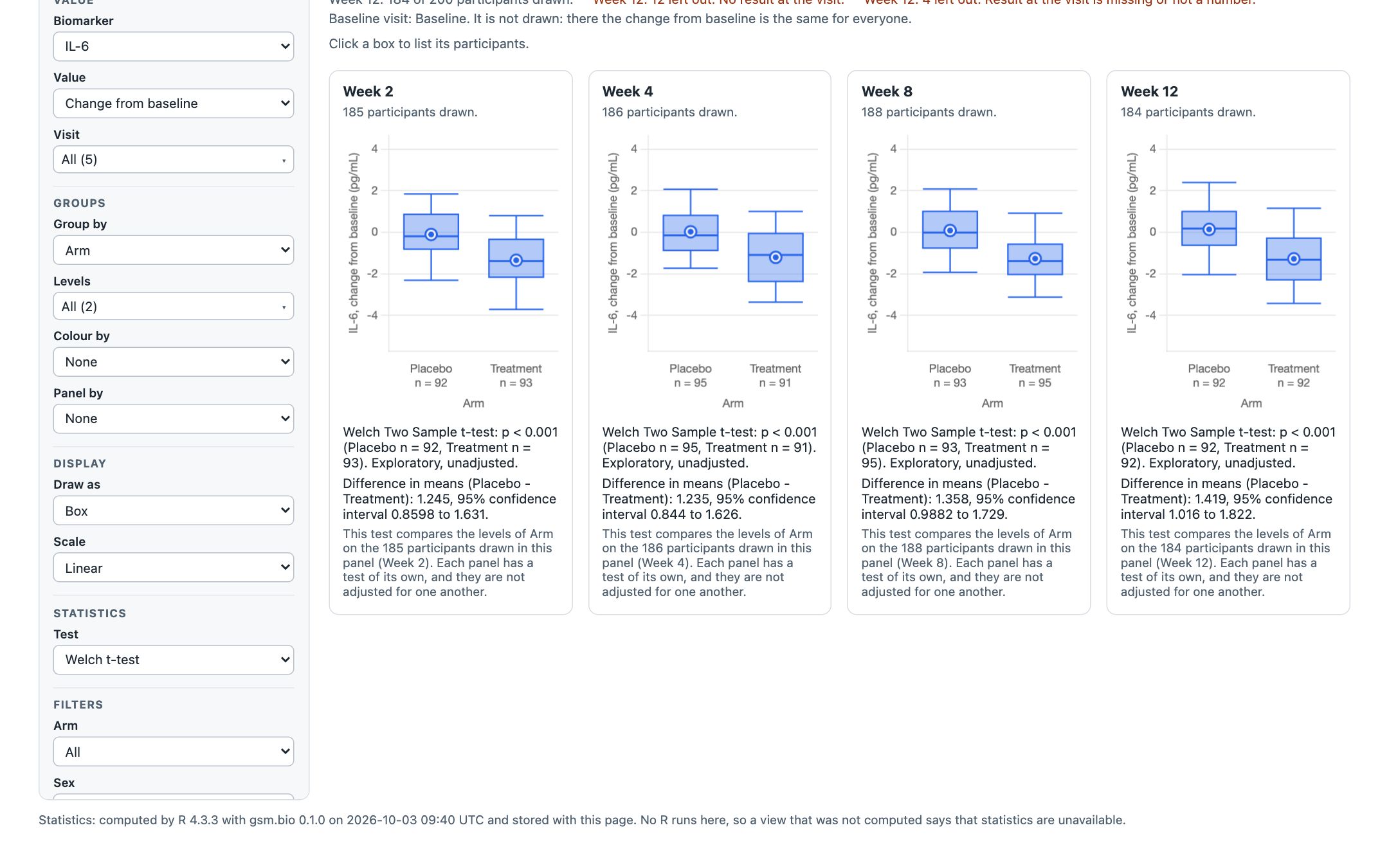
The group comparison widget, saved with htmlwidgets::saveWidget(selfcontained = TRUE) and opened from disk with the network off. The four tests are the browser demo’s numbers exactly. The line at the foot says which R computed them, and when.
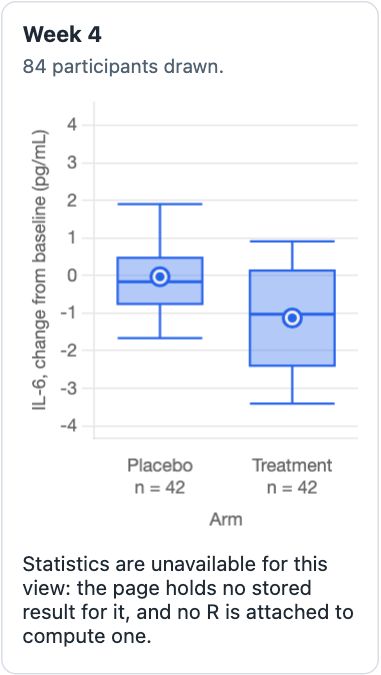
Set a filter the widget did not compute and the boxes redraw, but the line says statistics are unavailable. It never shows another view’s numbers.

The biomarker screen widget, offline, after clicking IL-6: the chart a row opens is stored too, so the same 1.235 (0.844 to 1.626) appears with no R anywhere.
What you should see
- Each saved page is one file of about 2.5 to 2.6 MB, and none of the four made a network request when opened.
- Under the chart: “Statistics: computed by R 4.3.3 with gsm.bio 0.1.0 on …” with the time it was made.
- The association scatter widget prints 0.6384 (0.5482 to 0.7139), and its Method and Fitted line controls still answer offline.
Try it in R
gsm.bio reference- Install the release with
remotes::install_github("jwildfire/gsm.bio@v0.1.0"), or what is on dev withremotes::install_github("jwildfire/gsm.bio@dev"). - Run the example on any widget’s reference page; the group comparison’s opens on IL-6.
- Save it as below, turn the network off, and open the file.
library(gsm.bio)
w <- Widget_BiomarkerScreen(
  Synthetic_Results, Synthetic_Participants,
  lSettings = list(visit = "Week 4", value_type = "change",
                   group_by = "ARM", baseline_visits = "Baseline")
)
htmlwidgets::saveWidget(w, "screen.html", selfcontained = TRUE)
Where it runs
- In any browser page that loads bio.viz beside safety.viz. Nothing is bundled into bio.viz: safety.viz, and R when it is used, are loaded beside it.
- bio.viz v0.1.0 needs safety.viz v1.9.0: that is the release that exports the kit the charts are built from. gsm.bio’s widgets carry a copy of safety.viz v1.9.0’s bundle.
- With R in the browser, fetched from webR’s public host by default, or from wherever a deployment serves its own copy.
- With no R at all, from answers worked out ahead of time and stored with the page, which is how every gsm.bio widget works.
- From R, as an htmlwidget: in the viewer, in an R Markdown document, or saved as one file.
- With neither R nor stored answers, a chart still draws, and says where a statistic would be that statistics are unavailable.
Built on safety.viz’s kit
The charts look and behave like safety.viz’s because they are built from safety.viz’s own shared parts: the control sidebar, the filters, the record listing, the participant profile rail and its copy of Chart.js. safety.viz now hands these out as one export, its kit, instead of a second copy drifting in bio.viz. The kit, explained in one page.
bio.viz also lists its four charts in safety.viz’s chart-list format, published as portfolio.json, so safety.viz’s demo app can offer them in a Biomarkers tab on a study’s own files. safety.viz v1.9.0 does: its demo page shows the tab, with R started on request.
What is not in this release
- The biomarker charts inside safety.viz’s demo app: bio.viz publishes the chart list, and the hosting ships in safety.viz v1.9.0, not here.
- A survival chart.
Analyze_Survivaland a screen by hazard ratio exist in R only; the screen chart offers a difference or a correlation. - A safety.viz bundle with the kit taken from gsm.safety. Until it has one, each widget carries a copy of the safety.viz bundle bio.viz uses, recorded as a stand-in.
- The released bio.viz site: only the dev build is published until the tag is cut.
Where to look further
- The release notes as they will publish: bio.viz and gsm.bio.
- The bio.viz gallery: each chart’s evidence page traces its requirements to named tests, and its API reference documents every setting.
- The design for the biomarker charts.