safety.viz demo app · design, settled 9 October 2026 · for release 1.11
The demo app, ready to be shown live
This design is settled as of 9 October 2026, and it is what release 1.11 is built from.
Six decisions are recorded below with your answers. On the RBQM tab the metrics are the chart-name row, and R starts from the Biomarkers tab's control in the same place. A status label is the word alone, its rung told by the pill's outline.
The mockups show the design as chosen; what was weighed and not chosen stays one switch away. The change list at the end is in six groups, each one requirement.
It is filed: one objective, seven requirements and their tasks are on the tree page, with the prompt that starts the build.
Every decision this design needed, with your answer. All six were answered by 9 October 2026.
How the RBQM tab gets its chart-name row
ChosenThe metrics are the row: Overview, then one item per metric with its status icon. It works like every other tab, each page fits one screen, and every metric's status stays in view. About two days.
Not chosenThe views as the row, or the metrics as the row over one long page. Both are still in mockups 4 and 5 and compared under RBQM options.
What marks the rung on a status label
ChosenNo mark. The word is the label, and the pill's outline tells the rung: filled for Qualified, solid for Exploratory, dashed for Experimental, dotted for Prototype.
Not chosenFour dots, a ladder, a pie, a pictogram for each rung, a numeral. All are compared in place under Label style.
Which charts carry a label of their own
ChosenOnly a chart or tab below Exploratory. The app's one label covers the rest.
ChosenThe stricter rule, as an interim path. You intend to move everything to RAW, then SDTM, then ADaM, in a later release, so only what the move to the Data tab needs is built. The picker to read a file the other way is dropped.
The wording of the disclaimer and the six reasons
ChosenThe drafts on this page ship. You correct them at the release candidate.
The mockups
Each is the whole app page at 1,280 pixels wide, scaled to fit this column. "Full size" shows it at true size, scrolling inside its frame.
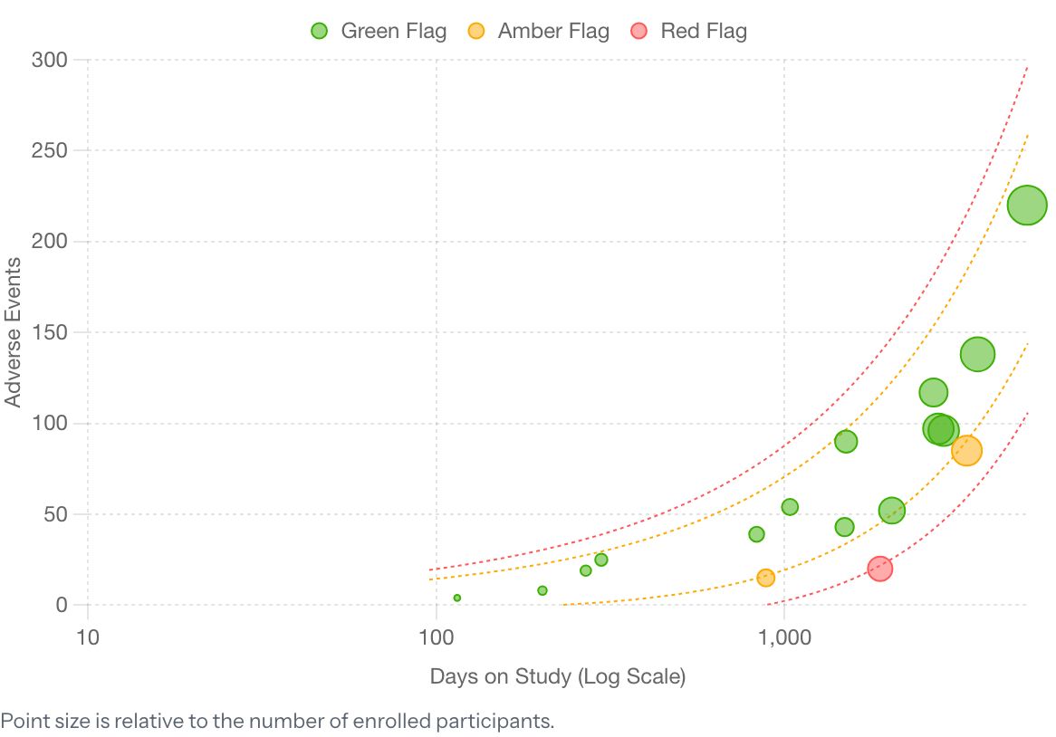
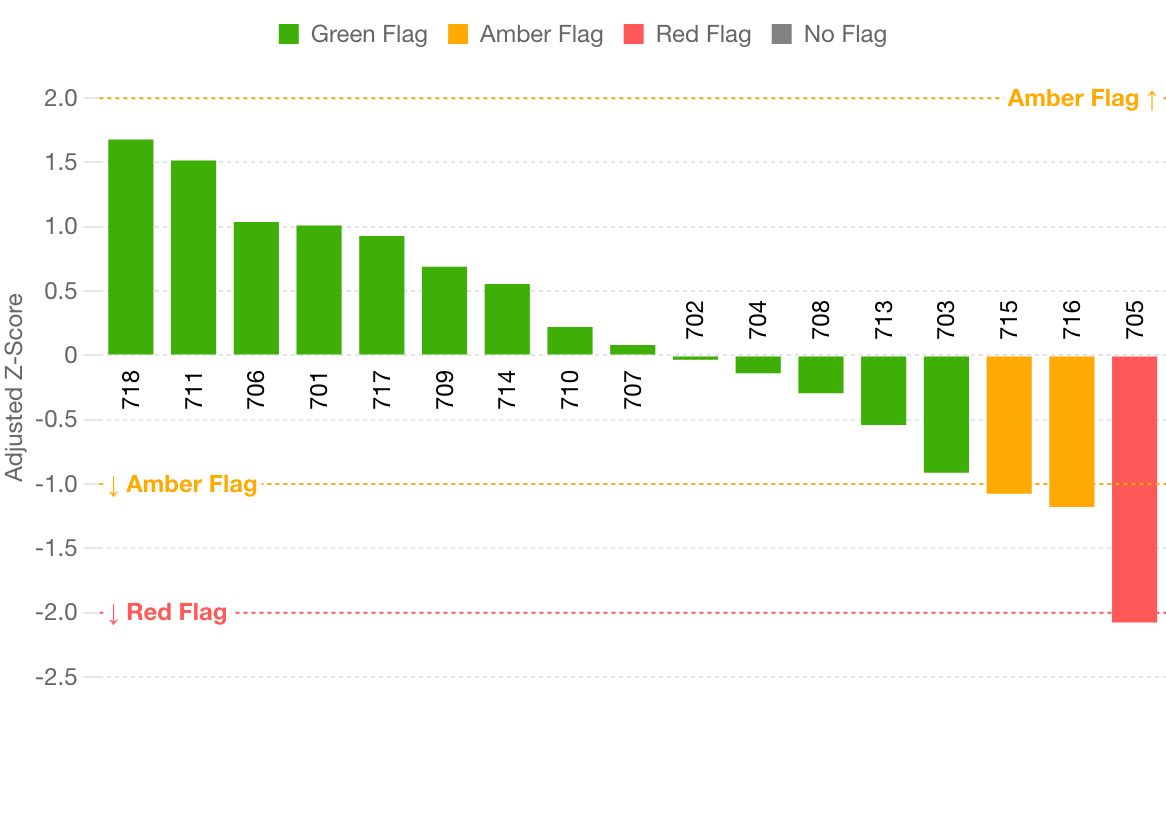
The header, tabs, rows and footer are built from the app's own styles at release 1.10. Where a chart goes there is a still of the real chart, captured from the live app on 9 October 2026.
Numbers on a mockup match the list under it. "Today" swaps in a capture of the released page in the same state.
Labels, the R control, the run button and the log all work on click.
What a first-time visitor meets today
Nothing says whose data is on screen, how many charts there are, or how far to trust a result. Mockup 1.
Two of the six tabs are graphite and read as switched off; the wordmark is not a link; a tab's "9 of 9" has to be worked out. Mockup 1.
Starting R is explained by a long sentence inside the chart, and nothing shows it is ready except a greyed button. Mockup 3.
The RBQM tab opens on a paragraph, a file box and an empty page, and ends in a log that outweighs the results. Mockups 4 and 5.
Choosing the RBQM demo study leaves every chart tab hollow and the Data tab reading "0 of 18 charts ready", with nothing pointing at RBQM. Mockup 6.
1The first screen: an Exploratory chart, as the app opens
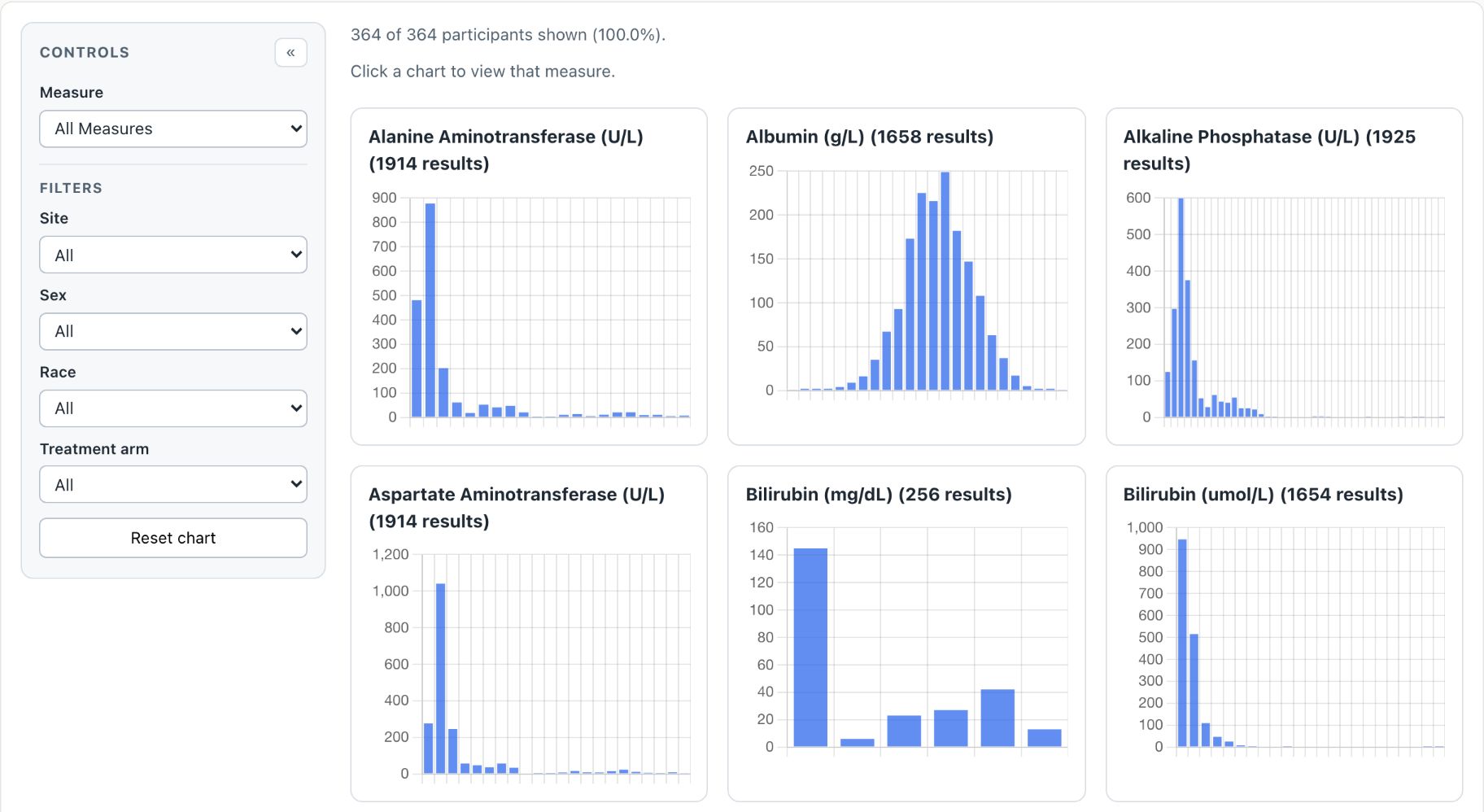
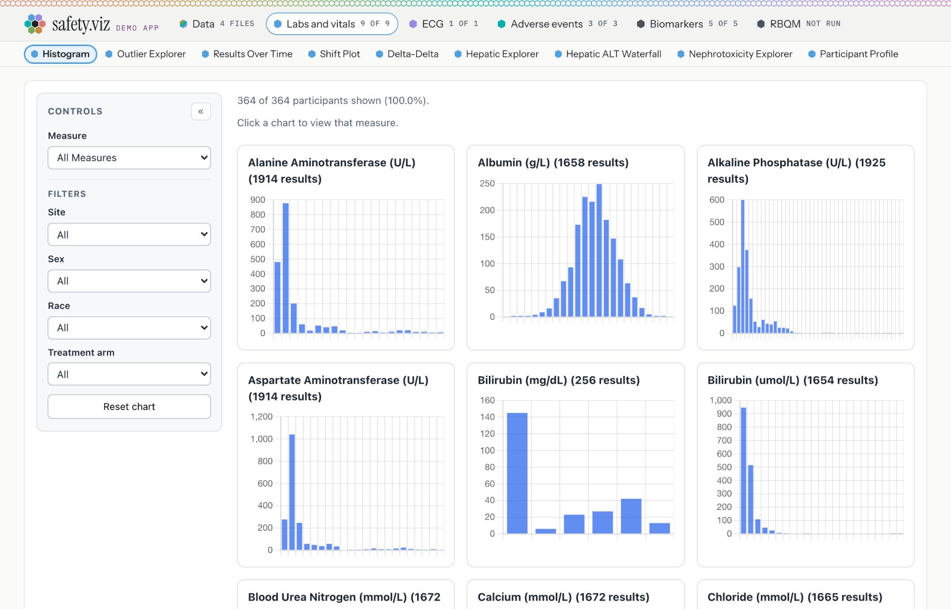
This is what a first-time visitor has in front of them for their first 30 seconds, so it carries the navigation changes too. The page is fast already: the first chart was drawn 0.7 seconds after the address was entered. What it lacks is orientation: whose data, how far to trust it, and where to go.
Nothing here is qualified. The charts, statistics and site metrics are tested and documented, but none has been through qualification. Confirm every result in a qualified system before you rely on it.
13 charts are Exploratory. 5 charts and the RBQM tab are Experimental, and say so when you open them.
QualifiedValidated for regulated use. Nothing in safety.viz is, yet.
ExploratoryThis appTested and documented. Confirm every result.
ExperimentalTested and documented, but what it shows or how it behaves may still change.
PrototypeAn early look, on the docs site only. Not in this app.
You are looking at the CDISC pilot study, a public demo: 254 participants, 18 charts on five tabs. To use your own files, open Data. They are read in this browser and never leave it.
The wordmark is a link to the docs and gallery. Today it is plain text, and the only way back is in the footer.
The Data tab names the study on screen: "Pilot study", or "Your 3 files". Today no chart says whose data it draws.
A tab shows one number when every chart draws ("9"), "5 of 9" only when some cannot, and "0" beside a hollow hex when none can. Less to read, and it makes the room the app label needs at 1280 wide.
Biomarkers and RBQM have colours of their own, pink and amber, in place of graphite. The rule is under Tab colours.
The one app-wide label: Exploratory. Hover it for one line; click it for the detail, shown in mockup 2. It replaces the Experimental pill that sits inside the RBQM tab today.
A one-line welcome on first open: whose data, how much, and where to load your own. It closes with the cross and is not stored anywhere.
An Exploratory chart, like this one, carries no label of its own: the app label covers it. Only a chart or tab below Exploratory says so, on the corner of its card (mockup 2).
Not drawn: the browser tab's title follows the open view ("Histogram · safety.viz demo"), so a shared-screen audience and a tab bar both say where you are.
Today: release 1.10 as it opens, captured on 9 October at 1280 wide. The page drew the Histogram 0.7 seconds after the address was entered.
2The labels, open
One component in two places: the app's label in the header, and a chart's label on the corner of its card. Each opens the same four-rung ladder with the current rung marked.
Nothing here is qualified. The charts, statistics and site metrics are tested and documented, but none has been through qualification. Confirm every result in a qualified system before you rely on it.
13 charts are Exploratory. 5 charts and the RBQM tab are Experimental, and say so when you open them.
QualifiedValidated for regulated use. Nothing in safety.viz is, yet.
ExploratoryThis appTested and documented. Confirm every result.
ExperimentalTested and documented, but what it shows or how it behaves may still change.
PrototypeAn early look, on the docs site only. Not in this app.
Nothing here is qualified. The charts, statistics and site metrics are tested and documented, but none has been through qualification. Confirm every result in a qualified system before you rely on it.
13 charts are Exploratory. 5 charts and the RBQM tab are Experimental, and say so when you open them.
QualifiedValidated for regulated use. Nothing in safety.viz is, yet.
ExploratoryThis appTested and documented. Confirm every result.
ExperimentalTested and documented, but what it shows or how it behaves may still change.
PrototypeAn early look, on the docs site only. Not in this app.
Experimental until an external clinical review confirms its Kaplan–Meier estimates. Its curves, intervals and at-risk counts may change after that review.
QualifiedValidated for regulated use. Nothing in safety.viz is, yet.
ExploratoryThis appTested and documented. Confirm every result.
ExperimentalThis chartTested and documented, but what it shows or how it behaves may still change.
PrototypeAn early look, on the docs site only. Not in this app.
The app label, open: one paragraph in plain words, then the four rungs with this app marked, then how many things sit below it. The cross, or a second click, closes it.
Hover shows one line only: "Nothing in this app is qualified. Confirm every result." Try it on the label.
A chart below the app's rung carries its own label, the same component, on the corner of its card. It takes no height and cannot cover the chart.
Its panel: the one-sentence reason first, then the same ladder with this chart and this app both marked.
"Label style" swaps the mark on every label on this page, here and in the other mockups. Word only is the one chosen: the outline tells the rung. The other five were weighed and not chosen; all six are compared under Label style.
The purple banner drawn inside two charts today, and the pill in the RBQM tab, both go. This corner is the one place a chart says its status.
Today: the app shows no status on a chart tab. An Experimental chart says so only on the docs site, or, for two charts, in a banner drawn inside the chart.
3A biomarker chart and R
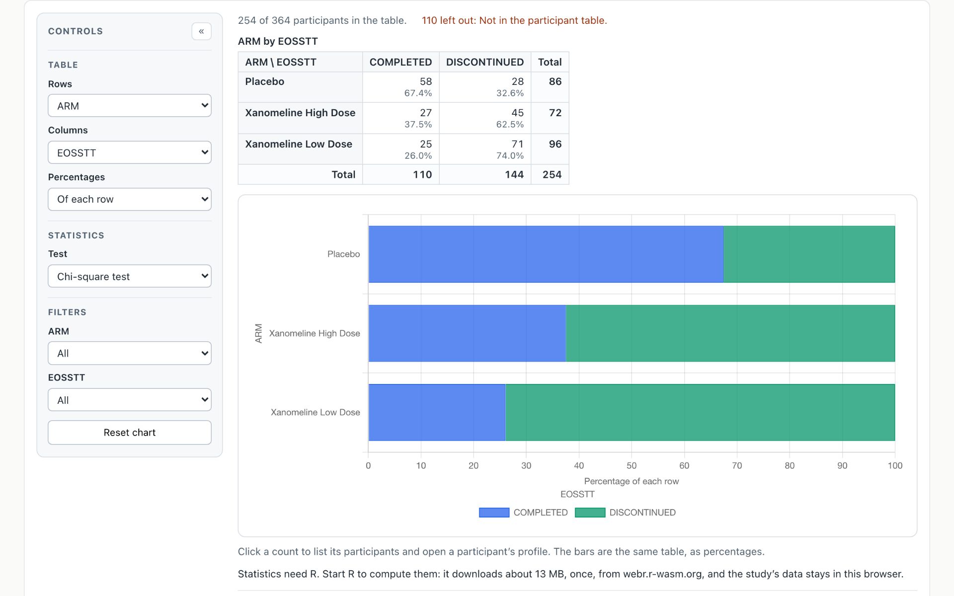
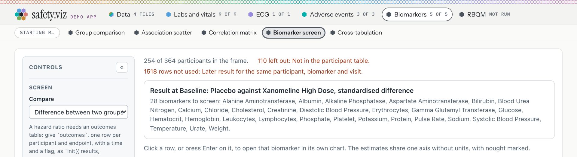
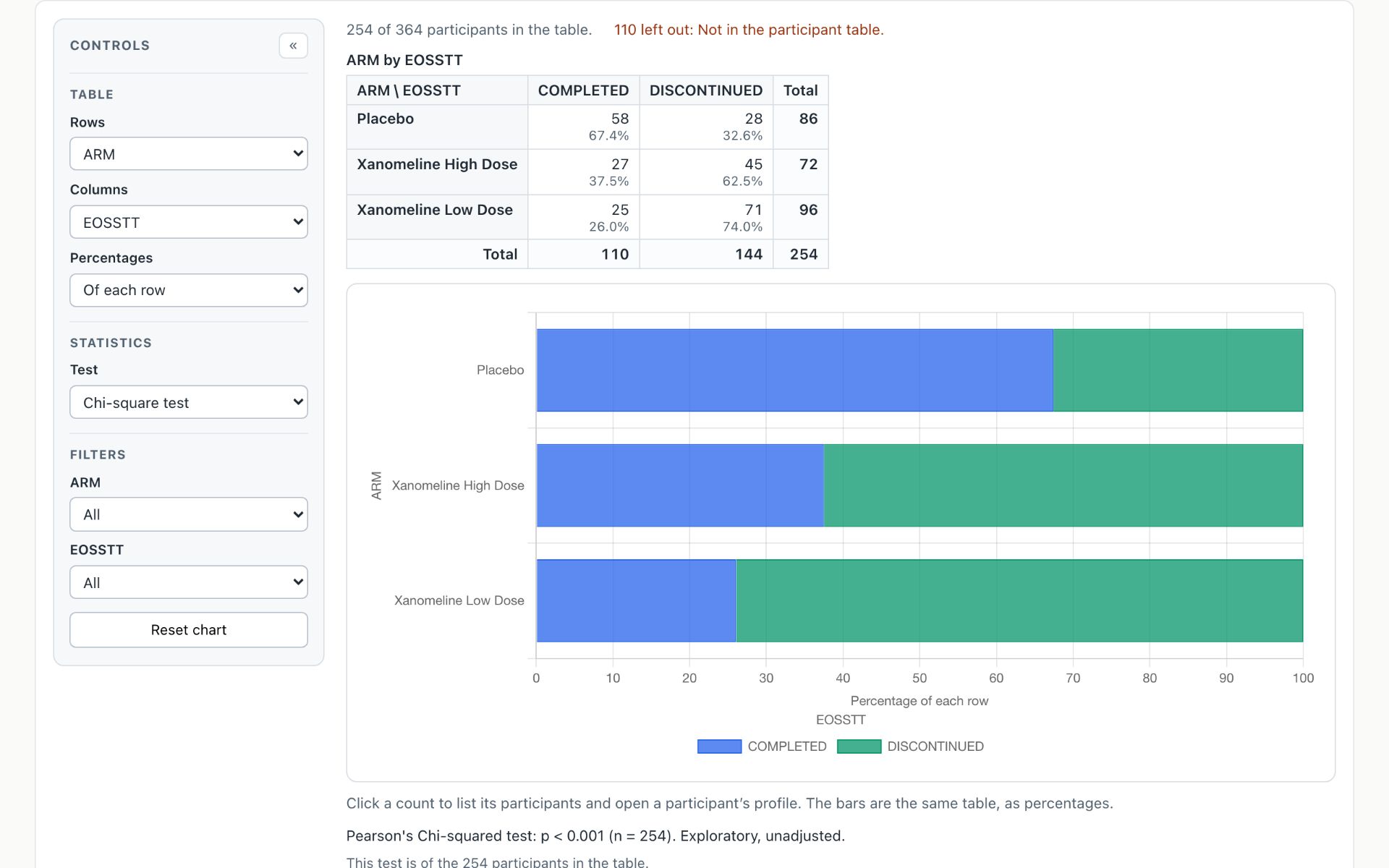
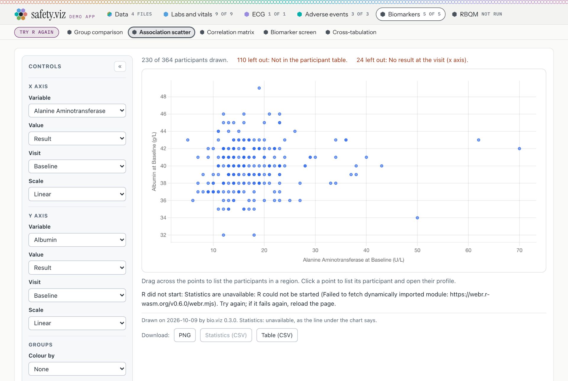
The cross-tabulation, in each state of R. Press Start R in the mockup to watch it go from off to a chip.
Nothing here is qualified. The charts, statistics and site metrics are tested and documented, but none has been through qualification. Confirm every result in a qualified system before you rely on it.
13 charts are Exploratory. 5 charts and the RBQM tab are Experimental, and say so when you open them.
QualifiedValidated for regulated use. Nothing in safety.viz is, yet.
ExploratoryThis appTested and documented. Confirm every result.
ExperimentalTested and documented, but what it shows or how it behaves may still change.
PrototypeAn early look, on the docs site only. Not in this app.
The R control moves to the right end of the chart-name row, outside the scrolling list of names. Today it is first in the row and pushes the chart names along. On a phone it stays first, so it shows without scrolling.
Before: three words for why, three for the cost, one button. The whole sentence is on hover. Press Start R here to watch the states.
Starting: a spinner and a count of seconds, and no list of steps. R for the biomarker charts started in 1.5 to 4.6 seconds in every run measured, too short for steps to be read.
Ready: the control shrinks to a quiet chip. Click it for the version, the size and where R runs.
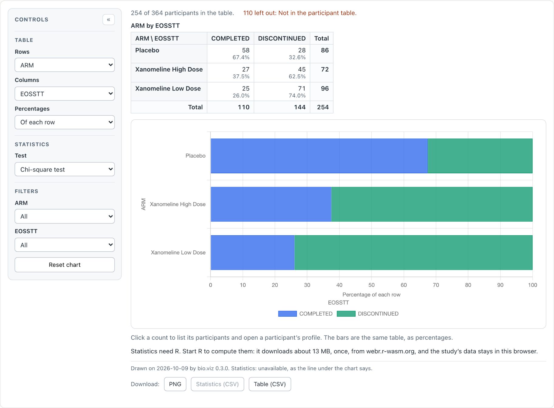
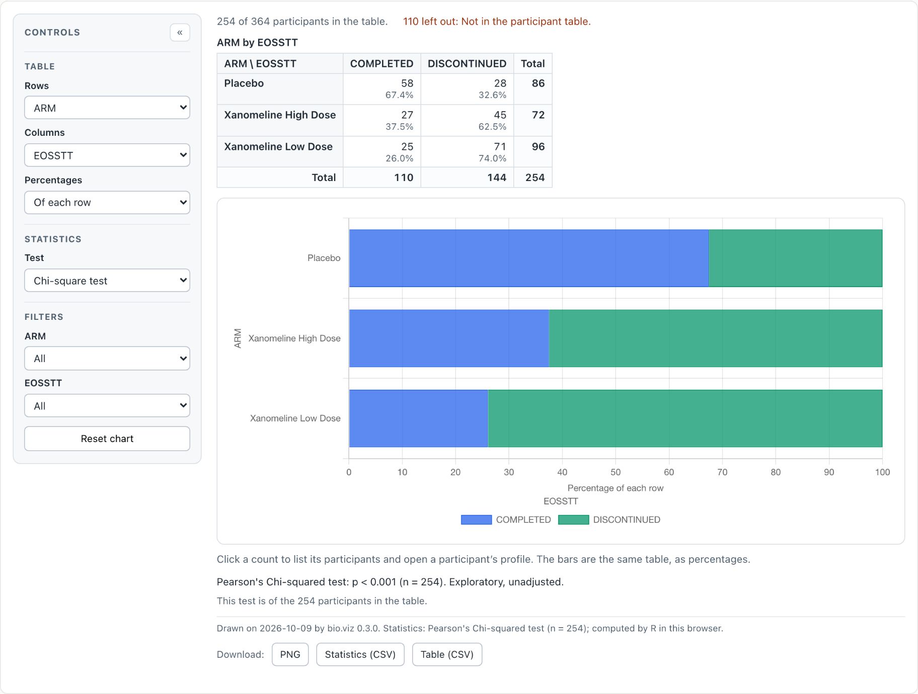
The sentence inside the chart, where the test will go, is cut to one short line that points at the control. The app owns this sentence, so no biomarker-library release is needed.
Did not start: the control says so in words, in the alarm colour, with Try again beside it and the reason one click away.
This is the control the RBQM tab now uses too, in the same place: see mockups 4 and 5.
Today: the Start R button leads the chart-name row; the reason is a long sentence inside the chart and in a tooltip; once started the button reads "R started" and stays, greyed.
The RBQM tab: the chart-name row, and what was weighed
Chosen
Option A: the metrics are the row. The row then means what it means on every other tab, the thing you click is the thing you see, each page fits one screen for an audience, and all eight statuses stay in view wherever you are on the tab.
What is the same in all three: the R control of the Biomarkers tab at the right end of the row; one press, after which the metrics run by themselves; the status icons; the 100-pixel columns; the key to the flags; the log folded until asked for; no file box.
What differs: what the row's items are, and so where the metric is chosen and where Run details live.
A · Metrics in the row (chosen)
B · Views in the row (not chosen)
C · Metrics in the row, one page (not chosen)
The row holds
Overview, then one item for each of the 8 metrics, its status icon where a chart has its hex.
Three items: Site overview, Metric charts, Run details.
One item for each of the 8 metrics. No Overview item.
The body under it
One thing at a time: the site overview, or one metric's two charts.
One view at a time. Inside Metric charts the metric is chosen with buttons.
One page: the site overview on top, the chosen metric's charts under it.
On Start R
One press. R starts, then the metrics run by themselves, as they do today. No separate Run step. A study loaded later runs by itself too.
The same.
The same.
Progress, for 20 to 40 seconds
In the control: the step, six segments, the seconds. In the body: the six steps ticked off. In the row: the metrics that will run turn.
In the control and the body, the same. Nothing in the row.
As A.
Run again and Run details
In the panel of the "R ready" chip. Run details is also one click from the line above the table.
Run details is an item of the row, with Run again at its head.
As A.
A metric that cannot run
In the row from the start, with a grey bar. Opened, its page is R's sentence and the way to the Data tab.
A grey bar on its button, inside Metric charts. Not visible from the other views.
In the row with a grey bar. Chosen, R's sentence takes the place of the charts, lower on the page.
8 metrics at 1,280 wide
Fits. The nine items take 610 pixels and the R control at its widest 427, of 1,216: about 180 to spare. Below about 1,100 wide the row scrolls and the control stays put.
Fits with room: the three items take 331 pixels.
Fits. The eight items take 517 pixels: about 270 to spare at the tightest.
At phone width
The row scrolls sideways, as a chart row does, with the R control first. Not drawn here.
The three items fit one line at 390; the R control takes the line above. Not drawn here.
As A.
A link straight to
the overview or any one metric.
any of the three views.
the tab, with a metric chosen.
For a first-time viewer
Works like the tabs they have just used. The items are abbreviations; the full name is on hover and heads the page.
The items are plain words. But what ran and what did not is out of sight until they open a view.
Everything on one page, but the row changes charts that are off screen on a laptop.
Cost
About two days. The most code: an item and an address for each metric, the body in two pages, the mid-page buttons removed.
About a day and a half. Three fixed items, the body in three pages; the buttons stay.
About a day. An item for each metric; the body stays as it is, less the buttons.
In all three, the page learns to draw a row for a tab that brings one, and to place a library's control at the right end of it. Today only a tab of charts has a row, and the control is placed inside the first chart group.
A fourth layout was considered and left out: a grid of small charts, one per metric, like the Biomarkers tab's opening tiles. It would need new drawing from gsm.viz, which is beyond polish.
4The RBQM tab, before Start R and while R starts
Option A, as chosen. The two options not chosen are on the switch, and the choice carries to mockup 5. Press Start R in the mockup to play the run through to the results.
Nothing here is qualified. The charts, statistics and site metrics are tested and documented, but none has been through qualification. Confirm every result in a qualified system before you rely on it.
13 charts are Exploratory. 5 charts and the RBQM tab are Experimental, and say so when you open them.
QualifiedValidated for regulated use. Nothing in safety.viz is, yet.
ExploratoryThis appTested and documented. Confirm every result.
ExperimentalTested and documented, but what it shows or how it behaves may still change.
PrototypeAn early look, on the docs site only. Not in this app.
Nothing here is qualified. The charts, statistics and site metrics are tested and documented, but none has been through qualification. Confirm every result in a qualified system before you rely on it.
13 charts are Exploratory. 5 charts and the RBQM tab are Experimental, and say so when you open them.
QualifiedValidated for regulated use. Nothing in safety.viz is, yet.
ExploratoryThis appTested and documented. Confirm every result.
ExperimentalTested and documented, but what it shows or how it behaves may still change.
PrototypeAn early look, on the docs site only. Not in this app.
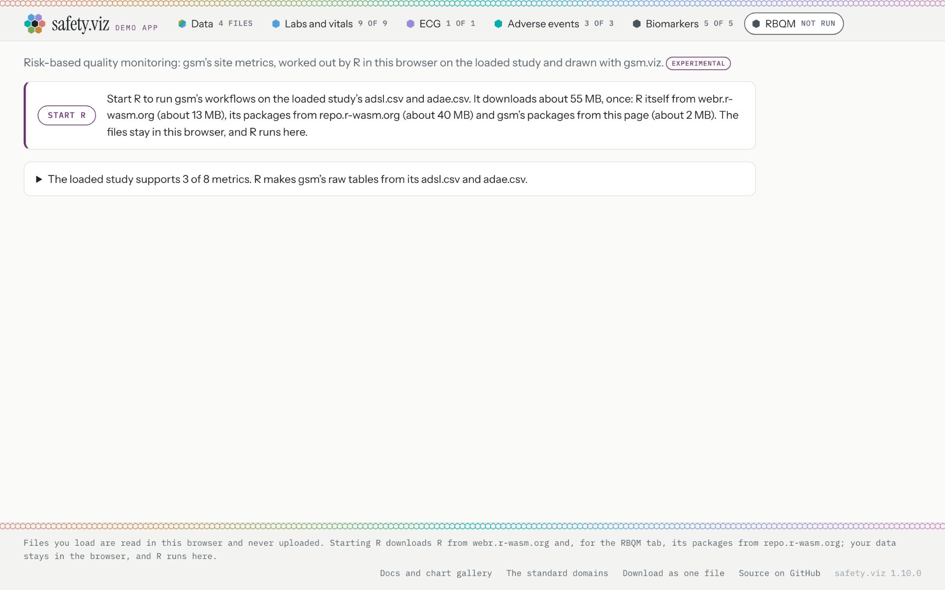
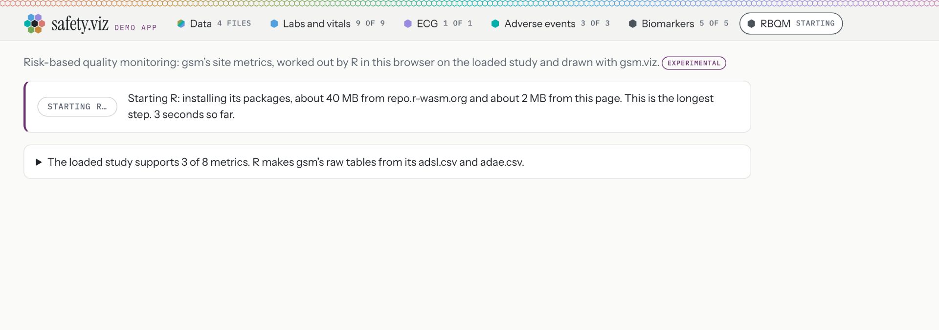
Risk-based quality monitoring: gsm’s metrics for every site of the loaded study, worked out by R in this browser. The site overview and each metric’s two charts appear here, usually 20 to 45 seconds after Start R the first time.
R is starting. The metrics run by themselves when it is ready.
Downloading R
Installing R packages
Fetching gsm’s workflow files
Loading gsm’s packages, the long one
Reading the study
Running the workflows
Site overview
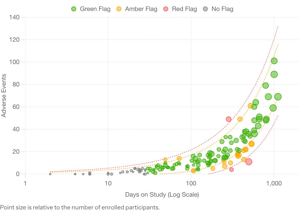
17 sites, 12 shown here
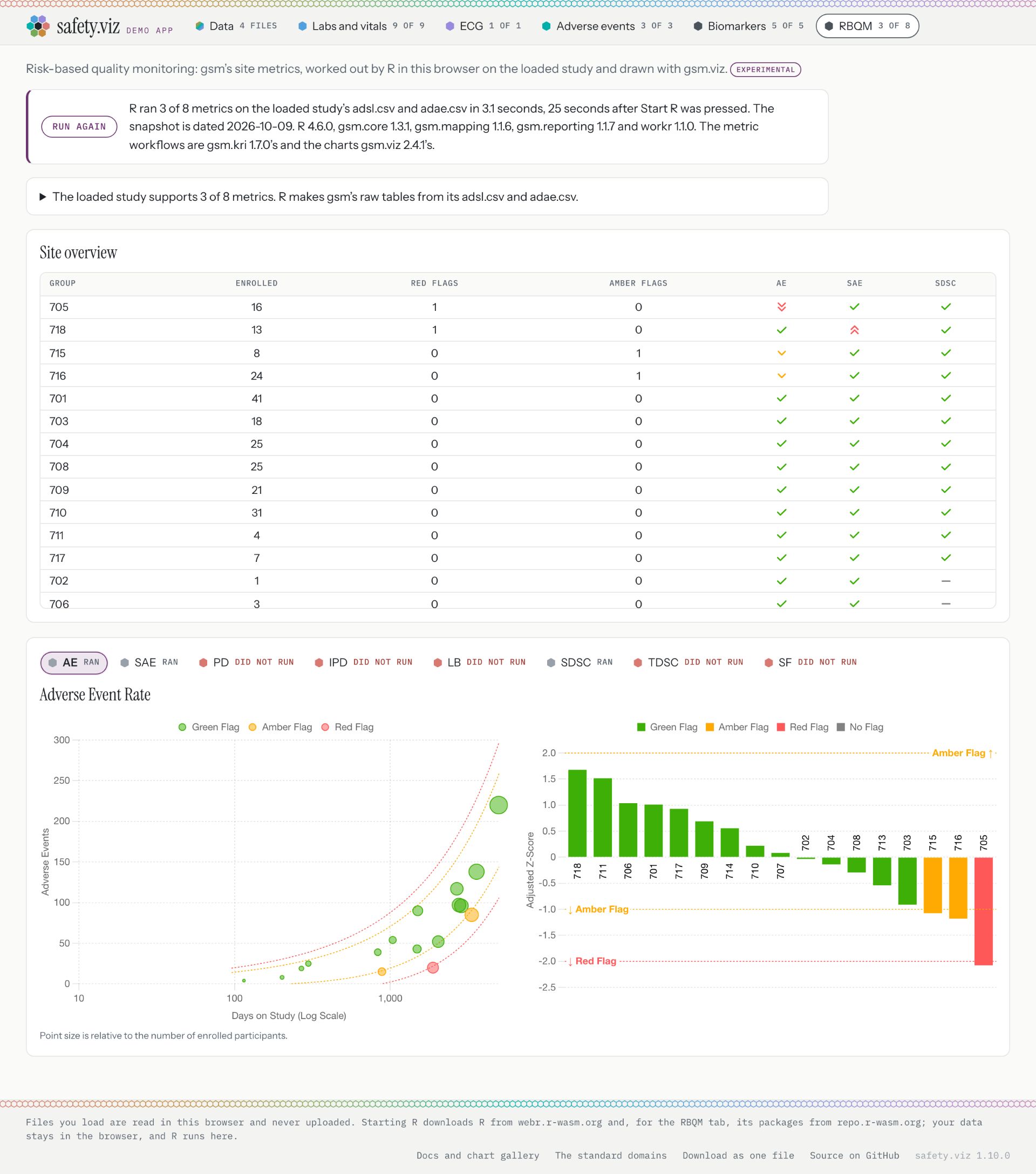
R ran 3 of 8 metrics on the Pilot study in 3.1 seconds. The other 5 need data it does not have: change the data on the Data tab.
Option A, chosen. The row is the tab's contents, as on every other tab: Overview, then one item per metric, with its status icon where a chart has its hex. A metric the data cannot support is in the row from the start, with the grey bar. Hover an item for the metric's full name.
Option B, not chosen. The row is three views by name: Site overview, Metric charts, Run details. It is the same three whatever the study, and reads without knowing any abbreviation.
Option C, not chosen. The row is the eight metrics and nothing else. It picks which metric the charts lower on the page show; the overview is always on the page, so it has no item.
The R control of the Biomarkers tab, in the same place, with the same three parts: why, the cost, one button. One press starts R, and the metrics then run by themselves, as they do today and as a biomarker chart asks for its statistics. Press it here to play the run.
Until R is ready the view says one short line, as a biomarker chart does, then what the loaded study supports and where to change it. No run button in the body, and no file box.
While R starts, the control names the step and counts it: six segments and the seconds. This is the one place it differs from the Biomarkers tab, because here the wait is 20 to 40 seconds and there it is under five.
The body lists the six steps and ticks them off, so a shared screen has something to watch. It is replaced by the results when they draw.
The tab's own label, on the corner of its card like a chart's: RBQM is Experimental. Click it for its panel.
Until the Data tab takes raw files, which is built after this tab, the file box stays where a reader can reach it: at the foot of the Overview page, unchanged, in every state. It is not on a metric's page. Until then the links that say "change the data on the Data tab" point down to it instead. It leaves when the Data tab requirement lands; the mockup shows the tab after that.
The metrics that will run turn in the row while R works; the ones that cannot keep their grey bar.
With views in the row, nothing in the row shows the run; the control and the body do.
Today: the RBQM tab has no chart-name row. It opens on a paragraph beside a Start R button, then a file box; after a run, a paragraph of versions, the overview table at full width, and metric buttons half way down the page.
5The RBQM tab, after a run
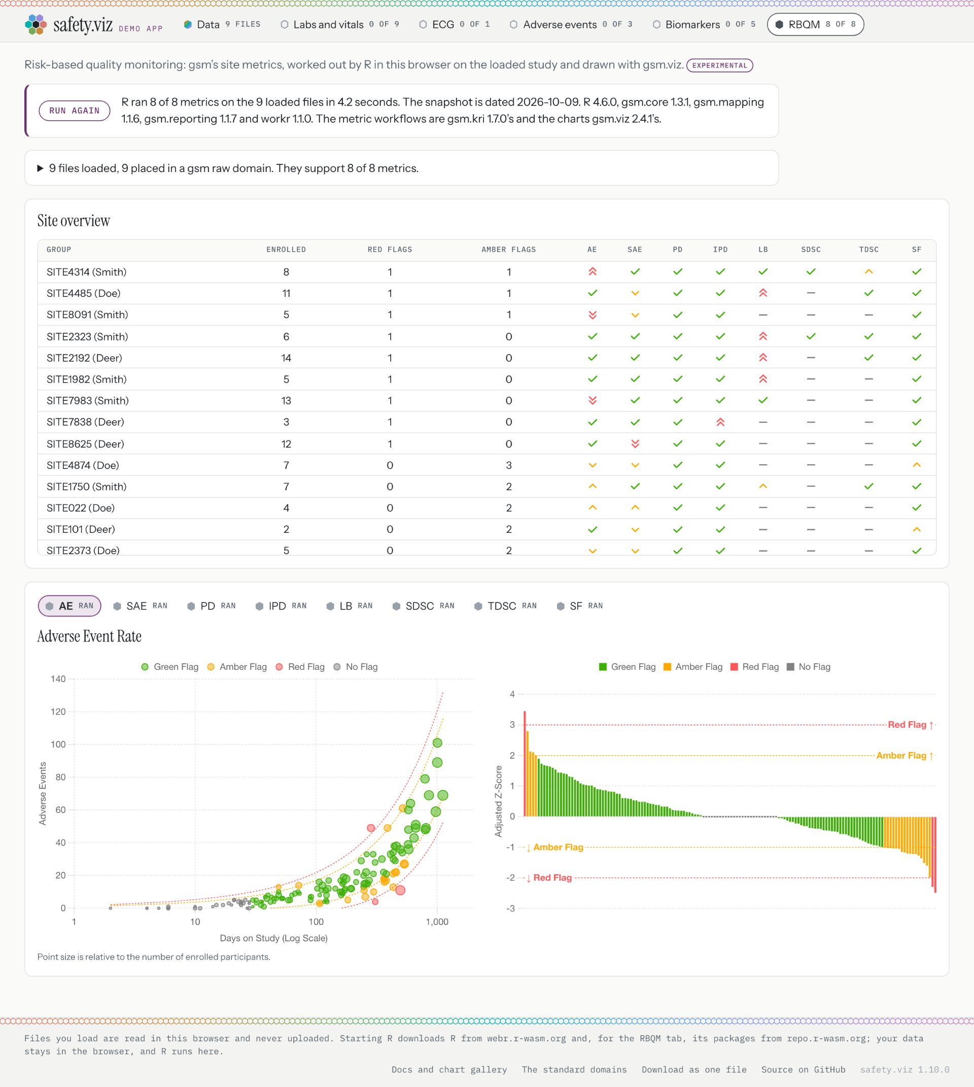
Option A with results. The row is live: click Overview, AE or PD. Switch the study to see eight metrics in the row and the table. The two options not chosen are on the switch.
Nothing here is qualified. The charts, statistics and site metrics are tested and documented, but none has been through qualification. Confirm every result in a qualified system before you rely on it.
13 charts are Exploratory. 5 charts and the RBQM tab are Experimental, and say so when you open them.
QualifiedValidated for regulated use. Nothing in safety.viz is, yet.
ExploratoryThis appTested and documented. Confirm every result.
ExperimentalTested and documented, but what it shows or how it behaves may still change.
PrototypeAn early look, on the docs site only. Not in this app.
Nothing here is qualified. The charts, statistics and site metrics are tested and documented, but none has been through qualification. Confirm every result in a qualified system before you rely on it.
13 charts are Exploratory. 5 charts and the RBQM tab are Experimental, and say so when you open them.
QualifiedValidated for regulated use. Nothing in safety.viz is, yet.
ExploratoryThis appTested and documented. Confirm every result.
ExperimentalTested and documented, but what it shows or how it behaves may still change.
PrototypeAn early look, on the docs site only. Not in this app.
Risk-based quality monitoring: gsm’s metrics for every site of the loaded study, worked out by R in this browser. The site overview and each metric’s two charts appear here, usually 20 to 45 seconds after Start R the first time.
R is starting. The metrics run by themselves when it is ready.
Downloading R
Installing R packages
Fetching gsm’s workflow files
Loading gsm’s packages, the long one
Reading the study
Running the workflows
Site overview
17 sites, 12 shown here
R ran 3 of 8 metrics on the Pilot study in 3.1 seconds. The other 5 need data it does not have: change the data on the Data tab.
Option A, chosen. Each metric in the row says how it went: a green tick for ran, a grey bar for did not run. The open item is the page, as with a chart. Click AE or PD in the row to try it.
Option B, not chosen. Three views, and the open one is the page. The row says nothing about the metrics; their status is inside Metric charts.
Option C, not chosen. The row marks the metric whose charts are lower on this page. Click AE or PD to change it.
Ready, the control is the Biomarkers tab's chip. Its panel holds what the log held: the steps, what R was handed, why metrics did not run, the versions, warnings, and Run again. Closed until asked for.
Ready, the control is the Biomarkers tab's chip, and its panel is the same short one. The run's own details are a view in the row.
One line says how the run went and where to change the data, with Run details one click away. It replaces the three-line paragraph of versions.
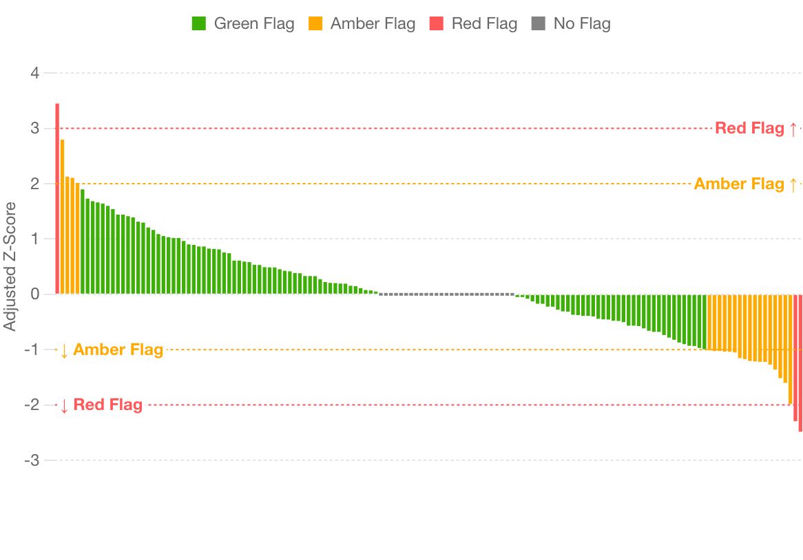
The site overview as agreed: number and flag columns at 100 pixels, the table as wide as it needs, and no wider than the card with eight metrics.
The key to the flags, beside the table or under it. A click on a cell opens that metric.
The metric's own page: its full name, then gsm.viz's two charts at full height. Nothing else is on the page, so it fits one screen.
A metric that did not run is still in the row and can be opened. Its page is R's sentence saying what it needs, and the way to the Data tab.
The metric is picked with icon buttons inside the view. Two levels: the row, then the buttons.
The chosen metric's charts, under the overview. On a laptop screen they start below the fold, so choosing in the row can change something that is not in view.
Run details, opened from the chip or from the line above the table. The same content the log on the page holds today.
Run details as a view of its own, with Run again at its head.
Until the Data tab takes raw files, which is built after this tab, the file box stays where a reader can reach it: at the foot of the Overview page, unchanged, in every state. It is not on a metric's page. Until then the links that say "change the data on the Data tab" point down to it instead. It leaves when the Data tab requirement lands; the mockup shows the tab after that.
On the RBQM study all eight metrics ran, so there is no metric that did not run to show.
Today: the RBQM tab has no chart-name row. It opens on a paragraph beside a Start R button, then a file box; after a run, a paragraph of versions, the overview table at full width, and metric buttons half way down the page.
6The Data tab, where all files now come in
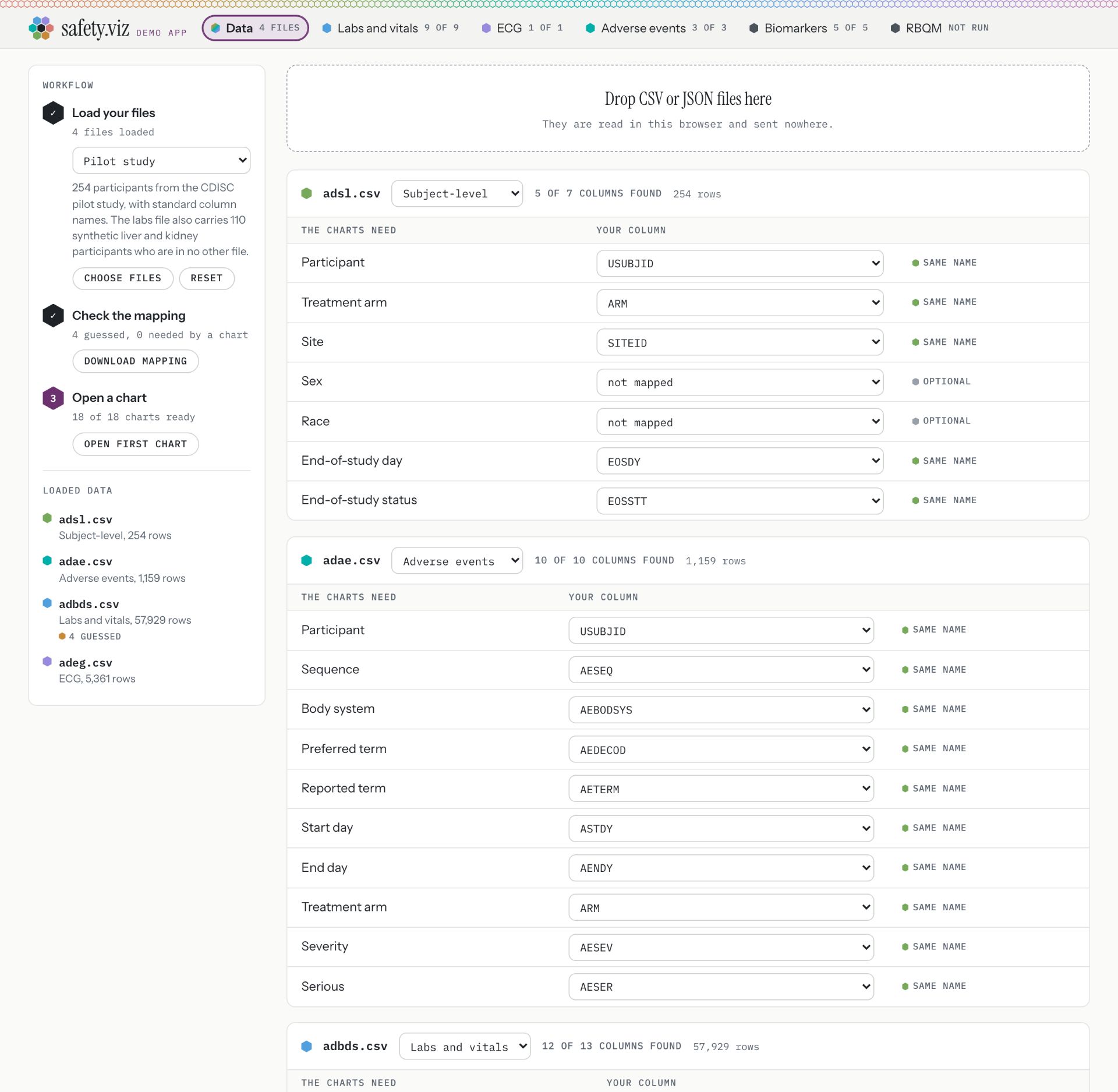
Three states: the RBQM demo study, the pilot study the app opens on, and a reader's own three raw files. The last is the case that only the RBQM tab handles today.
An interim path
Reading gsm raw files on the Data tab is not meant to last: the plan is RAW, then SDTM, then ADaM for everything, in a later release. So this mockup builds as little as the move needs. A raw file keeps the card it has today, and one small card says what the loaded data supports. Nothing here is worth keeping once raw files go.
Nothing here is qualified. The charts, statistics and site metrics are tested and documented, but none has been through qualification. Confirm every result in a qualified system before you rely on it.
13 charts are Exploratory. 5 charts and the RBQM tab are Experimental, and say so when you open them.
QualifiedValidated for regulated use. Nothing in safety.viz is, yet.
ExploratoryThis appTested and documented. Confirm every result.
ExperimentalTested and documented, but what it shows or how it behaves may still change.
PrototypeAn early look, on the docs site only. Not in this app.
Nothing here is qualified. The charts, statistics and site metrics are tested and documented, but none has been through qualification. Confirm every result in a qualified system before you rely on it.
13 charts are Exploratory. 5 charts and the RBQM tab are Experimental, and say so when you open them.
QualifiedValidated for regulated use. Nothing in safety.viz is, yet.
ExploratoryThis appTested and documented. Confirm every result.
ExperimentalTested and documented, but what it shows or how it behaves may still change.
PrototypeAn early look, on the docs site only. Not in this app.
Nothing here is qualified. The charts, statistics and site metrics are tested and documented, but none has been through qualification. Confirm every result in a qualified system before you rely on it.
13 charts are Exploratory. 5 charts and the RBQM tab are Experimental, and say so when you open them.
QualifiedValidated for regulated use. Nothing in safety.viz is, yet.
ExploratoryThis appTested and documented. Confirm every result.
ExperimentalTested and documented, but what it shows or how it behaves may still change.
PrototypeAn early look, on the docs site only. Not in this app.
Study files or gsm raw files. They are read in this browser and sent nowhere.
RBQM
This data supports 4 of 8 metrics.
not startedcannot run: missing data
Why 4 cannot run
Grade 3+ Lab Abnormality Rate needs Raw_LB.csv, which is not loaded.
Study Discontinuation Rate needs Raw_STUDCOMP.csv, which is not loaded.
Treatment Discontinuation Rate needs Raw_SDRGCOMP.csv, which is not loaded.
Screen Failure Rate needs Raw_ENROLL.csv, which is not loaded.
The Groups table needs Raw_STUDY.csv and Raw_SITE.csv, which are not loaded.
Read from the files’ names and columns, before R is started. R says the same when it runs.
Raw_SUBJ.csvgsm raw file: Raw_SUBJ, by its name1,005 rows, 16 columns
Raw_AE.csvgsm raw file: Raw_AE, by its name2,583 rows, 16 columns
Raw_PD.csvgsm raw file: Raw_PD, by its name3,000 rows, 6 columns
The drop zone says it takes both kinds of file. It is now the only place in the app that files come in.
A gsm raw file is recognised here, by a name that starts with "Raw_" or by columns that match one raw domain only. It keeps the card it has today, which now names the raw domain it was read as. Nothing else is built for raw files.
A card for RBQM says how many metrics the loaded data supports, with the same status icons as the tab and the reasons in R's own words. Open RBQM goes straight there.
Step three points where the data leads. With raw files and no chart ready it reads "Open the RBQM tab"; today it reads "Open a chart, 0 of 18 charts ready" and stops.
A study of standard files is unchanged, and the card says which raw tables R makes from which file.
With raw files loaded the chart tabs are hollow and read "0", and RBQM keeps its colour: the header shows at a glance where to go.
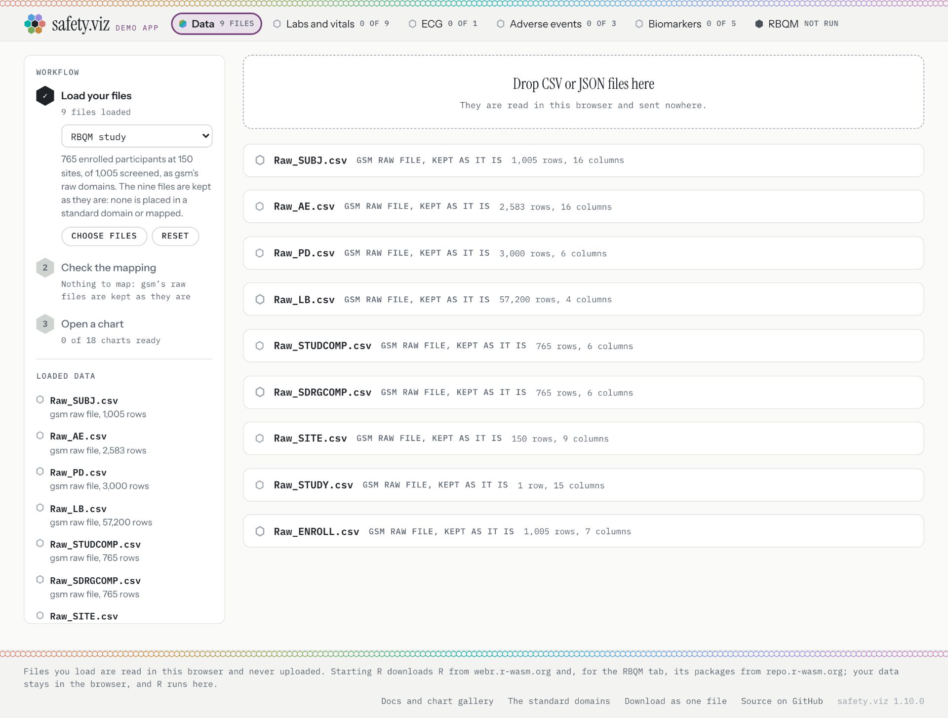
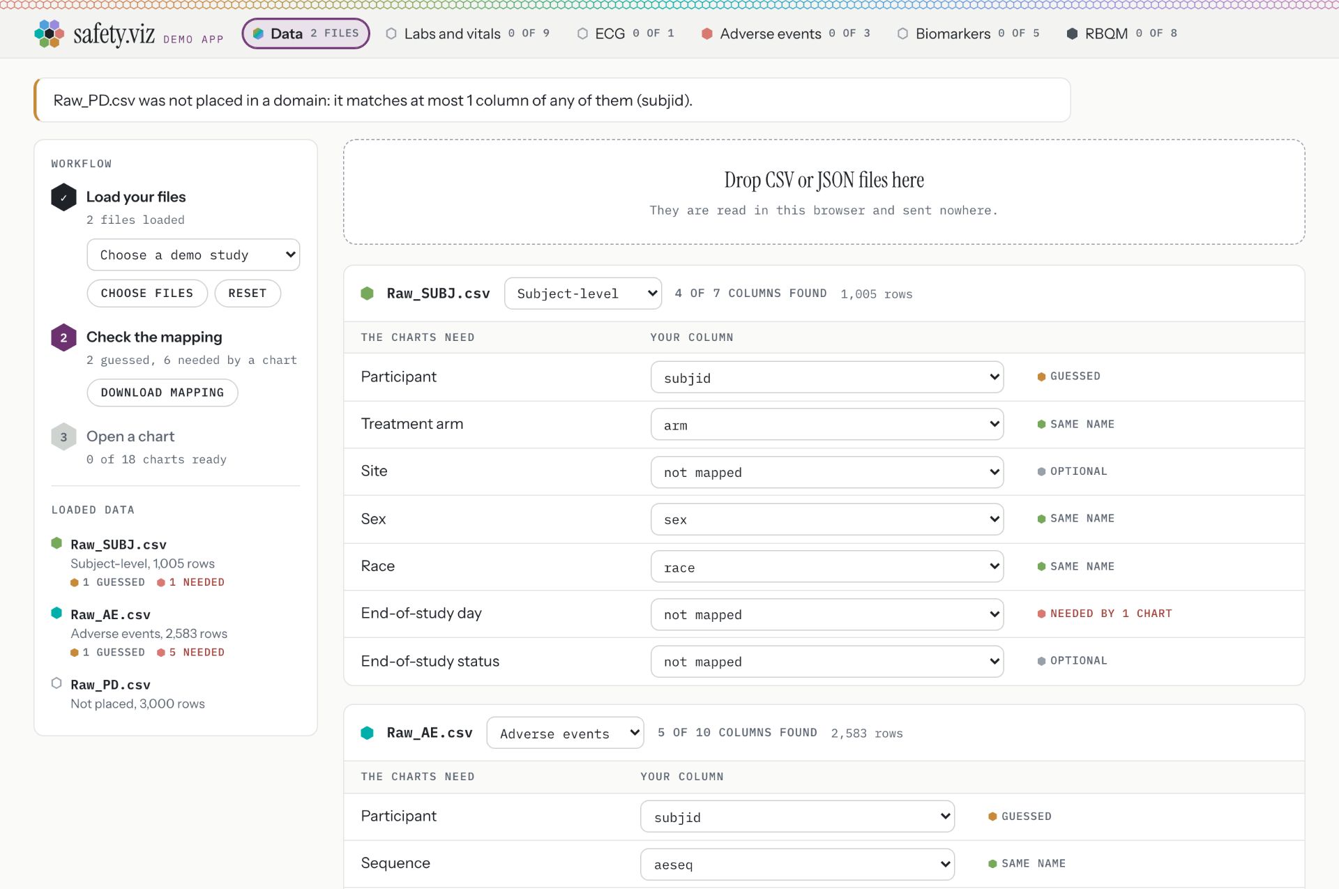
In the Today view of this state, the same three files were dropped on the Data tab of release 1.10: Raw_SUBJ.csv is read as the Subject-level file, Raw_AE.csv as the Adverse events file, and Raw_PD.csv is not placed. The RBQM tab then reads "0 of 8".
Today: the Data tab keeps a demo study of raw files as they are, but files a reader drops here are always read as standard study files. Raw files are understood only when dropped on the RBQM tab.
Status ladder
Four rungs, highest first: Qualified, Exploratory, Experimental, Prototype. Nothing is Qualified.
The app's rung is Exploratory, and so is every chart that says nothing else: 13 of the 18 charts.
Experimental: five charts and the RBQM tab. Prototype: the Patient Journey Explorer, on the docs site only.
Settled: one app label, and one more only on a chart or tab below Exploratory.
The label always shows its word. At phone width it keeps the word and sits on the header's first line beside the wordmark; that is not drawn here.
Label style: the one chosen, and the five weighed
Chosen
No mark at all. The word is the label, and the outline of the pill tells the rung: filled for Qualified, solid for Exploratory, dashed for Experimental, dotted and grey for Prototype. Nothing on it can be read as a meter, it needs no drawing, and a dashed outline already means "not settled" to most readers.
The four bars are gone. Each style below is shown where it will sit: in the header beside the tabs at real size, on a chart card's corner, all four rungs in a row, and in the open panel's ladder.
The switch changes every label on this page, the mockups included.
Label style, chosen
Not chosen
Word only, chosen. For: nothing to misread; the word was always doing the work; the cheapest to build. Against: dashed and dotted are close at header size. They never meet in the app, though: its header is always Exploratory, and no Prototype is in it.
Not chosen. Four dots, the rung's dot filled: position, not height. For: says "third of four" at a glance, and is not a signal meter. Against: it also reads as a page indicator, and nothing says which end is the better one until the panel is open.
Not chosen. A ladder with the rung marked. For: it is the metaphor itself. Against: at ten pixels wide the marked rung is hard to place from the back of a room, and the shape is close to a menu icon.
Not chosen. A pie: a quarter, a half, three quarters, full. For: familiar from maturity tables. Against: it reads as "three quarters done", which is the meter problem again, and a small filled round shape sits too close to the tab hexes.
Not chosen. A pictogram for each rung: a tick, a compass, a flask, a pencil. For: each word gets a picture. Against: no order is shown, four drawings have to be kept, they blur at this size, and a flask beside "Labs and vitals" looks like lab data.
Not chosen. A numeral, 4 down to 1. For: the order is explicit. Against: the tabs beside it carry numerals that are counts of charts, so "3" reads as a count.
In the header, at real size
On a chart card's corner
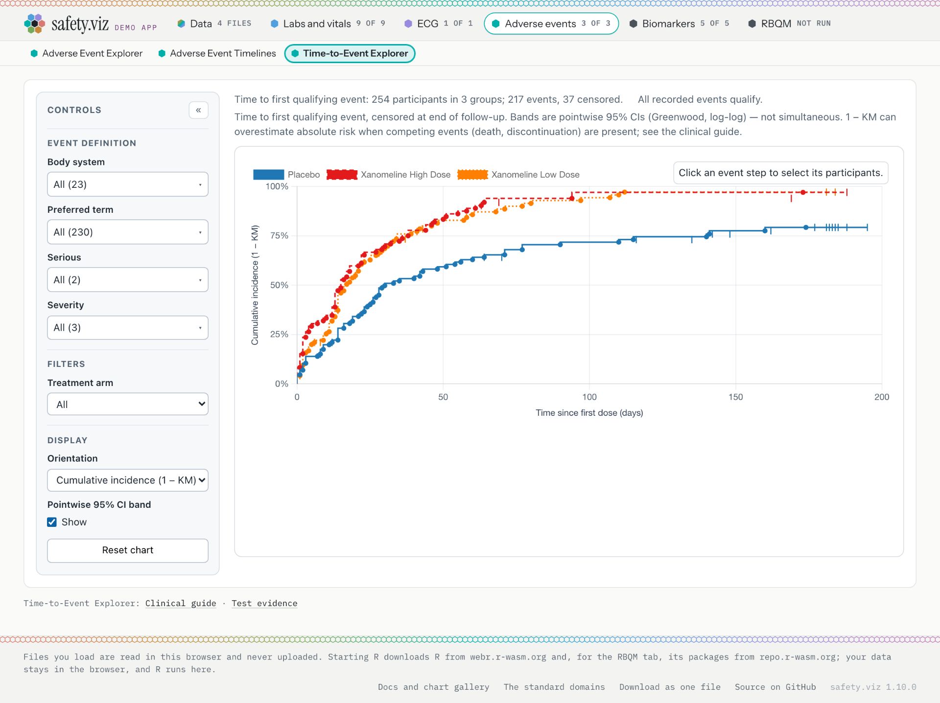
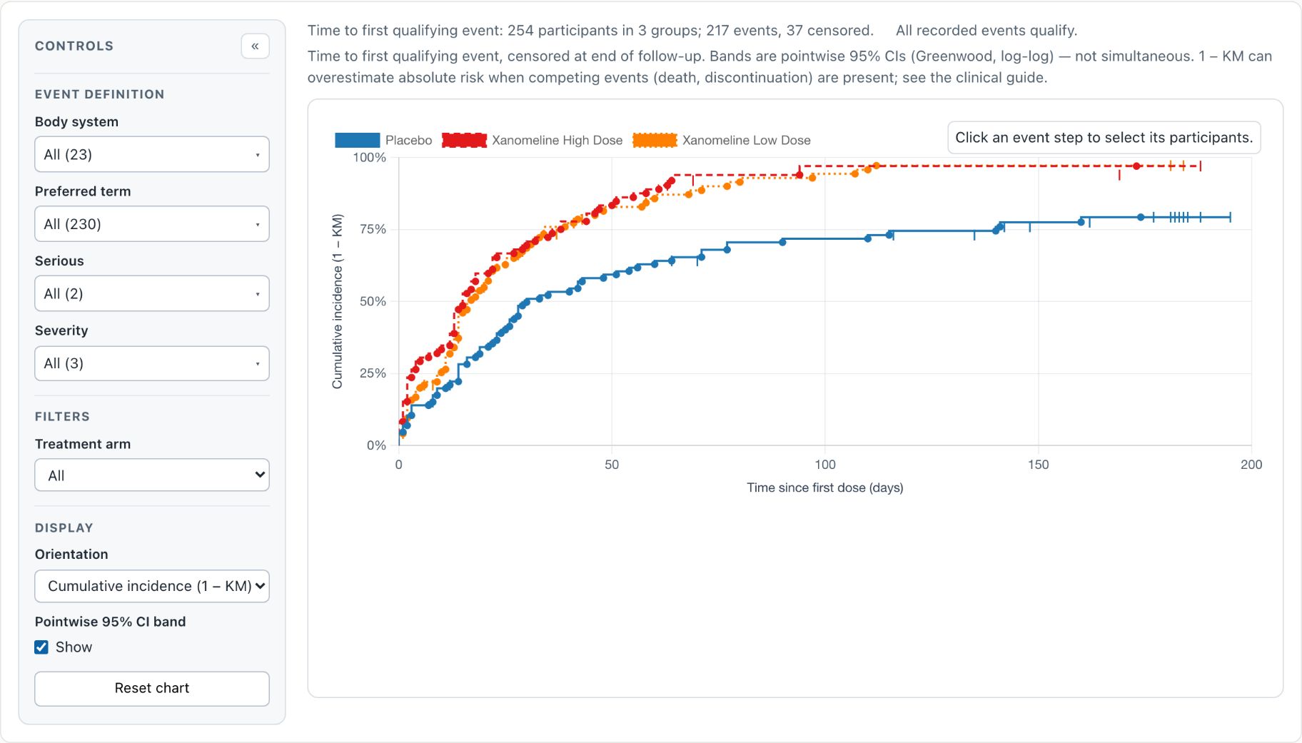
Time to first qualifying event: 254 participants in 3 groups; 217 events, 37 censored.
All four rungs, at header size and enlarged
In the open panel
Time-to-Event Explorer is experimental
Experimental until an external clinical review confirms its Kaplan–Meier estimates.
QualifiedValidated for regulated use. Nothing in safety.viz is, yet.
ExploratoryThis appTested and documented. Confirm every result.
ExperimentalThis chartTested and documented, but what it shows or how it behaves may still change.
PrototypeAn early look, on the docs site only. Not in this app.
Left out without drawing: a partly filled hex, which I agree is out, because the hex already means a tab's colour and a metric's status; a letter, because Exploratory and Experimental share one; bars or steps that rise, and battery segments, because they are the signal meter again.
How the rung is stored
Today, in the site configuration: every chart has status: "available" or "planned", and a chart below stable adds experimental: true or prototype: true. The RBQM tab has the same flag in the list of app tabs.
Proposed: one field, tier, with one of qualified, exploratory, experimental, prototype, and an optional tierNote for the one-sentence reason. Both on a chart and on an app tab.
The default when tier is absent is exploratory. So the 13 unlabelled charts need no edit, and six entries change a flag into a field.
status stays as it is: it says whether a chart exists yet, which is a different question.
The build stops with a sentence if any entry says qualified, until there is a qualification record for it to point at.
The app does not know a chart's rung today; only the docs site reads the flags. The app build has to hand the rung and its note to the page with each chart.
A chart from another library is Exploratory unless that library's own list says otherwise, by the same field.
The reason for each Experimental label
Settled: these ship as drafted, and you correct them at the release candidate.
Chart or tab
Sentence shown in its panel
Source
Time-to-Event Explorer
Experimental until an external clinical review confirms its Kaplan–Meier estimates.
From the docs site
Hepatic ALT Waterfall
Experimental: a new chart, drawn from a 2025 paper; its layout and settings may still change.
My draft
Nephrotoxicity Explorer
Experimental until its kidney-injury staging has had a clinical review.
My draft
Participant Profile
Experimental: what it lists for a participant, and how, may still change.
My draft
QT Explorer
Experimental: its settings and its table may still change.
My draft
RBQM tab
Experimental: new in 1.10. R runs in the browser, and what the tab shows may still change.
My draft
Tab colours
Settled: the rule chooses. Neither module names a colour, so Biomarkers is pink and RBQM is amber.
A module that names a colour for its tab gets that colour. Its chart names and file cards use it too.
A module that names none gets the first open colour from a fixed list: pink, then amber, then green. Open means no tab in the header uses it.
Modules are taken in the order the app's build lists them, which never changes between loads. So the same module has the same colour on every load, and a module added later goes to the end and moves nobody.
Red is never given out. It means "missing" and "did not draw" everywhere in the app.
When the list runs out, the app goes round again with each colour mixed 40 percent toward ink: a darker pink, a darker amber, and so on. Never grey.
Labs and vitals, blue
ECG, violet
Adverse events, teal
Biomarkers, pink (was graphite)
RBQM, amber (was graphite)
next module, green
Why the labels are not coloured
The status labels are ink on white, and the rung is read from the word and its outline. A coloured Experimental label beside an amber RBQM hex would look like the same signal.
Metric status icons
RanA filled green hex with a tick. Read aloud and on hover as "Adverse Event Rate: ran".
Did not runA grey outlined hex with a bar. On hover, R's own sentence: "… needs Raw_PD.csv, which is not loaded." Grey, because missing data is not an error.
RunningA turning ring in the app's plum, still when the reader asks for reduced motion. "Adverse Event Rate: running".
Not startedA dashed outlined hex. "Adverse Event Rate: not started".
The icon is decoration to a screen reader; the button's name carries the metric and its state in words.
On the RBQM tab the icon takes the place of the hex in the chart-name row.
The same icons are used on the Data tab's RBQM card, so the two tabs say the same thing the same way.
Data loading: what moves to the Data tab, in the code
An interim path
In your words: the stricter rule is fine for now, but this is not a process to support for long; the aim is RAW, then SDTM, then ADaM for everything, in a later release. So this section is the least that moves loading to the Data tab without losing what the RBQM tab can do today. Every piece of it lives in the RBQM tab's own files, or in a few lines beside them, and can be deleted with the raw path.
Already shared
The app, not the RBQM tab, already holds the raw files: its state has a list for them, and a loader that keeps a file as it is with its column names and row count (src/app/page.js, lines 234 and 806 to 834).
The Data tab already shows them: a card per raw file, a row in "Loaded data", and "Nothing to map" at step two (src/app/data-panel.js, lines 252 to 267, 386 to 388 and 445 to 455). Those stay as they are.
The RBQM demo study already arrives through the Data tab's study menu and that loader.
Reading files from disk is one function used by both tabs (readFiles, src/app/data-panel.js, lines 32 to 53).
Everything that decides what a file is and what the data supports is one module with no page code in it (src/app/rbqm-files.js). It moves nowhere.
The least that has to change
Routing. The Data tab's drop zone sends every file to the standard loader. It asks first whether the file is a raw file, by the stricter rule, and sends it to the other loader. This is the one real change in behaviour.
Two functions. The list that says what each raw domain and each metric needs is handed only to the RBQM tab. Rather than teach the Data tab about it, the RBQM tab hands the page two functions: is this file a raw file, and what does the loaded data support. The Data tab calls them and knows nothing else about RBQM.
One card. "What they support" and "From the loaded study" are drawn on the RBQM tab today (src/app/rbqm-view.js, lines 546 to 596). They are drawn in one card on the Data tab instead, sentences unchanged. The "Loaded files" list is not rebuilt: a raw file's existing card names its raw domain, which is one string.
The RBQM tab's drop zone and file box are removed (same file, lines 496 to 545), and the tab keeps one line with a link.
The CSV-only rule and its sentence move with the routing: raw files are CSV, and the Data tab also takes JSON.
Not built, because raw files are not staying
A picker to read a file the other way, as raw or as standard. Dropped, not postponed.
A table of raw files, or any new display for them. Today's card is enough.
A general way for any tab to claim files. Two functions for this one tab are enough.
Size
Code: small to medium. About 100 lines leave the RBQM tab; fewer arrive on the Data tab, plus a short routing rule.
Tests: the larger half. The unit tests of the RBQM tab mention the file box on 32 lines. In the browser tests, two long cases cover a reader's own files on that tab and several more read its lists. They are rewritten for the Data tab, with the requirement rows they prove.
Risks to what RBQM does today
Settled by the stricter rule: the RBQM tab places a file by its name before its columns, so "ae.csv" is the adverse events raw file whatever is in it. On a shared drop zone that would claim the standard ae.csv of the "Renamed columns" demo study. Under the stricter rule a file is raw only when its name starts with "Raw_" or its columns match exactly one raw domain.
The reverse fault exists today and this change fixes it. Dropped on the Data tab of release 1.10, Raw_SUBJ.csv is read as the Subject-level file and Raw_AE.csv as the Adverse events file, and the RBQM tab then reads "0 of 8". Mockup 6 shows it under Today.
A reader's own files clear a loaded demo study, in both loaders. A drop that mixes raw and standard files must clear it once, not twice, and say so once.
Raw files and a standard study loaded together already work: a raw file wins over the table R would make from a standard file. The routing must not change that order.
The sentences are held, word for word, to what desktop R says of the same files by a unit test. Moving where they are drawn does not touch that test; rewording them would.
Every proposed change for release 1.11
Six groups, each sized to be one requirement. Sizes: Small is under half a day, Medium is a day or two.
Three groups carry the decisions of 9 October: the R control (one component in the chart-name row on both tabs), the RBQM tab (the metrics are its row), and data loading (the least an interim path needs). A grey note under a row gives its cost or what it replaces.
The RBQM tab is built before data loading, so its file box stays at the foot of the Overview page until the data loading requirement removes it.
Rows marked "Left out" are proposals to keep out of 1.11, with the reason. There are 12 days to the talk.
If time runs short, build in this order: labels, RBQM tab, data loading, R control, navigation, defects. The first three are what an audience sees.
Change
Files touched
Size
Status ladder and labelsOne requirement: four rungs, stored once, shown by one component.
The four rungs replace the two flags: one tier per chart and per app tab in the site configuration, exploratory when absent. The build refuses qualified, since nothing is.
site/config.json; scripts/site.mjs (lines 215 to 216); scripts/site-lib.mjs (status meanings and badge, about lines 1505 to 1530); scripts/app-libraries.mjs (lines 120 to 137); the app build, which must hand each chart's rung to the page
Medium
The app-wide Exploratory label in the header: one line on hover, the disclaimer and the ladder on click. The label is the word alone; the pill's outline tells the rung, so nothing is drawn.
src/app/page.js (header, lines 270 to 287); src/app/styles.js; one new module for the label and its panel
Medium
A chart or tab below Exploratory carries the same label on the corner of its card, with its one-sentence reason. The RBQM tab's pill and the banner drawn inside two charts go.
src/app/page.js (renderMain, lines 531 to 574; view tabs, lines 426 to 443); src/app/rbqm-view.js (lede, lines 647 to 655); src/hep-waterfall.js (line 232); src/hep-explorer/views/migration.js (line 867); src/shell.js (banner, lines 47 to 71)
Medium
The docs site says the same four words with the same component: gallery cards, page titles, the kit table.
scripts/site-lib.mjs (lines 883, 1523 to 1530, 1306); site/site.css (lines 107 to 132)
Small
A reason sentence for each of the six Experimental things, in the configuration. The drafts on this page ship; you correct them at the release candidate.
site/config.json
Small
R presentationOne requirement: one control in one place on both tabs, one wording, on request as now.
One R control, one component, at the right end of the chart-name row on the Biomarkers tab and on the RBQM tab: off, starting, ready as a chip, did not start. It sits outside the scrolling list of names. On the RBQM tab the starting state also names the step and counts it. The RBQM tab has no run line of its own; its side of the control is what makes this row Medium.
one new module for the control; src/app/page.js (actionControl, lines 477 to 497; its placement, lines 414 to 421, which today needs a chart group to sit in); src/app/libraries.js (what a library's control may say of itself: its phase, its step, its details); src/app/r-on-request.js (lines 96 to 123); src/app/rbqm-view.js (control, lines 325 to 343; statusText, lines 174 to 195; press, lines 272 to 322, which now feed the control); src/app/styles.js (lines 82 to 85)
Medium
One set of sentences: the short line in the control, the full one on hover, and one short line in the view that points at the control, on both tabs.
src/app/r-on-request.js (lines 43 to 51); src/app/rbqm.js (lines 69 to 119)
Small
The ready chip opens the details: R's version, the download size, where it runs. On the RBQM tab the same panel holds the run's details and Run again.
the new control; src/app/r-browser.js for the version; src/app/rbqm.js (doneSentence, lines 223 to 247; warningsSaid, lines 261 to 268)
Small
One R shared by both tabs. Why left out: Unproven, and it needs a release of a second library. The two tabs keep their own R in 1.11; the reader sees one control either way.
src/app/r-browser.js; the biomarker library's own R engine, which needs a release of that library
Left out
RBQM tabOne requirement: the tab gets a chart-name row and loses its run box; no change to what it computes or draws.
The tab gets a chart-name row, and the metrics are its items: Overview, then one item per metric with its status icon where a chart has its hex. Each item is a page with its own address. The body is one thing at a time: the site overview, or one metric's two charts, or R's sentence for a metric that did not run. The mid-page metric buttons go, and a click on a table cell opens that metric. About two days. The largest row of this group. The page learns to draw a row for a tab that brings one, and to open an item of a tab by its address.
src/app/page.js (renderNav, lines 366 to 443; navItem, lines 348 to 361; select, lines 1031 to 1037); src/app/libraries.js (a tab's items); src/app/rbqm-view.js (the view, lines 600 to 705; drawResults, lines 387 to 488; the metric buttons, lines 448 to 473; the cell click, lines 433 to 438)
Medium
The run box leaves the body. Until R is ready the view says one short line and what the loaded study supports; while R starts it lists the six steps; after, one line says how the run went. The file box stays at the foot of the Overview page, unchanged, until the data loading requirement removes it. Replaces the run line of the earlier draft.
src/app/rbqm-view.js (render, lines 634 to 704); src/app/rbqm.js (needSentence 69 to 75; stepSentence 92 to 106; doneSentence 223 to 247); src/app/styles.js (lines 105 to 109)
Small
Run details stay folded until asked for, in the R chip's panel, with a link to them from the line above the table. Steps, what R was handed, why a metric did not run, versions, warnings, Run again.
src/app/rbqm-view.js (drawResults notes, lines 409 to 413); src/app/rbqm.js (doneSentence, warningsSaid)
Small
Metric status as icons, with the words on hover and for screen readers: ran, did not run, running, not started. They sit in the chart-name row, in place of the hex.
src/app/rbqm-view.js (metric chooser, lines 448 to 473); src/app/styles.js
Small
Site overview: number and flag columns capped at 100 pixels, the table as wide as it needs, a key to the flags, the site count in the heading, the height a whole number of rows.
src/app/styles.js (lines 125 to 130); src/app/rbqm-view.js (lines 417 to 443)
Small
The time each step took, in Run details. Why left out: Nice to have. The total is already measured; per-step times can follow.
src/app/rbqm-view.js (press, lines 272 to 322)
Left out
Data loading for RBQM on the Data tabOne requirement: every file comes in on the Data tab. Reading gsm raw files there is an interim path, so only what the move needs is built.
The Data tab recognises a gsm raw file when it is dropped or chosen there, by the stricter rule, and keeps it as it is. Today it reads such a file as a standard study file.
src/app/page.js (loadFiles, lines 738 to 792; loadRaw, lines 806 to 834); src/app/rbqm-files.js (placeRaw, lines 51 to 61, plus the stricter rule); src/app/rbqm-view.js (one function handed to the page: is this file a raw file)
Small
The Data tab says what the loaded data supports for RBQM: one card with the metrics, their icons and R's own reasons. A raw file keeps today's card, which now names the raw domain it was read as.
src/app/data-panel.js (rawCard, lines 252 to 267; drop zone, lines 474 to 501); src/app/rbqm-view.js (handed, lines 117 to 147, and the sentences of filesSection, lines 546 to 596, which move)
Medium
The file box leaves the RBQM tab. One line stays: how many metrics the loaded study supports, and a link to the Data tab.
src/app/rbqm-view.js (filesSection, lines 496 to 598); src/app/rbqm.js (lines 78 to 83); src/app/styles.js (lines 110 to 122)
Small
Step three of the Data tab points where the data leads: "Open the RBQM tab" when raw files are loaded and no chart is ready.
src/app/data-panel.js (lines 394 to 404)
Small
The tests and the requirement rows that describe the file box on the RBQM tab are rewritten for the Data tab.
tests/unit/app/rbqm-view.test.js; tests/unit/app/data-panel.test.js; tests/e2e/basic-app.spec.js; the app's requirement matrix
Medium
Tab colours and navigationOne requirement: the header says where you are, whose data it is and where each tab leads.
A module names its tab colour; one that names none gets the next open palette colour. Settled: the rule chooses, so Biomarkers is pink and RBQM amber.
src/app/libraries.js (hueClass, lines 323 to 325); src/app/page.js (tabs and chips, lines 381 to 443); src/app/styles.js (line 56); scripts/app-libraries.mjs (an optional colour per library)
Small
The Data tab names the loaded study; a tab shows one number when every chart draws.
src/app/page.js (lines 370 to 396)
Small
The wordmark links to the docs home; the browser tab's title follows the open view; one favicon for app and docs.
src/app/page.js (lines 270 to 287 and 1031 to 1037); scripts/site-lib.mjs (lines 1650 and 1667 to 1668); site/shell.html (lines 8 to 11)
Small
A one-line welcome on first open, closed with a cross and not stored.
src/app/page.js (renderMain); src/app/styles.js
Small
The RBQM tab gets the same footnote links as a chart: its docs and its test evidence.
src/app/page.js (view branch of renderMain, lines 543 to 562); scripts/app-libraries.mjs (chartLinks, lines 320 to 339)
Small
On a phone, the open tab is scrolled into view on a direct link, and tabs and chips are 44 pixels tall to the touch.
src/app/page.js (select, lines 1031 to 1037); src/app/styles.js (lines 225 to 231)
Small
One set of colours for treatment arms across the QT, time-to-event and biomarker charts. Why left out: Touches charts in two libraries and every screenshot in their evidence. After the talk.
src/qt-explorer/getPlugins.js (line 15); src/time-to-event/getPlugins.js (line 19); the biomarker library's palette
Left out
One casing for chart names in the chart-name row. Why left out: A rename ripples into evidence pages and tests. After the talk.
chart titles in two libraries' manifests
Left out
Defects and phone-width fixesOne requirement: the four defects from round one, and what breaks at 390 pixels.
Hepatic ALT Waterfall: the two panel titles overlap on the pilot study.
src/hep-waterfall.js (line 853)
Small
QT Explorer: its table runs past the page at 390 pixels.
src/qt-explorer.js (line 829, and the styles at lines 91 to 96)
Small
Docs site at 390 pixels: the reference pages and two demo pages are clipped at the right.
site/site.css (lines 72 and 889)
Small
A console message on every R start, from the R runtime.
src/app/r-browser.js; possibly the runtime itself
Small
The site's description still says "Nine classic" charts.
scripts/site.mjs (line 78)
Small
RBQM table headings are 8 pixels tall on a phone; the two step sentences each claim to be the longest step.
src/app/styles.js (lines 219 to 224); src/app/rbqm.js (lines 98 and 102)
Small
What I could not verify
How the RBQM tab's row and the app label behave at phone width. The mockups are desktop only; the phone behaviour stated here is what the existing chart rows do, not something drawn or tried.
The file box at the foot of the Overview page, for the time between the two requirements, is described and not drawn.
The addresses for single metrics. The app's address handling takes one name today; that it extends cleanly to a tab and an item is read from the code, not tried.
How a dashed or dotted outline looks on a projector. It was checked in one browser at laptop and phone widths only.
The R version in the ready chip on the Biomarkers tab. The RBQM tab already reports it; whether the biomarker library's R engine can be asked for it without a release of that library is not checked.
The column rule on the real table. The mockup's table is my own markup with the app's styles; the live table is drawn by gsm.viz. Its cells carry no widths of their own in the capture, so the same two style rules should hold, but it is not tried on the live table.
Five of the six Experimental reasons are my drafts, not statements from the repository.
The per-step times in Run details are from one run on 9 October, read from the status line once a second.