safety.viz release review 2026-07-25
What v1.5.0 adds, annotated
Four groups of work sit between v1.4.1 and this release. Each one below is a line on what changed, why it matters when you are reading a study, a capture of it running, and a way into the live demo to check it yourself. Every capture on this page was taken from the release candidate — the dev site — on 25 July. sv#112 joined the release that evening and removed the profile dock; the profile captures were re-taken against the rail after it merged, and every other capture predates it and is unaffected by it.
6 PRs, all merged to dev 2 new renderers 1 052 unit + 219 browser tests promotes dev → main
Participant profile
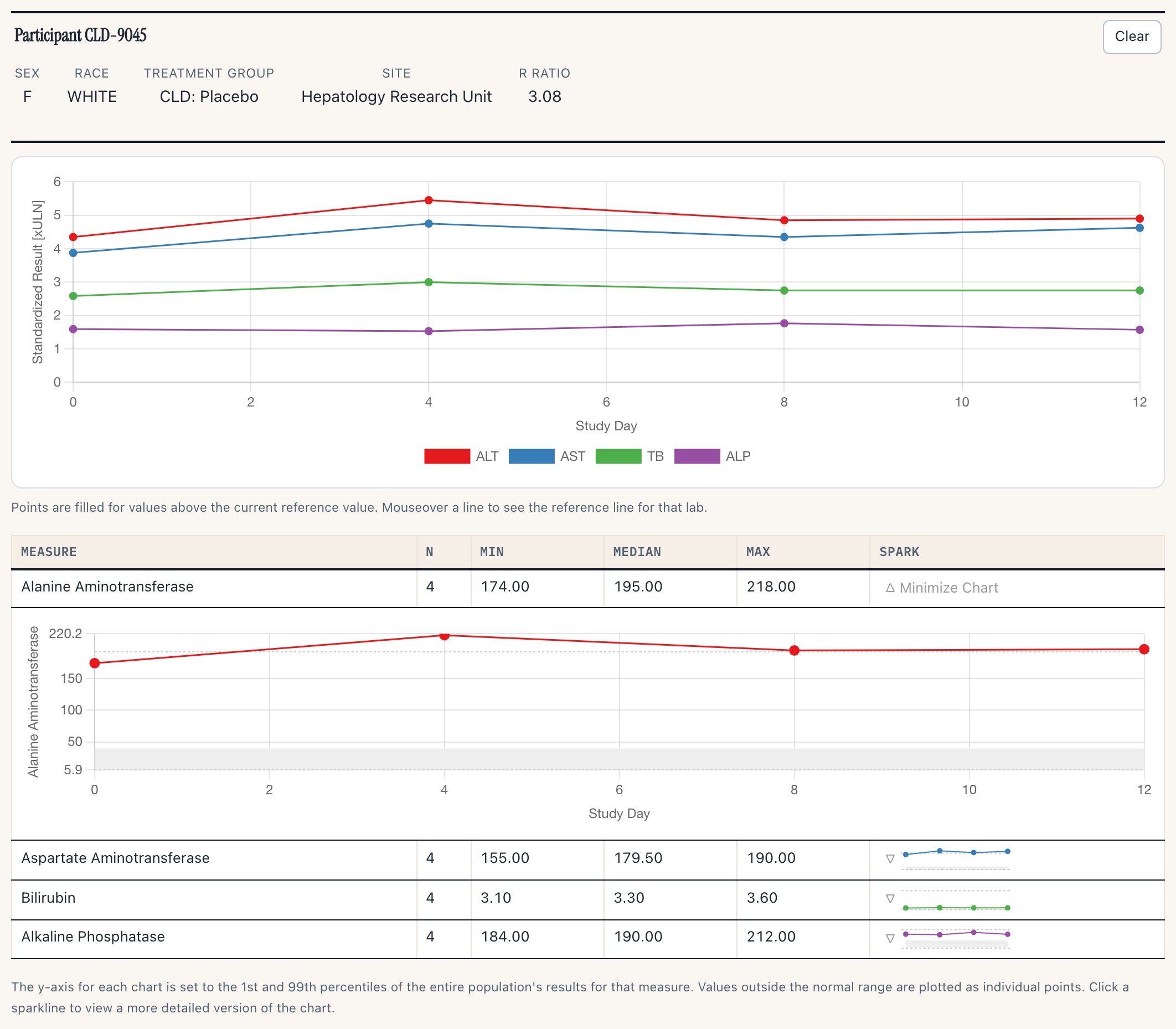
ExperimentalDrilling into one person used to mean whatever detail panel a given renderer happened to have. v1.5.0 replaces that with a single chart-agnostic module — demographics header, labs-over-time spaghetti, per-measure table — that any chart can hand a participant to. Six lab renderers adopted it in this release: hep-explorer, shift-plot, outlier-explorer, delta-delta, histogram and qt-explorer. sv#112 then added a second data domain — adverse events — which let ae-explorer and ae-timelines adopt it too.
This section shows profile v2. sv#112 merged to dev on the evening of 25 July, and its D4 removes the dock: the profile now opens in a right-hand rail beside the chart, gains an expand state, and reads adverse events as well as labs. The captures below were re-taken against that build. The module itself and the participantsSelected contract are unchanged — only the surfacing and the second domain are new.
Click a point in one chart, read the whole lab course in another
The two modules in this clip share no internals. The scatter dispatches participantsSelected; the standalone profile below it is listening. That event is the contract — and the part of this feature that is stable.
4 s clip · press play
The demo page runs the Hepatic Safety Explorer with its own rail off, and mounts the profile separately underneath. One click on the top-right point selects CLD-9045 and the profile below fills in — no shared state, just the event.
What the profile shows
 1
2
3
4
1
2
3
4
- 1 Demographics header, R Ratio included, with a templated link-out to the source record
- 2 Labs over time, one line per measure; points fill above that lab's reference value
- 3 Per-measure summary — n, min, median, max — with a sparkline per row
- 4 Click the sparkline and it expands in place into a full chart with the normal-range band
Where it opens: the rail, beside the chart
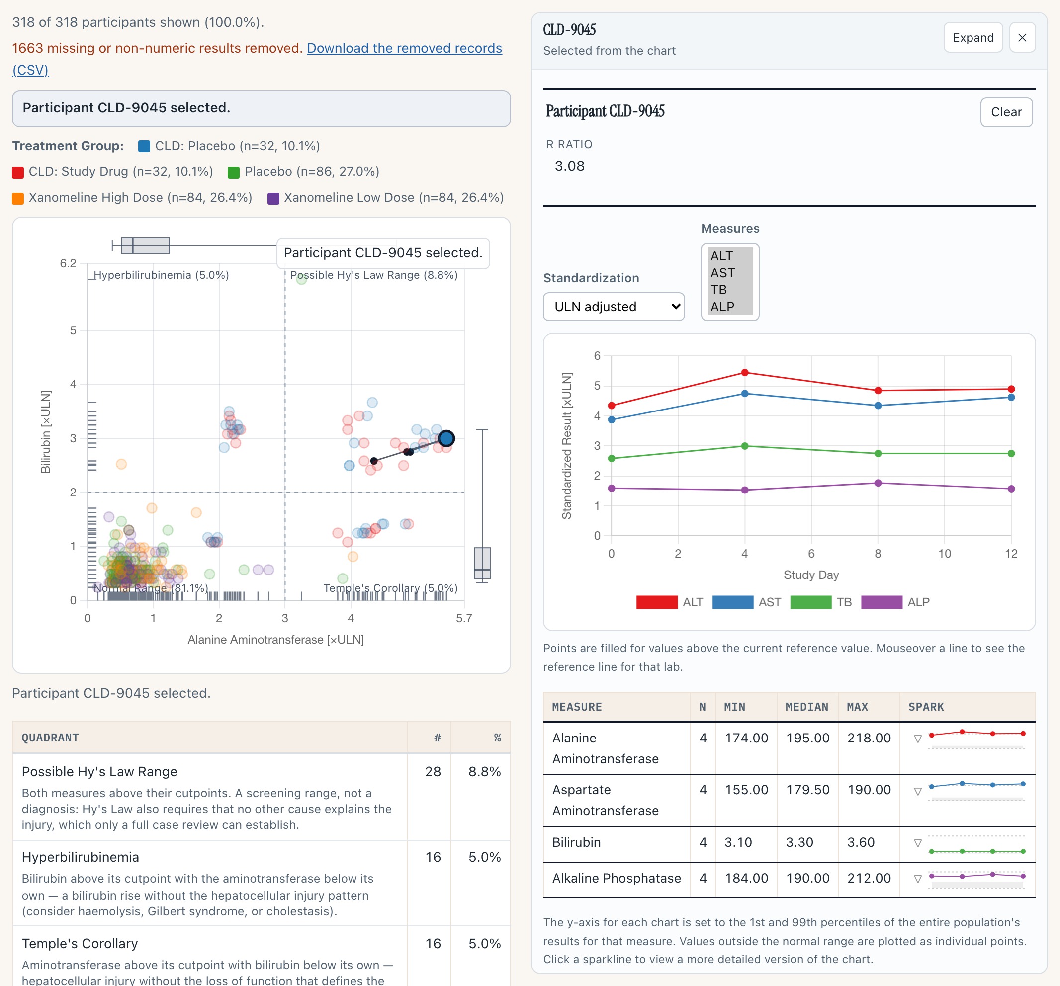
The same module, opened by hep-explorer rather than mounted standalone. Note what the chart did: it re-laid out narrower rather than being covered, so the Hy's-Law point the click came from is still on screen and still in place. The rail head names the participant, says where the selection came from, and carries Expand (fills the renderer's own container, Escape collapses) and a close that clears the chart's selection. Idle, the rail takes no width at all. This replaces the dock that sat below the chart in v1 — the same module, a different surface.
The second domain: adverse events on the labs chart's own axis
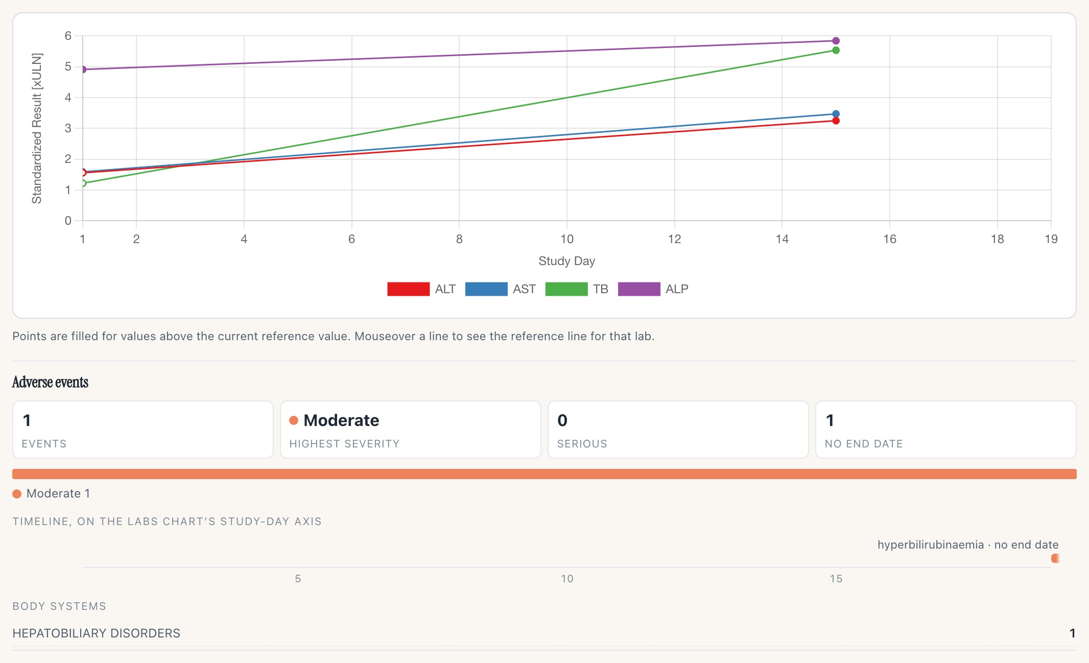
Participant 01-705-1186 — the worst eDISH position in this cohort that also carries adverse-event records. Four figures, a severity mix, and a timeline drawn on the labs chart's own study-day axis, which is the point: the two tracks share one domain, so the bar and the lab excursion above it are read against the same clock. This capture happens to show that domain doing its job — the labs stop at day 15, the event starts on day 19, and the axis extends to day 19 to keep it visible instead of cropping it. The event has no resolution date recorded, so it reads as open-ended and the label says so, rather than becoming a zero-length tick.
Why it matters
Every lab chart now answers “who is that point?” the same way, so a reviewer learns one surface instead of six. It also unblocks the charts that never had a drill-down at all.
It ships Experimental on purpose, and that licence has already been spent once: hub#75 — the rail, the expand state and the adverse-event domain — landed inside this same release as sv#112 rather than after it, which is why the surface here is not the one the earlier PRs shipped. If you wire the profile into your own chart, wire the event, not the surface.
Try it
Open the Hepatic Safety Explorer- Click any point in the scatter — the further right and up, the more interesting the case. The rail opens beside it.
- Press Expand in the rail head, then Escape to come back.
- Click a sparkline in the measure table to expand it into a full chart.
- Drag a box across several points: the rail head becomes a stepper, worst case first.
For adverse events, open the participant-profile demo instead — it is the one wired with an AE dataset. Note that the crafted CLD-* Hy's-Law cases carry no AE records, so pick a point outside that cluster to see the block populated.
Migration Sankey and the ALT waterfall
PrototypesTwo tools for trials that enrol participants whose liver tests are already abnormal — chronic liver disease, NASH, hepatitis. In those studies the eDISH ×ULN quadrants fill with people who were there on day one, and the scatter stops discriminating. Both come from Amirzadegan et al., Drug Safety 2025;48:443–453.
Mirrored about a pinned column of baseline quadrants
 1
2
3
4
1
2
3
4
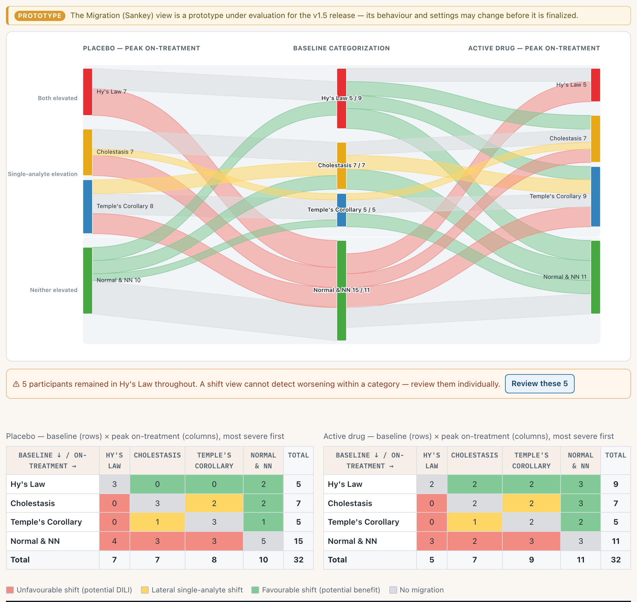
- 1 Baseline quadrants pinned in the centre; placebo flows left, active drug right, on one shared thickness scale so the arms compare directly
- 2 Ribbon colour comes from a fixed concern matrix, not the direction of travel — the geometry and the clinical reading cannot disagree
- 3 A shift view cannot see worsening within a category, so the ones that never moved are called out rather than left implied
- 4 The same counts as tables, most severe first, for anyone who would rather read numbers
And built for one gesture: hand a group of participants to the composite plot
4 s clip · press play
Hover a ribbon to read the shift it represents, click to select it, then take “Review these N in the composite plot” — the composite view opens with exactly those participants carried across and ringed. That is the paper's Sankey → composite workflow, executable rather than described.
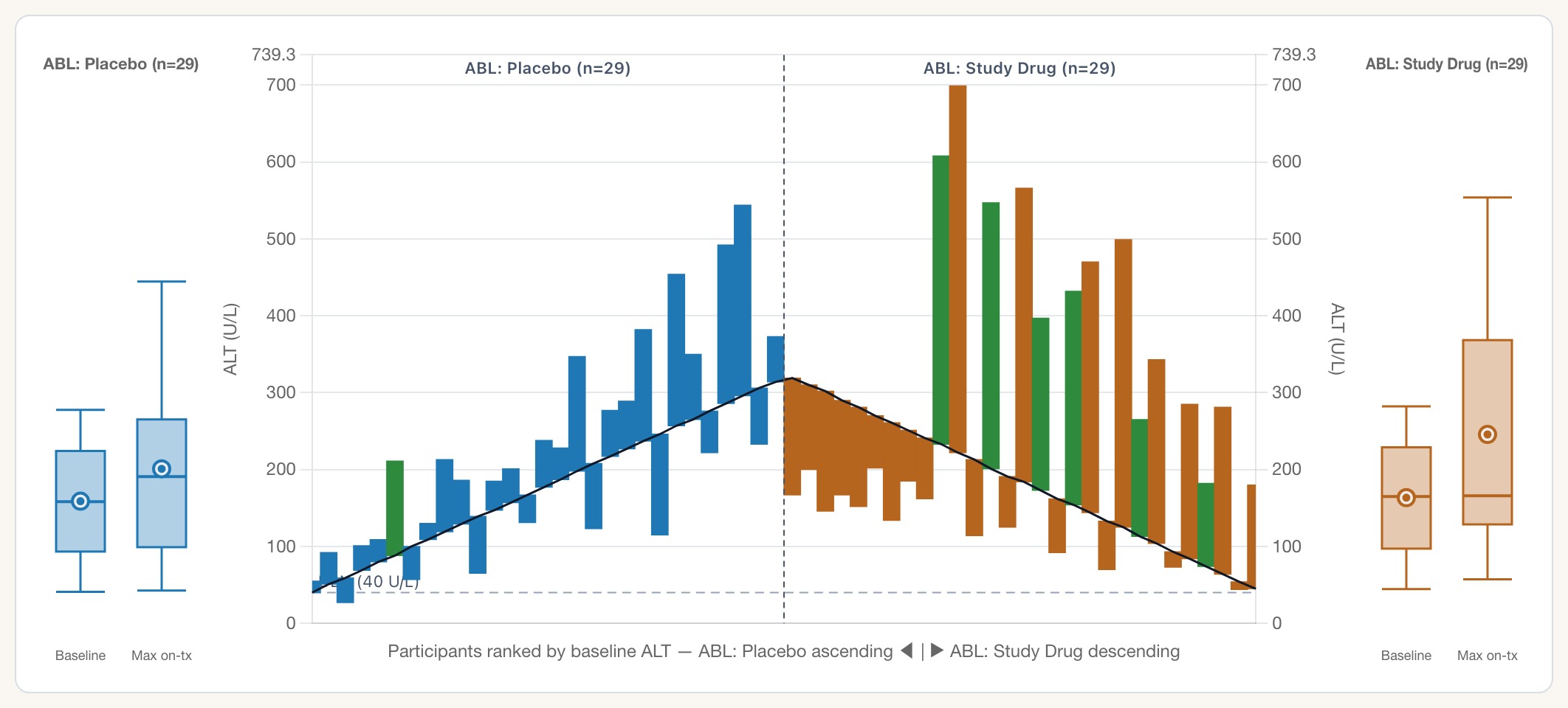
The waterfall puts the axis back in absolute U/L
 1
2
3
4
1
2
3
4
- 1 The seam: participants are ranked by their own baseline, so the two arms' highest baselines meet in the middle
- 2 One floating bar per participant, from their baseline ALT to their maximum on-treatment ALT; the black line traces the baselines
- 3 Green overrides the arm colour — that participant developed new-onset jaundice, in either arm
- 4 Flanking panels summarise each arm: left box is baseline, right box is the maximum on-treatment value
Why it matters
These are the first two displays in the portfolio aimed squarely at abnormal-baseline populations, where the standard eDISH read is misleading rather than merely noisy.
Both are marked prototype in the gallery: the clinical judgement calls in design #43 are still open, so behaviour and settings can move before they are called finished.
Try it
Open hep-explorer, then switch View to Migration- Hover a red ribbon: it names the shift and the count.
- Click it, then take the “Review these N” hand-off.
- Then open the ALT waterfall and hover across the seam.
The eDISH scatter gets its hands back
Four sets of features deferred from the v1.3 coordinated-core port land together: direct manipulation of the cut-lines, marginal distributions, the chart saying what it means, and traceable data handling.
Drag a Hy's-Law cut-line and everything reclassifies under your hand
5 s clip · press play · watch the ALT Reference Line box on the left
Take hold of the dashed line and move it: the corner percentages, the quadrant summary table and the ALT Reference Line input all move with it, and the value the drag writes is the same number you would have typed. A selected participant survives the drag.
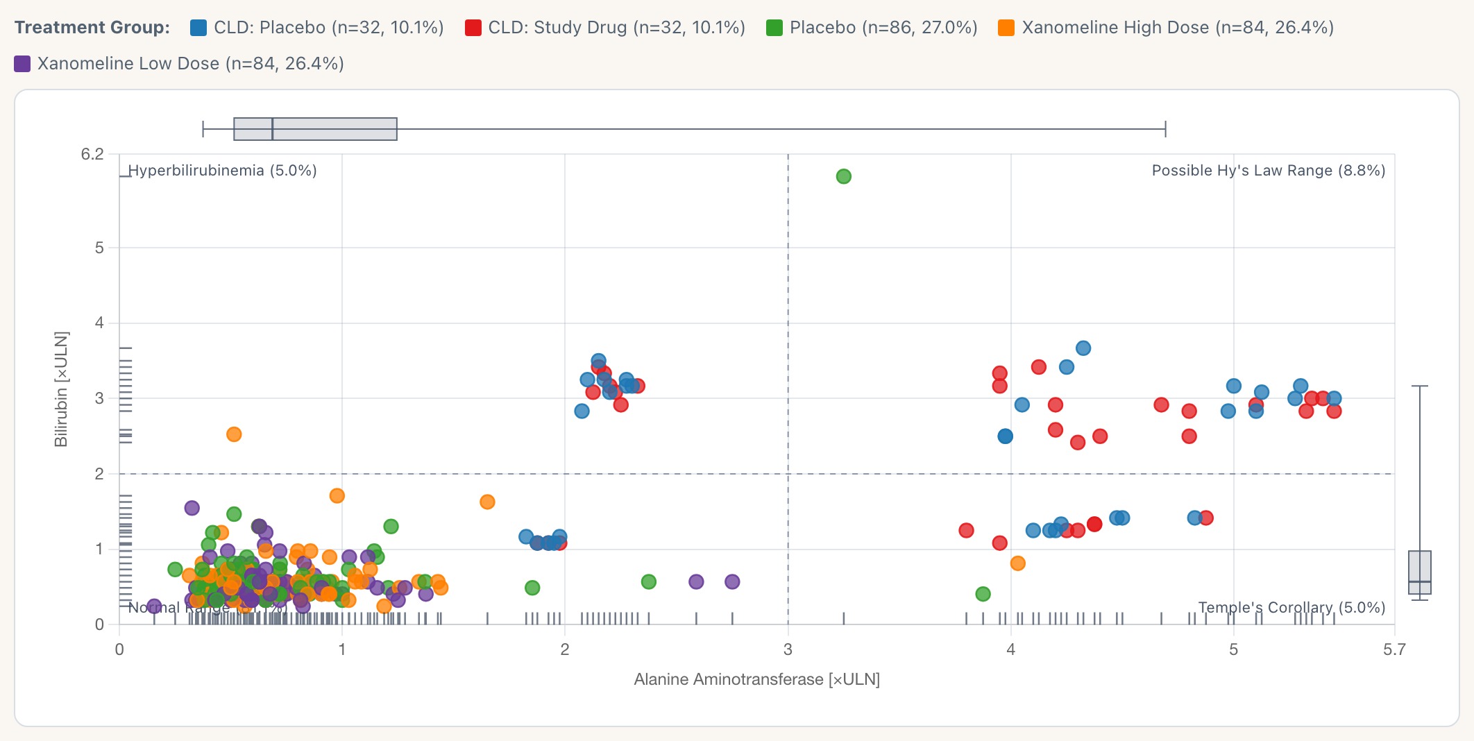
Marginal box plots and rugs, following the filtered view
 1
2
3
4
1
2
3
4
- 1 Peak-ALT distribution across the filtered cohort
- 2 Peak-bilirubin distribution, same treatment
- 3 Rugs: one tick per participant on each axis
- 4 The legend now carries each arm's n and percent
All four follow the filtered view rather than the whole cohort, so narrowing to one arm redraws them. Setting Marginal Distributions to Hidden takes them away again — it is a control, so whether they default on is still your call.
The chart now says what it means
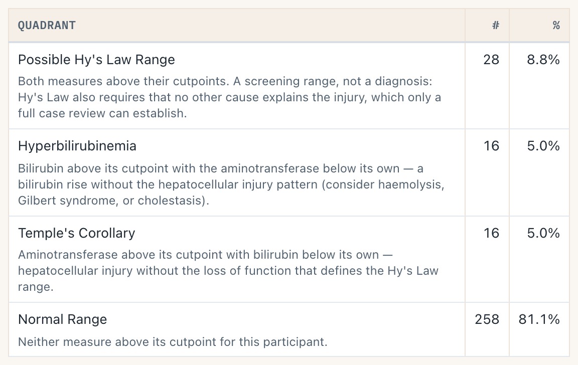
Each quadrant carries its clinical reading in the summary table — including that Possible Hy's Law is a screening range, not a diagnosis. Point-size encoding explains itself, and the standing “not validated for clinical use” caution sits under every view.
Open sub-decision: the quadrant prose is agent-drafted and flagged needs-jeremy-review in the merged matrix.
Data handling you can audit

Dropped records download as a CSV naming, per row, which mapped column failed — so “1,663 removed” stops being a number you have to trust. Below-LLOQ results are imputed by the original renderer's documented rules, and reported rather than absorbed.
The waterfall's flanking panels and bars now answer a hover
5 s clip · press play
Hovering a bar gives the whole case in one card: arm, baseline ALT, maximum on-treatment ALT and the day it happened, the change in both U/L and ×baseline, and peak bilirubin. The flanking panels label what they are — box is IQR with the median rule, whiskers 5th–95th, ○ the mean — which was your #83 ask.
Why it matters
The cut-lines are the argument the eDISH scatter makes. Being able to move them and watch the population reclassify is how a reviewer tests whether a signal is real or an artefact of where the line happened to sit.
Six of the eight #88 gaps close here. Still open and not in v1.5.0: transition animation (sv#46), listing sparklines (sv#48) and the exposure track (sv#49, needs adex).
Try it
Open hep-explorer on the eDISH view- Drag the vertical dashed line right, past the cluster near ALT 4.
- Watch the Possible Hy's Law row in the table, and the ALT Reference Line box.
- Set Marginal Distributions to Hidden and back, then filter to one treatment group.
Axis-limit boxes load showing the limits in force
The limit inputs used to sit empty until you typed into them, which made auto and override look identical. They now load carrying the data-driven values the chart actually resolved, so you can see the current limits and nudge one without having to supply both.
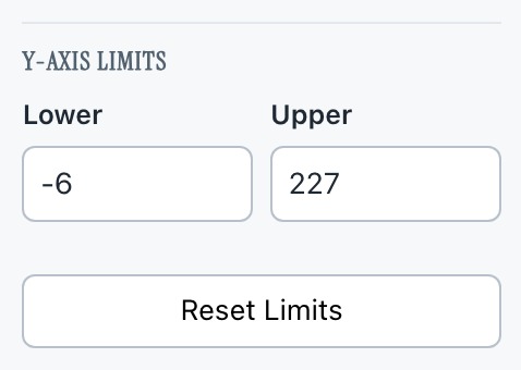
Safety Outlier Explorer. Lower and Upper arrive filled with the domain this render resolved. Clear a box to hand that side back to auto; Reset Limits drops both.
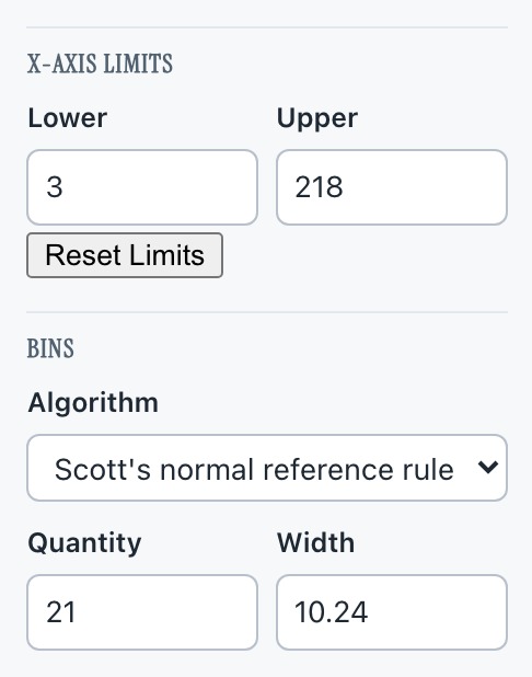
Safety Histogram, with ALT selected. The same treatment reaches the bin quantity and width. The boxes seed blank only until a render has a single measure's domain to resolve — on “All Measures” there is no one domain to show.
Why it matters
Small, but it removes a class of confusion: an empty box used to mean both “auto” and “I have not touched this”, and typing one limit against a blank other could send an inverted domain to the chart. The invert guard now reads the displayed value, so a crossing entry swaps the pair instead of breaking the axis.
Try it
Open the outlier explorer- Read the Y-axis Limits boxes before touching anything.
- Type a Lower above the Upper shown and tab out.
- Change the measure and watch both boxes re-derive.
Reading this page
How the captures were made
- Playwright drove Chromium against the live dev site — the same build this release promotes — on 2026-07-25. Nothing was staged or mocked. The profile section's captures were taken twice: first that afternoon, then again late that evening against the rail, after sv#112 merged and removed the dock. Every other capture predates sv#112 and shows behaviour it did not touch.
- Clips are silent WebM at 7–8 fps, 4–5 s, captured frame by frame during the real interaction. Stills are 2× PNG-quality JPEG.
- The demo data is the shared
adbdscohort: 318 participants for the eDISH views, 58 for the abnormal-baseline waterfall. The adverse-event demo readsadae, which covers 254 of those 318 — but none of the 24 craftedCLD-*Hy's-Law cases, so those participants' profiles report no events. That is a gap in the demo fixture, not in the module.
Also in the release, not shown here
- hep-core — the 2,149-line hep-explorer splits into an orchestrator plus per-view components. One behaviour change fell out: peaks now exclude the baseline record by identity rather than by study day, which had been counting 24 participants' own baselines as on-treatment.
- Requirement matrices moved in-repo (sv#111), so a chart's spec, tests and evidence now move in one PR.
- Closed-PR preview sites redirect to the dev tier instead of 404-ing;
dist/safety.viz-1.4.1/is restored to the bytes v1.4.1 shipped.
Where this fits
This page is the visual companion to the v1.5.0 release plan, which lists the eight items in review order and what checking R1 sets in motion. The user-facing release notes live in the promotion PR body.
The rest of the candidate
- The dev gallery — all eleven renderers
- Evidence pages — requirement-keyed test records
- Review guide #114, item R1