safety.viz release review 2026-10-02
What v1.8.0 adds, annotated
safety.viz becomes something you can use on your own study. A demo app puts every chart on one study, says which ones your data can feed, and lets you load your own files and map their columns, all in the browser. Nine requests from the people who used the original renderers land on the existing charts. And a prototype of a fourteenth chart follows one participant through a trial; a prototype is not ready for production, so it is on the docs site only. Every capture below was taken from the live dev site, which is the release-candidate build.
13 charts in 1 demo app, 1 prototype 2,100 unit + 344 browser tests reviewed in three parts: 22 findings fixed, 5 filed, the narrative layer taken out nothing leaves the browser: asserted by test promotes dev → main via sv#158
The demo app
The docs site keeps its gallery and its per-chart demos. The app is a page of its own, with its own header and footer, so the chart has the full width of the screen. The header has a tab for your data and a tab for each data domain, saying how many of that domain’s charts the loaded data supports. Beneath the tabs, on one line, are the open domain’s charts.
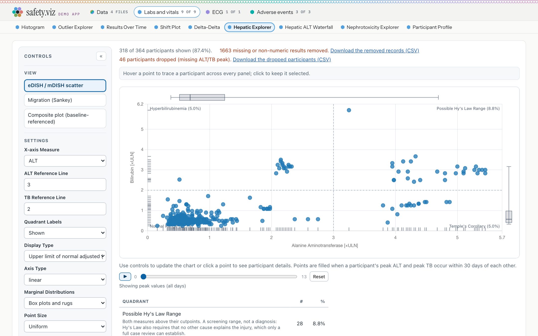
The demo study, on the hepatic explorer. Each domain has a hue, carried by a small hex beside its name: blue for labs and vitals, violet for ECG, teal for adverse events. The open chart’s chip is highlighted, and that chip is the view’s name: there is no separate heading taking up room.

With a participant selected, the chart’s own controls, the chart and the participant profile sit side by side. Keeping the app’s own parts to a header and a footer is what leaves the chart room here.
- A filled hex means the chart is ready. A red one means something it needs is missing, and the chip says how many things. A hollow one means no file is loaded for it.
- On the demo study all thirteen charts are ready. The Patient Journey Explorer is a prototype and is not in the app.
- A chart’s status now means one thing. Prototype: not ready for production, on the docs site only. Experimental: still being worked on and fine to use, in the app with a badge. No badge: stable.
- The four standard domains, their columns, and what each chart needs from them are on the new Domains page, generated from one manifest that a test holds to every chart’s own schema.
Why it matters
The original safetyGraphics app put a study’s charts in one place and told you which ones your data could feed. safety.viz had fourteen separate demo pages and no shared statement of what data a study supplies. This is that app again, running entirely in the browser.
Try it
Open the demo app- Click the ECG tab: it opens straight onto the QT explorer.
- Click Labs and vitals, then Hepatic Explorer in the row beneath.
- Click a point on the scatter: the participant profile opens beside the chart.
- Change the address to end in
#data, or use back and forward: the app follows it.
Load your own study
Drop CSV or JSON files on the Data view. Each file is read in the browser and placed in a domain by its column names, with the number of that domain’s columns it carries. A sidebar keeps the work in sight: three steps, each showing where it stands, and the list of loaded files. A test asserts that no network request leaves the page from the first file onward.
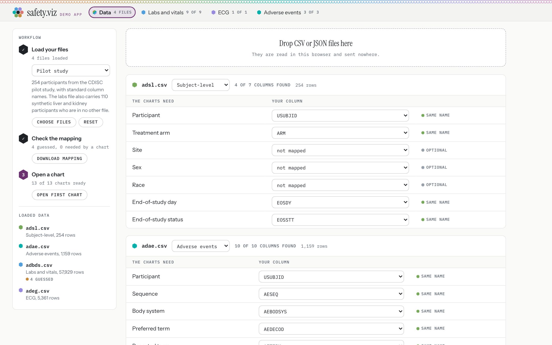
The Data view as it opens. The sidebar’s three steps carry their own buttons, and the list beneath them flags a file only when one of its rows wants a look. The demo study menu offers three studies: the pilot study, a renamed-column study, and a labs-only liver cohort. The pilot study’s description says its labs file carries 110 synthetic liver and kidney participants who are in no other file. Chart views have no sidebar.
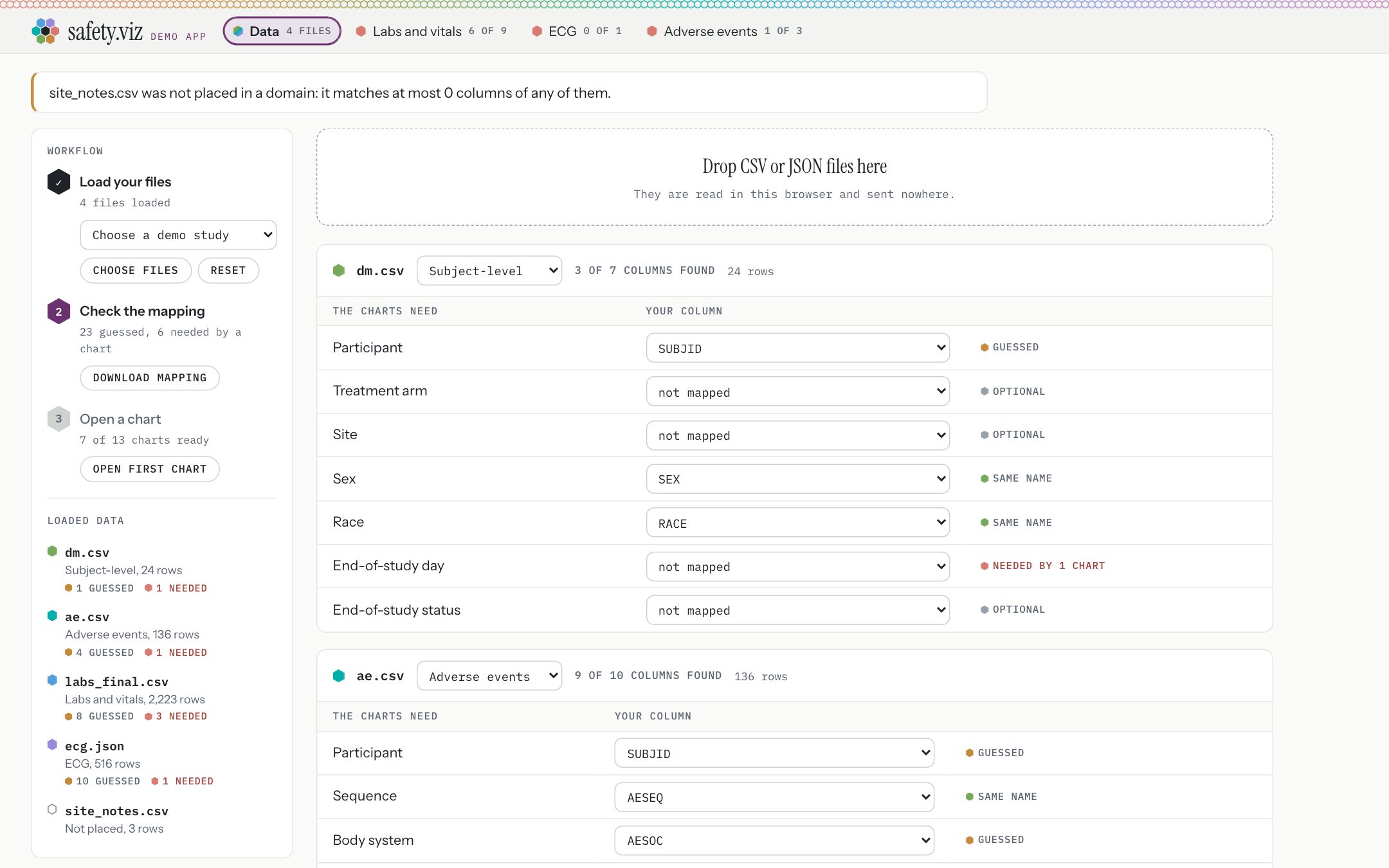
A study whose columns carry none of the default names, loaded after Reset. Four files are placed; the fifth belongs to no domain, and the page says so in one sentence and keeps it, with a picker to place it by hand. The sidebar counts what is left to do: 23 rows guessed, and six rows that a chart is waiting on.
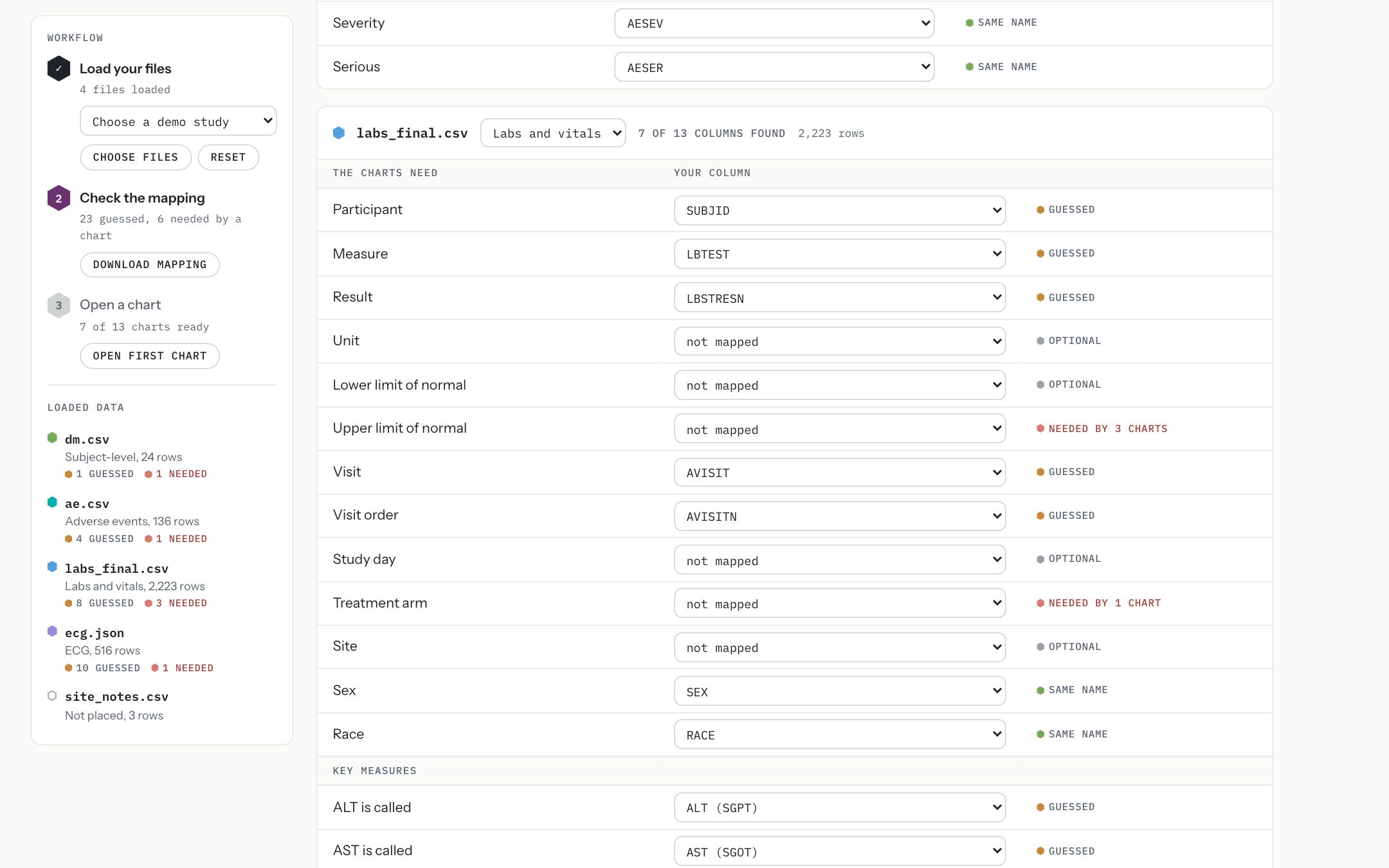
One table per file: what the charts need on the left, your column on the right. A row filled because the name matched says “same name”. A row filled from a short list of known SDTM and ADaM alternatives says “guessed”. Nothing fuzzier is attempted. An empty row says how many charts need it. The same table asks what your data calls the measures some charts find by name. The sidebar stays in view as the tables scroll, and choosing a file there jumps to its table.

Before any correction, a chart that cannot draw says what it is missing, by name.
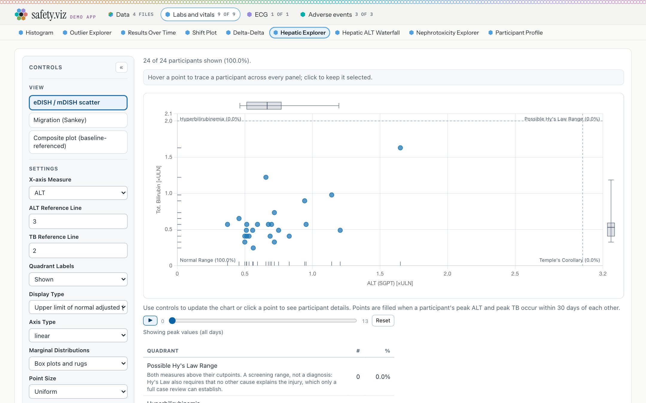
After six rows are set by hand, the same chart draws from the user’s own files. The data is never renamed or rewritten: the mapping only tells each chart which column to read.
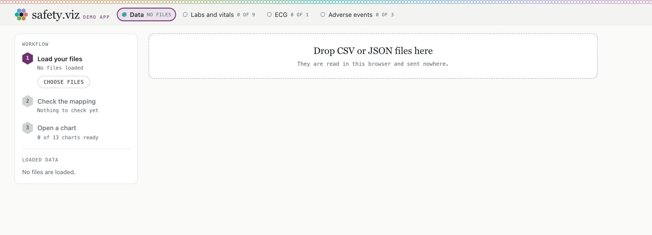
The same app as one HTML file, under 1 MB, opened from disk with the network off. It starts empty, offers no demo studies, and uses your system’s fonts, because it loads nothing.
Two rules to confirm
- Which measures each chart cannot draw without (ALT and total bilirubin for the hepatic explorer, creatinine for the kidney explorer, one QTc correction for the QT explorer) is read from the charts’ code, not from a reviewed clinical rule.
- When a labs file has no study-day column, the hepatic charts and the participant profile are given visit order instead, as the site’s own demo pages do.
Why it matters
A study programmer has a folder of extracts and wants to see them in the charts without installing anything or sending data anywhere. The old app did this in R. Here the files are read with the browser’s own file API, and the single file needs no server at all.
A guess is always labelled as a guess, and a gap is priced in the charts it turns off, by name. The mapping downloads as a small JSON file, and choosing that file again with your data restores it.
Try it
Open the Data view- In the sidebar’s demo study menu choose Renamed columns. The sidebar reads 23 guessed, 6 needed by a chart, and 7 of 13 charts ready.
- Click labs_final.csv in the sidebar. In its table set Upper limit of normal to ULN, Treatment arm to TREATMENT, and Total bilirubin to Tot. Bilirubin.
- Set Treatment arm to TREATMENT under ae.csv and ecg.json, and End-of-study day to LASTDAY under dm.csv. The sidebar now reads 0 needed by a chart and 13 of 13 charts ready, and “Check the mapping” is done: guesses stay counted and flagged, but only a row a chart is waiting on holds the step.
- Click Open first chart, then Hepatic Explorer in the row of charts.
- Back on Data, click Reset, then choose Liver cohort, labs only: one file, and the charts of the other domains say they have no file.
- To load the same study as files of your own, save labs_final.csv, dm.csv, ae.csv and ecg.json, click Reset, and drop them on the drop zone.
- In the footer, choose Download as one file, open it from your disk, and drop the four files there.
Patient Journey Explorer
PrototypeA prototype of a fourteenth chart, and the first that looks at one participant and not across them: exposure, dose changes, adverse events, labs, concomitant medications, medical history and disposition as stacked lanes on one study-day axis. Clicking any mark anchors time on it and lists what was recorded around it.
Not counted a finished chart
- The review of this release found five cases where the chart misdraws or drops part of a record, among them false dose changes when two drugs are given over the same days, and a record far to the left of the axis that is counted as drawn but cannot be seen (safety.viz#167).
- The AI narrative layer that sat on top of this chart is not in the release. The reviews found it could cite another participant’s rows and pass its own checks, so it was taken out; its code is kept on a branch and its findings are filed (safety.viz#168, safety.viz#176).
- So it ships as a prototype: on the docs site, outside the demo app and the standard domain set, and its two requirements stay open.
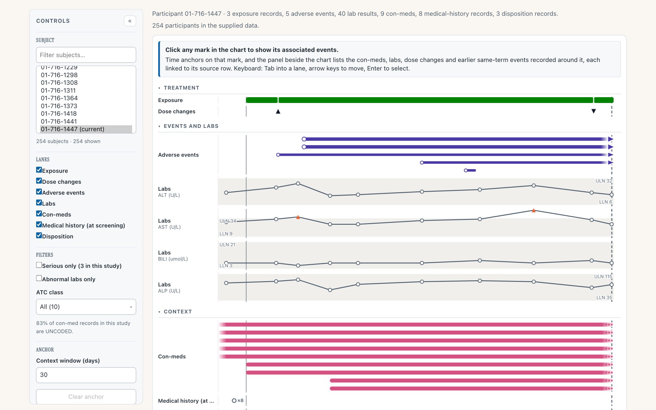
One participant’s course on one study-day axis. Click any event and the panel beside the chart lists what was recorded around it, each item linked to its source row.
Why it matters
Reviewing a single participant usually means opening five listings and lining the days up by eye. This puts them on one axis, and makes the question “what else was happening then” one click.
Try it
Open the Patient Journey Explorer- Pick a participant from the list on the left.
- Click an adverse-event bar: the panel beside the chart lists the labs, medications and dose changes around it.
- Click an item in the panel: it opens the source row it came from.
- Read the evidence page: each requirement row traces to a named test.
Nine requests from the original renderers’ users
When the RhoInc and SafetyGraphics renderers were retired they left 282 open issues behind. A survey of all twelve trackers found 144 still worth carrying over and picked nine that the shared modules made cheap. All nine are in this release.
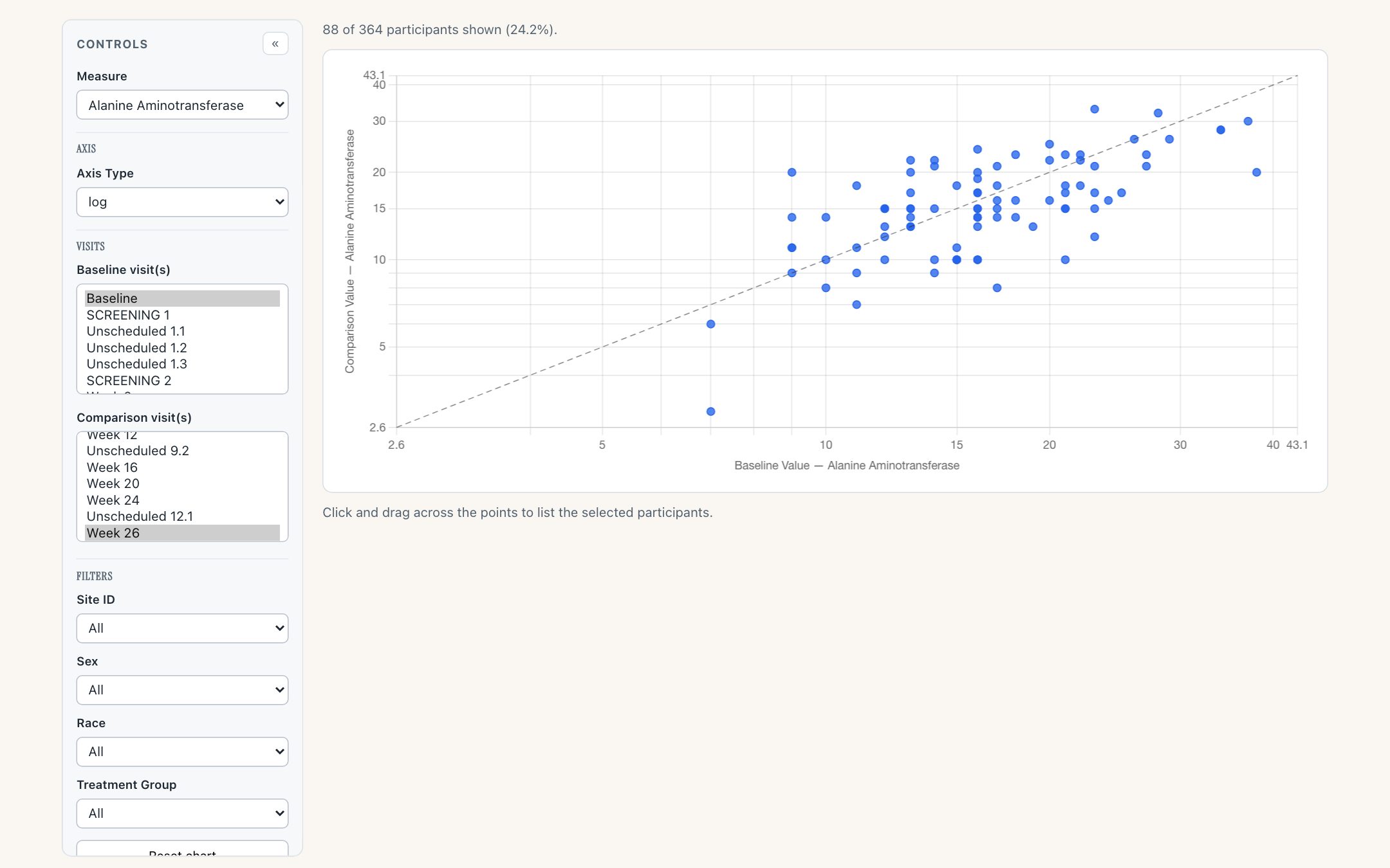
The Shift Plot on a log scale, asked for in 2016. Both axes share one domain, so the identity line still means no change.
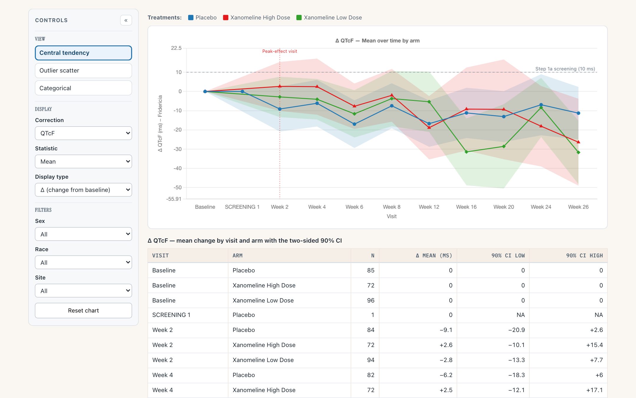
The QT explorer now prints the confidence intervals it was only drawing, and carries its caution in every view.
- A filter means the same thing in every chart: it can open on a value, drop its All option, or take several values at once, and the dropdown always shows what the chart is filtered by. One test runs the same cases against all twelve charts.
- A measures setting chooses which measures the Measure control offers, and in what order.
- A Reset chart control on nine charts returns filters, measures, visits, scales and selections to how the chart opened.
- The Adverse Event Explorer says what kind of empty an empty table is.
- The Shift Plot learns a log scale.
- The QT explorer prints its confidence intervals as a table, and carries its safety language permanently. Replicate readings are averaged per participant and visit first, so the sample size counts participants.
- The Hepatic Safety Explorer can include or exclude unscheduled visits, and re-derives baseline and peak when it does.
- Fixed: the Adverse Event Explorer drew no counts for a single-arm study with the per-group columns switched off.
Why it matters
These were filed by the clinicians, programmers and reviewers who ran the original charts on studies, some as long ago as 2016. The release notes name the issue each one answers and, where the tracker recorded it, the person who filed it.
Try it
Open the Shift Plot- Set Measure to Alkaline Phosphatase and Axis Type to log.
- Scroll to the foot of the controls and choose Reset chart.
- Open the QT explorer and read the table under the chart.
What is not in this release
- One set of arm, site and population filters across every chart, and a saved study configuration.
- The participant profile opening from every chart on the mapped identifier.
- Detecting the standard, not only the domain, of a file.
- A demo study inlined in the single file, and a size budget for it.
- The Patient Journey Explorer as a finished chart: it is a prototype, with its review findings filed.
- AI narratives on the Patient Journey Explorer: taken out before release, kept on a branch.
- Several files in one domain, such as labs and vitals delivered apart: a second file takes the domain and the first is kept, set aside (hub#365).
Where to look further
- The release notes, as they will publish.
- The demo app’s design, and its requirement matrix.
- The manifest the app and the Domains page read.