bio.viz gsm.bio v0.3.0 released 2026-10-07
What v0.3.0 of bio.viz and gsm.bio changes, annotated
The group comparison chart is redrawn as three levels: every biomarker over time, one biomarker across its visits with R’s test under each visit, and one visit alone. gsm.bio draws the same three levels from R and stores every test, so a saved page shows them with no R running. Below, each change is shown on the live site with the numbers you should see, and with the detail the short release notes leave to this page.
3 levels in one chart made-up study: 200 participants, 12 biomarkers, 5 visits every test computed by R, held to desktop R bio.viz v0.3.0 and gsm.bio v0.3.0: released 2026-10-07
Where the two stand
- Both are released, together, on 2026-10-07: bio.viz v0.3.0 and gsm.bio v0.3.0.
- Each was read by three independent reviewers before the owner approved it. What they found, and what was done about each finding, is in the comment headed “Review of” on each release pull request (bio.viz #111, gsm.bio #61).
- The review found two bugs in the group comparison, and both were fixed before release (bio.viz #112, #113): clicking a visit also selected visits the biomarker has no data at, and the trail’s buttons dropped the keyboard’s place. No number on this page changed.
- The links on this page go to bio.viz’s released site, such as
jwildfire.github.io/bio.viz/group-comparison/. Its header reads v0.3.0, and its footer names the commit the release was tagged at, 4a85d61. - The release notes are short, and the detail behind them is here: under “The detail” in each section, and in sections 07, 08 and 09.
- The stills were taken on 2026-10-06, before the review’s fixes. Taken again on the released site, they differ only in the date a chart’s footnote prints, so they stand. The picture of gsm.bio’s reference page was taken again on 2026-10-07.
What to look at
- The group comparison opens on a tile for every biomarker. IL-6 is the tile whose two lines part, and R has been asked for nothing yet.
- Click the IL-6 tile. Under each visit is R’s test of the arms: p = 0.221 at Baseline, then p < 0.001 at every later visit.
- Open D-dimer and switch Adjust across visits to Holm. The smallest p-value goes from 0.014 to 0.071, and the row says which adjustment R made.
- Click Week 4 under the IL-6 picture. That visit opens alone, as v0.2.0 drew it: a difference in means of 1.544 (1.091 to 1.998).
- From R, the same three levels in one saved file, opened with the network off, with every test stored in the page.
Every biomarker: a trend tile each
Which biomarkers move differently between the groups? With no biomarker chosen, the chart draws one small tile per biomarker: a line for each group through the group’s median at every scheduled visit. The tiles print no statistic and ask R for nothing.
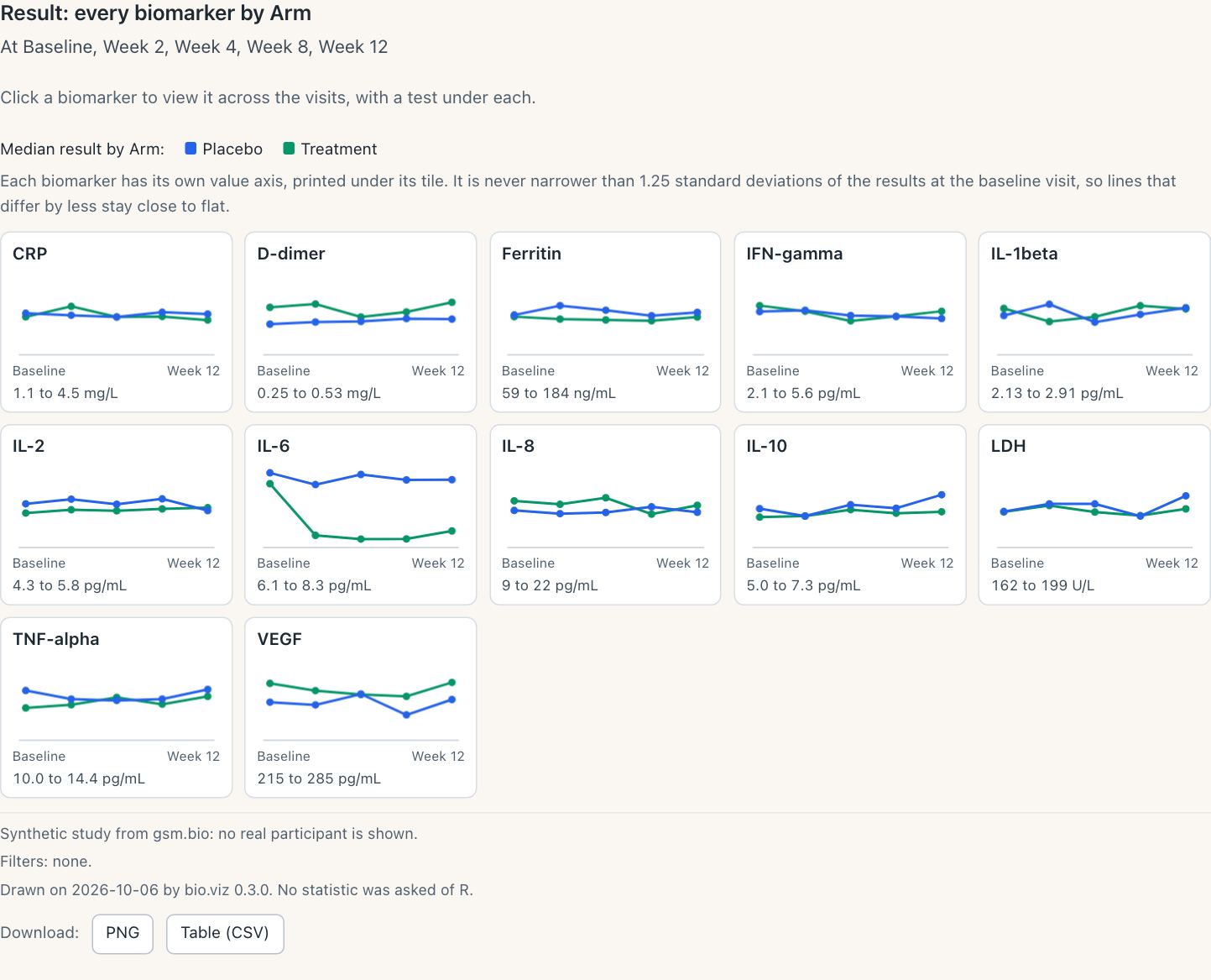
The view the chart opens on, by arm. One key above the tiles serves all of them, and each tile’s own value axis is printed under it.
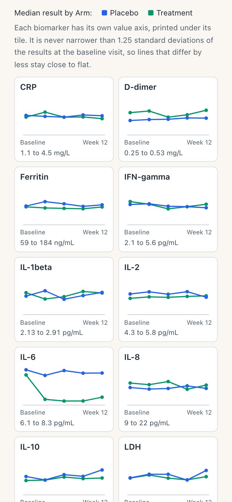
On a phone, two tiles to a row.
What you should see
- A tile for each of the 12 biomarkers, with a line for Placebo and a line for Treatment across the five visits.
- IL-6 is the tile whose lines part: the made-up study plants a treatment effect there. The other lines stay close to flat, because a tile’s axis is never narrower than a set spread of the baseline results.
- The chart’s own footnote ends “No statistic was asked of R.” Nothing of R is downloaded until a tile is opened.
- Colour by, Panel by and Draw as are switched off, and each says when it applies.
Try it
Open the group comparison- Switch Tiles draw from Medians to Means.
- Set Group by to Sex, then to Arm and sex for four lines a tile.
- Set Value to Change from baseline.
- Click the IL-6 tile, or press Enter on it.
The detail
- Every biomarker has a tile, all at once. v0.2.0’s overview drew twelve biomarkers to a page; the tiles have no pages.
- A tile’s line goes through each group’s median at each scheduled visit. The Tiles draw control switches it to the mean, and so does the setting
tile_summary. - A tile’s value axis is the biomarker’s own, printed under the tile. It is never narrower than 1.25 standard deviations of the results at the baseline visit. So lines that differ by less than that stay close to flat, and a tile whose lines part is one to open.
- The multiple is the setting
tile_min_spread. Zero means no least. - A tile is a button. A click, or Enter with the keyboard on it, opens its biomarker across the visits.
- Colour by and Panel by read “Applies once a biomarker and a visit are open.” Draw as reads “Applies when one biomarker is open.” Each keeps what it is set to.
In full, in the API reference: the trend tiles, a tile’s value axis and how many tiles. Built under obot.roadmap #367, bio.viz #84, #87.
One biomarker over time, with R’s test under each visit
A tile opens its biomarker across the visits in one picture: the groups side by side at each visit. A table under the axis, lined up with the visits, gives the number in each group and R’s test of the groups at each visit. R is asked once for the whole row.
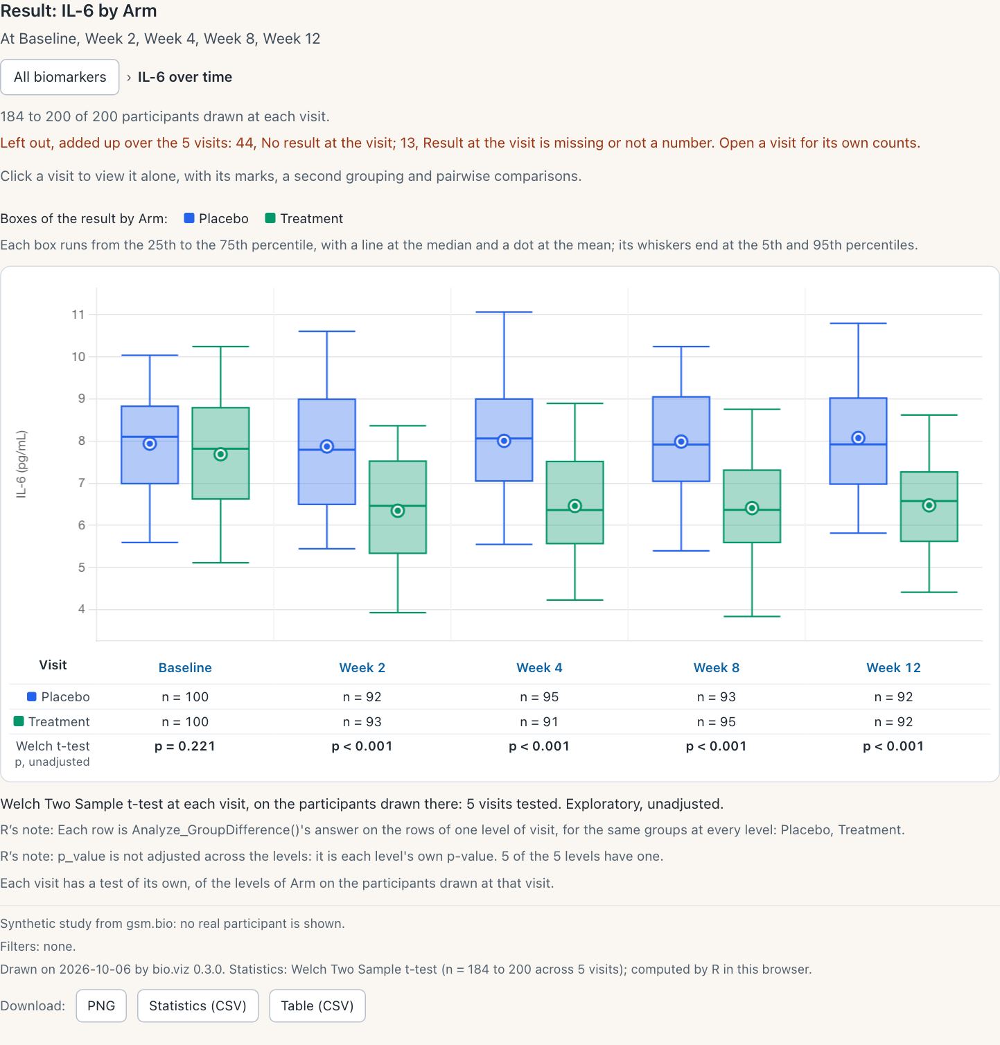
IL-6 by arm. The trail above the chart names the level and leads back to the tiles. R’s notes under the picture say what each p-value is.
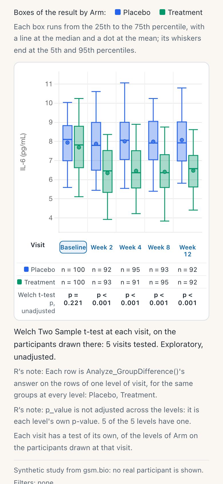
On a phone the picture and its table hold five visits.
What you should see
- Number in each arm, Baseline to Week 12. Placebo: 100, 92, 95, 93, 92. Treatment: 100, 93, 91, 95, 92.
- Welch t-test at each visit: p = 0.221 at Baseline, then p < 0.001 at Week 2, Week 4, Week 8 and Week 12.
- The row is labelled “p, unadjusted”, and R’s note says each visit’s p-value is its own.
- The first time, the row reads “Waiting for R…” and the line under it says what starting R costs: about 13 MB to download, once.
Try it
Open the group comparison- Click the IL-6 tile and wait for R the first time.
- Set Draw as to Means with standard errors.
- Set Test to Wilcoxon rank-sum test.
- Set Value to Change from baseline: Baseline is drawn and not tested.
Adjust across visits
Five visits are five tests. The Adjust across visits control has R adjust the p-values across the visits, by Holm or by Benjamini and Hochberg, and the row names the adjustment R made. D-dimer shows why it matters.
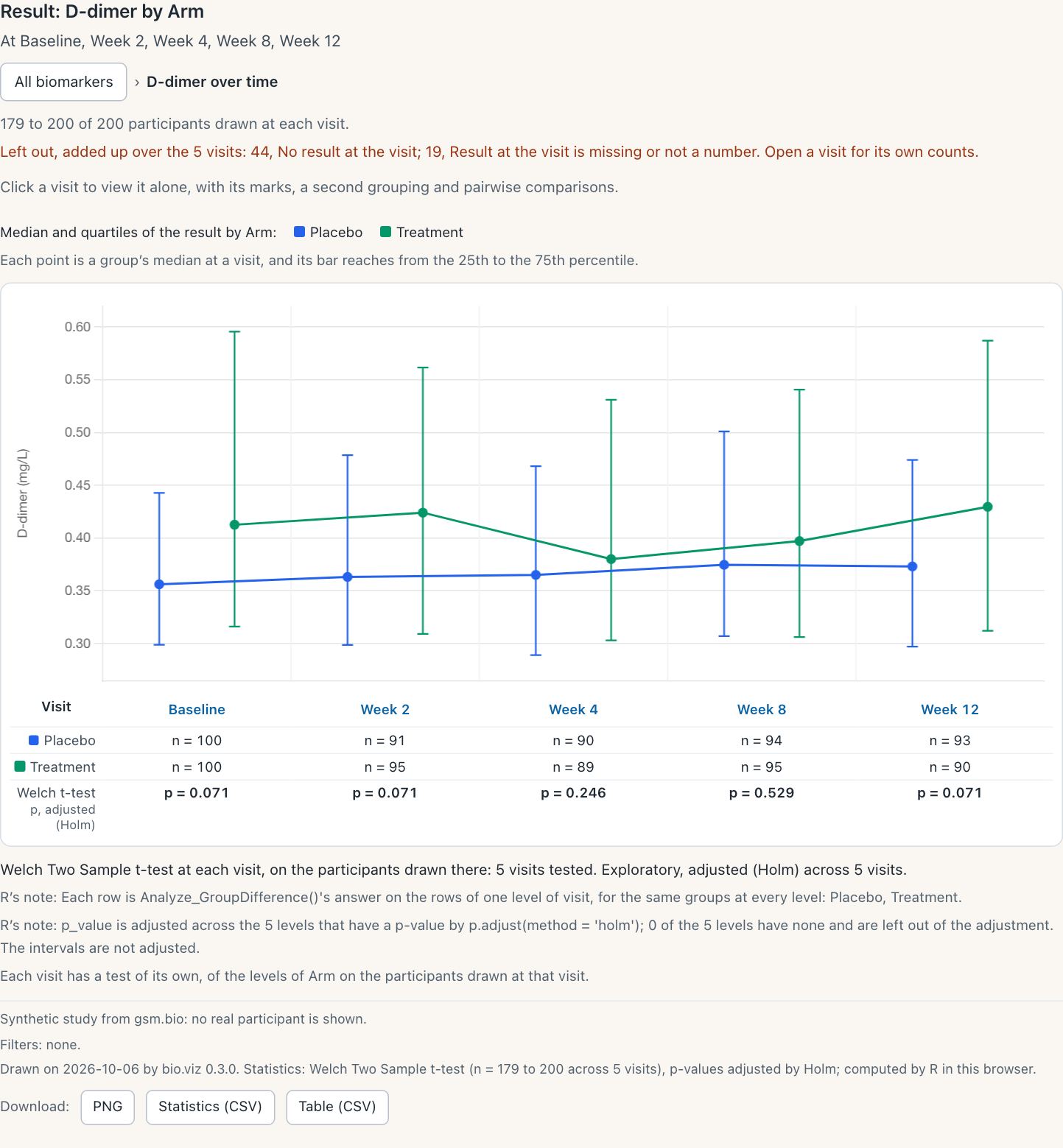
D-dimer as medians with quartiles, adjusted by Holm. Resting the pointer on a p-value shows the unadjusted one beside it.
What you should see
D-dimer by arm, the p-value at Baseline, Week 2, Week 4, Week 8 and Week 12:
- Unadjusted: 0.014, 0.017, 0.123, 0.529, 0.017.
- Holm: 0.071, 0.071, 0.246, 0.529, 0.071.
- Benjamini and Hochberg: 0.028, 0.028, 0.154, 0.529, 0.028.
- The row reads “p, adjusted (Holm)” or “p, adjusted (Benjamini-Hochberg)”, and R’s note names its own
p.adjust()call.
Try it
Open the group comparison- Click the D-dimer tile.
- Set Draw as to Medians with quartiles.
- Under Statistics, set Adjust across visits to Holm.
- Set it to Benjamini-Hochberg, then back to None.
The detail
- The picture is drawn when a biomarker is chosen and every visit it has is ticked. Fewer visits are a panel each, as v0.2.0 drew them.
- Draw as offers three forms here: boxes, means with standard errors, and medians with quartiles. The last two are joined across the visits by a line per group.
- A group’s mean, its standard deviation and its standard error at a visit are the chart’s own descriptions of the values drawn. Each is of one group, and each is held to desktop R’s
mean(),sd()andsd() / sqrt(n). Everything that compares the groups is R’s. The owner decided this on 2026-10-06 (bio.viz #112). - The row is the test the Test control names, asked of R in one request through gsm.bio’s
Analyze_GroupDifferenceBy(). v0.2.0 asked once per visit. - A visit R could not test, because a group there is too small, reads “not computed”. R’s reason is printed under the table.
- For a change from baseline, the baseline visit is drawn, reads “not tested” and is not sent to R.
- On a phone, five visits fit. More scroll sideways inside the chart, the picture and the table together, and the page stays still.
In full, in the API reference: one biomarker over time, the test under each visit and on a phone. Built under obot.roadmap #367, bio.viz #85, #93.
One visit, opened from the picture
A visit’s name under the picture is a button, and a click anywhere in that visit’s part of the picture does the same. It opens that visit alone: the view v0.2.0 drew, with its marks, a second grouping, panels and pairwise comparisons.
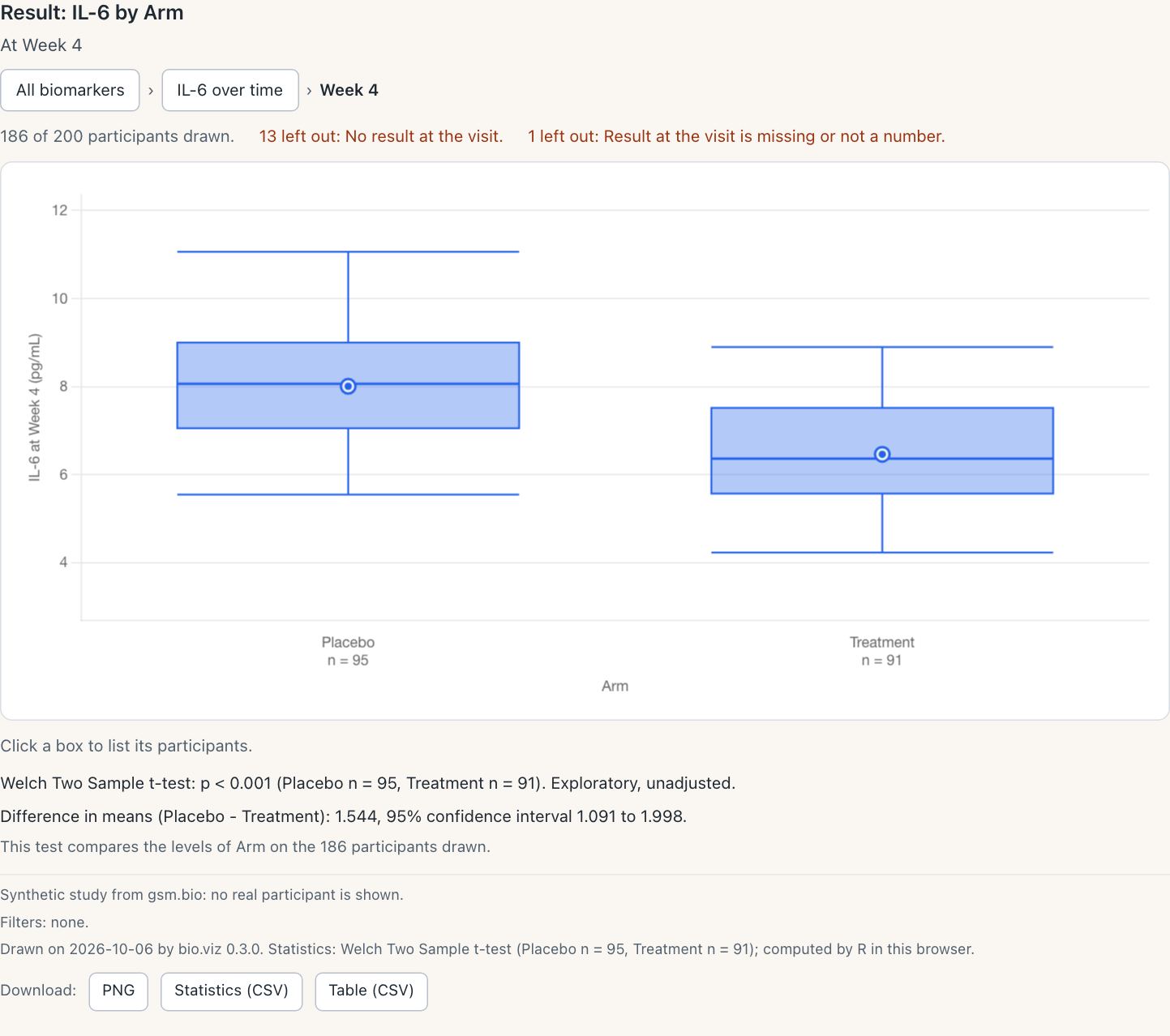
IL-6 at Week 4. The trail now has three steps, and each of the first two leads back up.
What you should see
- The trail reads All biomarkers, IL-6 over time, Week 4.
- 186 of 200 participants drawn: 95 on Placebo and 91 on Treatment. 13 have no result at the visit, and 1 has a result that is missing.
- Welch t-test p < 0.001, the same test the row under Week 4 printed.
- Difference in means, Placebo minus Treatment: 1.544 (1.091 to 1.998).
- Colour by, Panel by, and Draw as with boxes, violins and points, are switched on here.
Try it
Open the group comparison- Click the IL-6 tile, then Week 4 under the picture.
- Set Draw as to Violin, and Colour by to Sex.
- Click a box to list its participants.
- In the trail, click IL-6 over time, then All biomarkers.
The detail
- The groups are boxes, violins or points, with the number in each group beneath. A second grouping is by colour, and panels are by one further variable.
- R’s test of the groups is printed under each panel, with the choice of test and the pairwise comparisons.
- A click on a box or a point lists its participants, and the list opens a participant’s profile.
- The trail leads back up across every visit: to the biomarker over time, and to the tiles.
- The controls lead back too. All in the Visit control returns to the biomarker over time. All Biomarkers in the Biomarker control returns to the tiles and keeps the visits chosen.
- The visits chosen are the ones ticked or opened, and no others. In a title,
{visits}names the visits drawn.
In full, in the API reference: what is drawn, the controls and titles and footnotes. Built under obot.roadmap #367, bio.viz #85, #93.
Unscheduled visits are left out unless switched on
A visit named as unscheduled, or as an early termination, is no longer drawn at any level of the group comparison. A note above the chart says how many are left out and which, and an Unscheduled visits control switches them on. The three settings are the ones safety.viz’s results over time chart has.
How this still was made
The made-up study has no unscheduled visit: its five visits are all scheduled. So this still is of a second chart, typed into the page’s console, that names Week 2 as unscheduled with the setting unscheduled_visit_values. The study and every other setting are the demo’s.
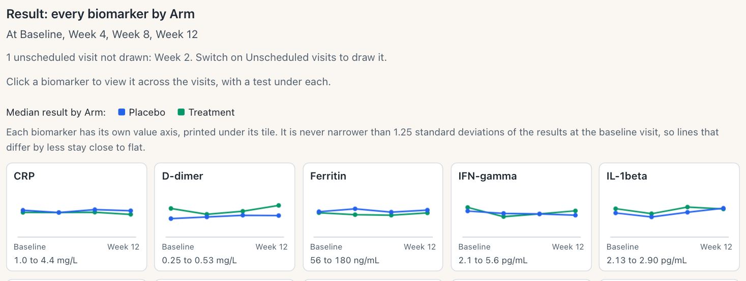
The note names the visit left out, and the title lists the four that are drawn.
What you should see
- The note: “1 unscheduled visit not drawn: Week 2. Switch on Unscheduled visits to draw it.”
- The Visit control offers four visits, not five.
- IL-6 opened over time has four visits and four tests: p = 0.221 at Baseline, then p < 0.001 at Week 4, Week 8 and Week 12.
- With Unscheduled visits switched on, Week 2 is drawn again and five visits are tested.
Try it
Open the group comparison- Open the browser’s console and paste the lines below.
- A second chart appears above the demo’s, with the note.
- Click its IL-6 tile.
- Under Display, tick Unscheduled visits.
const demo = BioVizDemo.groupComparison;
const study = await BioVizDemo.loadStudy('../data/synthetic-study/');
const el = document.createElement('div');
el.id = 'unscheduled';
document.querySelector('#chart').before(el);
const chart = BioViz.groupComparison('#unscheduled', {
  ...demo.settings,
  unscheduled_visit_values: ['Week 2'],
  connection: BioViz.r.createConnection({ browser: demo.browser })
});
await chart.init(demo.tables(study));
The detail
- A visit is unscheduled when
unscheduled_visit_valuesnames it. With no list, it is one whose name holds “unscheduled” or “early termination”, or matches the patternunscheduled_visit_patterngives. A list of names decides alone. - Left out means at every level: not on a tile, not a visit of the picture over time, not a panel, and not offered by the Visit control.
- It is also not the baseline a change is measured from, when no baseline visit is named.
- From R,
unscheduled_visits = TRUEin the widget’s settings draws them. - R and the page leave out the same visits, because the widget hands the page the visits R found.
- A pattern R cannot read the way a browser does is refused, with a sentence that says to name the visits instead.
- gsm.bio’s static figure and table, Visualize_GroupComparison() and Table_GroupComparison(), leave them out by the same rule.
In full: the API reference on unscheduled visits, and the widget’s reference on the same from R. Built under obot.roadmap #367, bio.viz #84, #87, gsm.bio #53, #57.
Fisher’s exact test of a small table, and the site’s layout
Fisher’s exact test of a table with a small category
In v0.2.0 the cross-tabulation printed R’s reason and no number for any table with a row or a column of fewer than 5 participants, whichever test was chosen. Fisher’s exact test is exact at any count, so R now computes it for such a table. The chi-square test of the same table is still withheld.
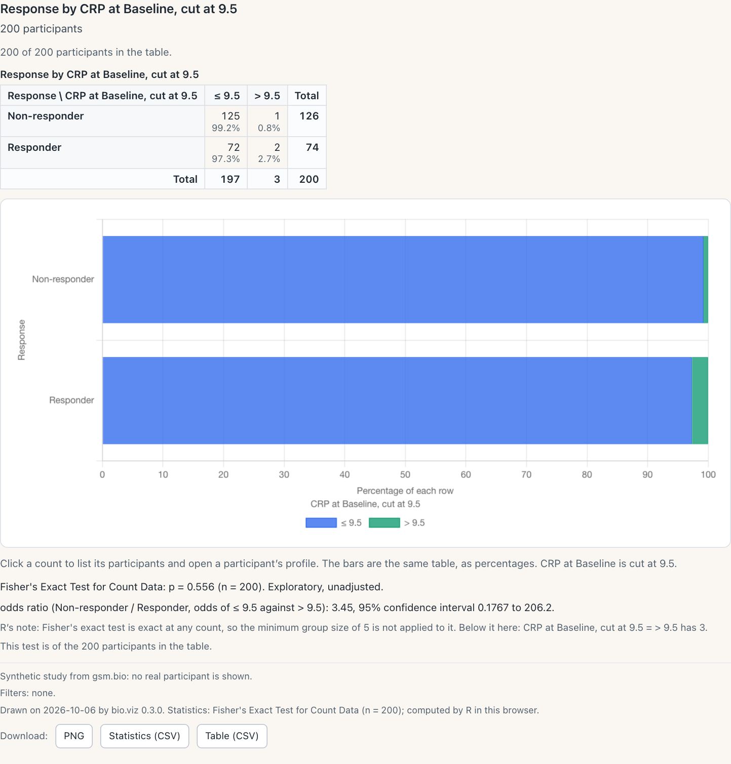
Three participants are above the cut. R’s note says the minimum group size was not applied and which category is below it, named by the table’s own variable.
How this still was made
The demo’s controls cut CRP at its median only, which leaves no small category. So this still is of a second chart, typed into the page’s console, that cuts CRP at 9.5. The study is the demo’s.
What you should see
- Response by CRP at Baseline, cut at 9.5. Non-responders: 125 and 1. Responders: 72 and 2.
- Fisher’s exact test: p = 0.556, with the odds ratio 3.45 (0.1767 to 206.2).
- R’s note: the minimum group size of 5 is not applied, and “> 9.5 has 3”.
- Switched to chi-square, the line reads “Not computed” with the same reason, and no number.
Try it
Open the cross-tabulation- Open the browser’s console and paste the lines below.
- A second chart appears above the demo’s. Wait for R.
- In it, switch Test to Chi-square test.
const demo = BioVizDemo.crossTab;
const study = await BioVizDemo.loadStudy('../data/synthetic-study/');
const el = document.createElement('div');
el.id = 'small';
document.querySelector('#chart').before(el);
const chart = BioViz.crossTab('#small', {
  ...demo.settings,
  row_by: 'RESPONSE',
  col_by: { measure: 'CRP', visit: 'Baseline', cut: [9.5] },
  test: 'fisher',
  connection: BioViz.r.createConnection({ browser: demo.browser })
});
await chart.init(demo.tables(study));
The detail
- For a two-by-two table the line prints the odds ratio with its interval beside the p-value.
- The minimum group size, 5, now applies to the chi-square test only. In R it is
nMinGroupof Analyze_Contingency(). - Fisher’s exact test still needs two or more rows and two or more columns with someone in each.
- From R, the cross-tabulation widget stores Fisher’s answer for a small table, and
Table_CrossTab()andVisualize_CrossTab()print it. - bio.viz carries the change in its copy of gsm.bio’s statistics file, so a chart with R in the browser answers as the widget does.
- One rule comes with it, for every p-value any chart prints. R’s
fisher.test()can return a p-value a rounding above 1 for a small table: 1.0000000000000002. A p-value within 0.000000001 above 1 is now read as 1 and printed “p > 0.999”, where it was refused as no p-value. Anything further above 1, and anything below 0, is refused as before. - The owner decided on 2026-10-04 that Fisher’s exact test should answer for a small table.
- Larger tables are another matter: see what was found and not fixed, at the foot of this page.
In full: the R connection’s reference on how a p-value is printed, and Analyze_Contingency(). Built under gsm.bio #46, #55, bio.viz #104, #106.
The site is laid out as safety.viz’s is
Every page of bio.viz’s site now reads as a page of safety.viz’s: the header, the type, the colours, the gallery cards, a chart’s three tabs and the footer. The styles are safety.viz’s own stylesheet, copied with a record of the commit it came from. Nothing about a chart changes.
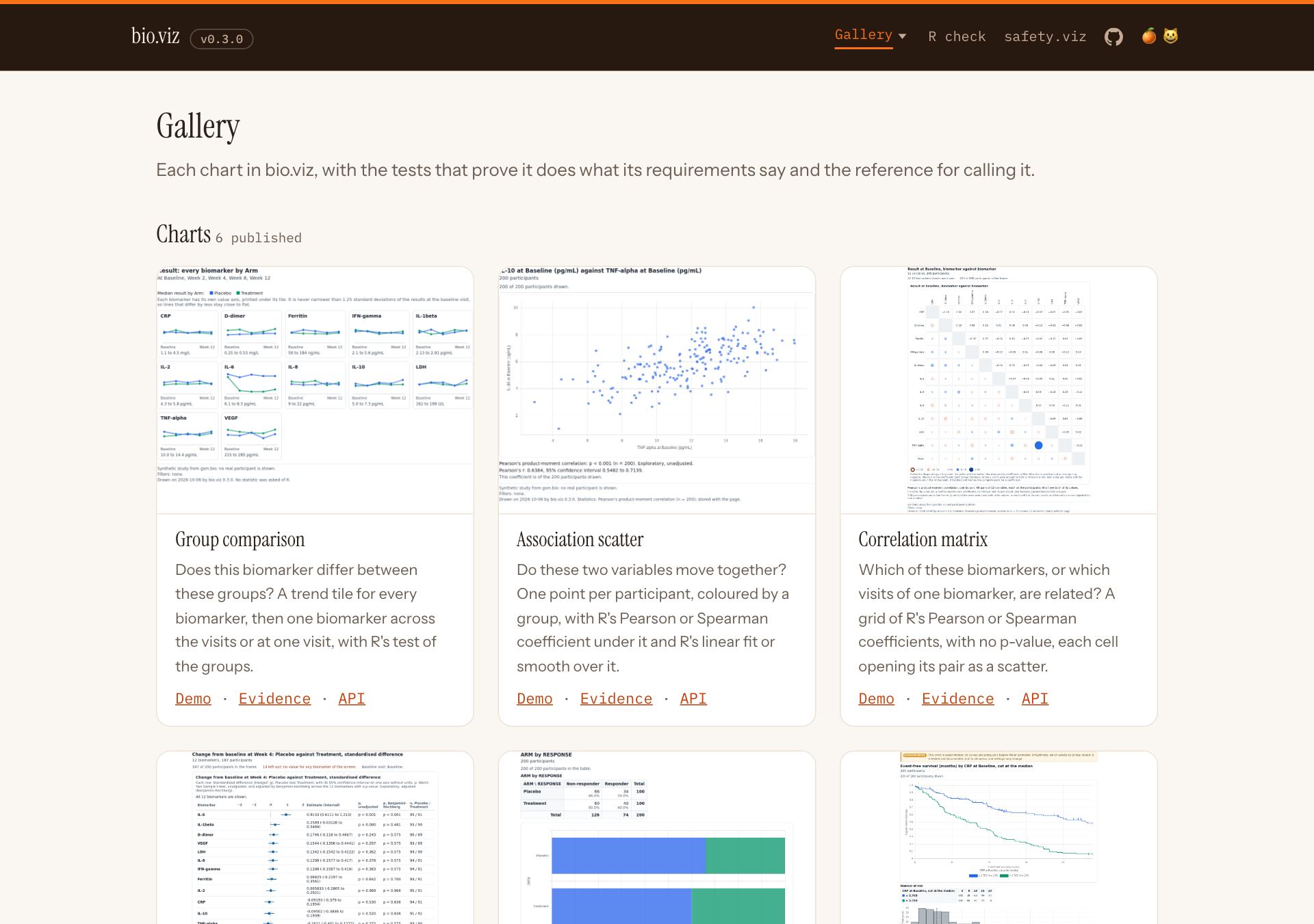
The gallery. Each card says what its chart is in two sentences, and the group comparison’s card shows the view it opens on.
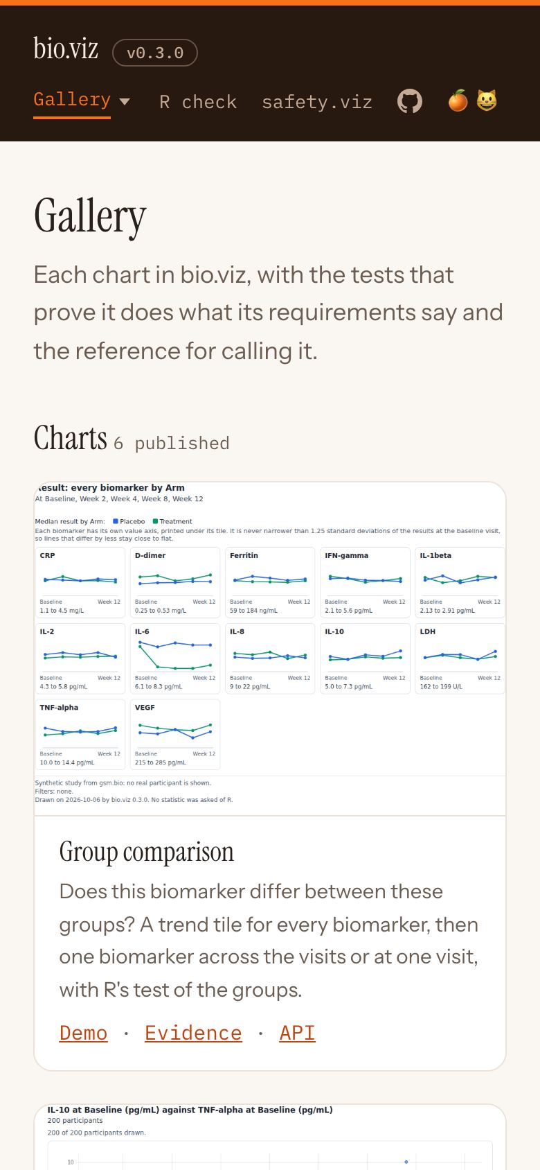
On a phone.
What you should see
- safety.viz’s header on every page, with a Gallery menu that lists every chart.
- 6 chart cards, each with Demo, Evidence and API links.
- On a chart’s page, three tabs: Live demo, Test evidence and API reference.
- On a phone, every page stays inside the screen.
Try it
Open the bio.viz gallery- Open the Gallery menu in the header and pick a chart.
- Move between its three tabs.
- Open the same page on a phone.

bio.viz’s group comparison page beside safety.viz’s results over time page, each from its dev site on 2026-10-06. bio.viz’s released pages are from the same build.
The detail
- The pages: the landing page, the gallery, each chart’s live demo, evidence page and API reference, and the R check page.
- What is safety.viz’s: the header with its Gallery list, the type, the colours, the gallery cards, a chart’s three tabs, the panel of facts, the evidence table with its screenshots, the reference’s list of sections beside it, and the footer.
- The stylesheet is loaded as it is, not retyped, so the two sites cannot drift apart.
- A few rules are bio.viz’s own. They keep every page inside a phone’s screen, where a table becomes a list and code wraps, and they show a chart’s picture whole, footnotes and all.
- A gallery card gives the question the chart answers and what it draws. Its text is the
cardentry for the chart in the site’s registry,site/config.json, and the site’s build holds it to two sentences and 200 characters. - The fuller description is where it was, at the head of each chart’s live demo. Nothing a page calls changes.
- The cards are shorter for it. In a window 1280 by 800, with the first row of cards at the top, the pictures of the second row are whole in view. Two whole rows of cards do not fit that window.
Built under obot.roadmap #369, bio.viz #91, #92 for the layout, and #96, #107, #108 for the cards.
The three levels from R, with the tests stored in the page
gsm.bio’s Widget_GroupComparison() draws the group comparison at the same three levels. When the widget is made, R computes every test those levels will ask for and stores them in the page. A saved file then shows all three levels with no R and no network.
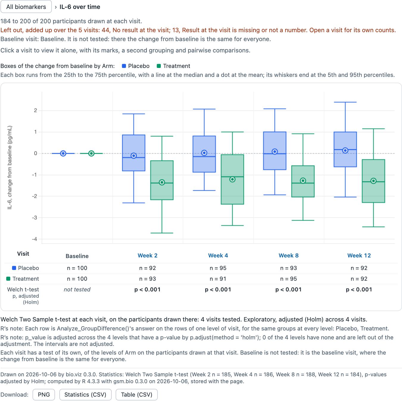
One level down in the saved file: IL-6’s change from baseline. Baseline is drawn and not tested, because there the change is the same for everyone.
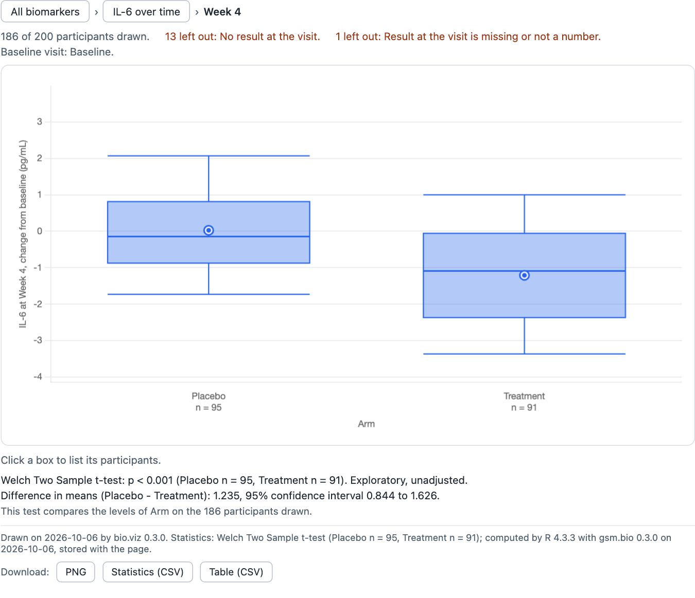
Two levels down: Week 4 alone, with its own stored test.
What you should see
- One file, a little under 3 MB. Opened from disk with the network off, it made no request for anything else.
- It opens on the 12 tiles. The IL-6 tile opens the change from baseline over time: Baseline “not tested”, then p < 0.001 at Week 2, Week 4, Week 8 and Week 12, unadjusted and after Holm.
- Week 4 alone: difference in means, Placebo minus Treatment, 1.235 (0.844 to 1.626), p < 0.001.
- The footnote: “computed by R 4.3.3 with gsm.bio 0.3.0 on 2026-10-06, stored with the page.”
- A view that was not computed says so. This call named Holm, so Benjamini-Hochberg reads “Statistics are unavailable for this view”. The page never shows one view’s numbers under another.
Try it in R
Widget_GroupComparison reference- On the reference page, scroll to the example: it is a live widget. Click its IL-6 tile, then Week 4.
- Or install the release,
remotes::install_github("jwildfire/gsm.bio@v0.3.0"), and run the code below. - Turn the network off and open the file.
library(gsm.bio)
lColumns <- list(
  list(value_col = "ARM", label = "Arm"),
  list(value_col = "SEX", label = "Sex"),
  list(value_col = "RESPONSE", label = "Response")
)
w <- Widget_GroupComparison(
  Synthetic_Results, Synthetic_Participants,
  lSettings = list(
    value_type = "change", baseline_visits = "Baseline", group_by = "ARM",
    groups = lColumns, filters = lColumns, visit_adjustment = "holm"
  )
)
htmlwidgets::saveWidget(w, "group-comparison.html", selfcontained = TRUE)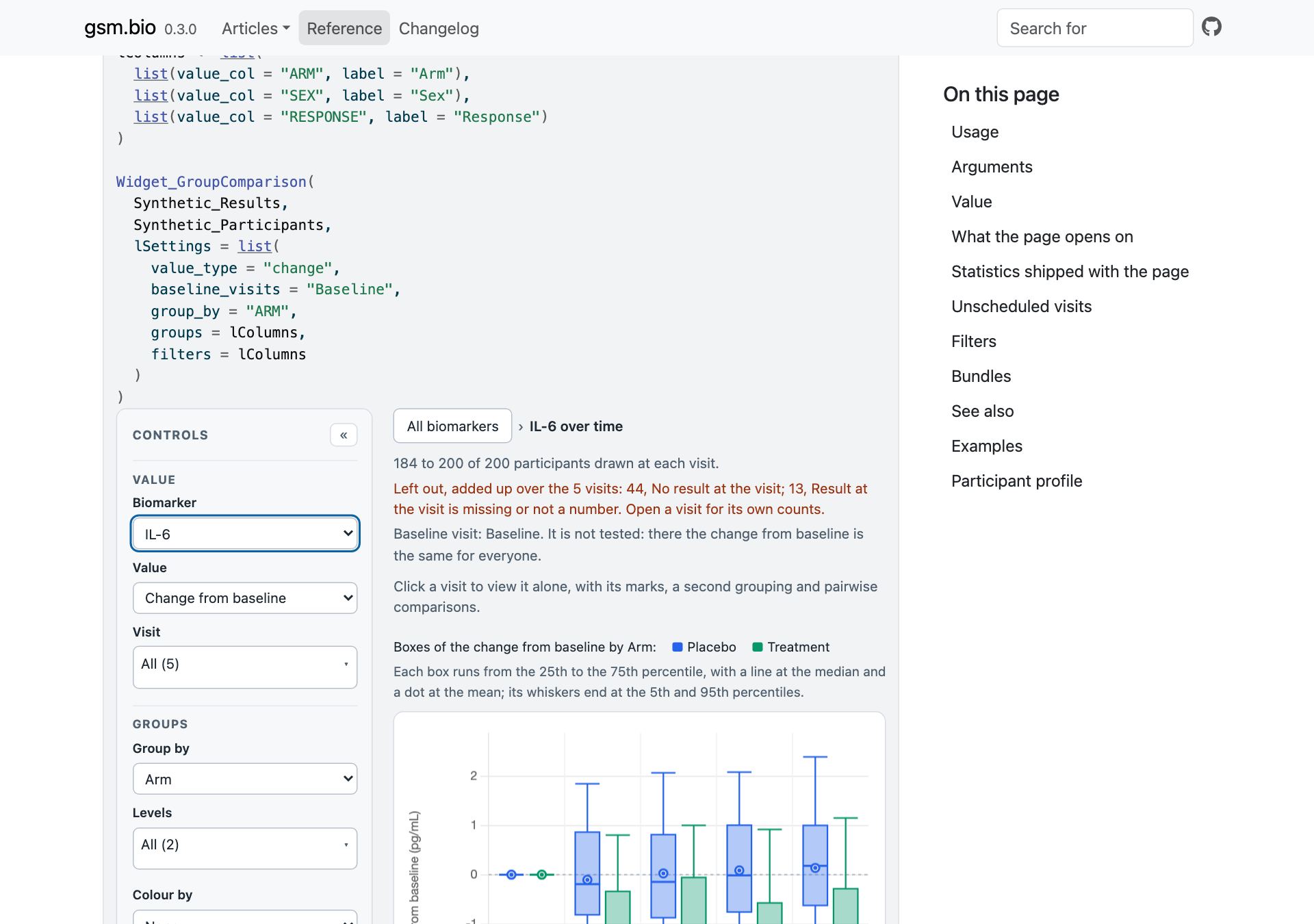
The reference page’s example is a live widget with its tests stored. Here it is one level down, on IL-6’s change from baseline.
The detail
- With no biomarker named, the widget opens on the tiles. They ask R for nothing, and nothing is stored for them.
start_valuenames a biomarker to open on, over time.visitsnames visits to open as panels.- For every biomarker the page stores the row of tests as one answer of
Analyze_GroupDifferenceBy(), with the p-values as R gives them. - When
visit_adjustmentnames"holm"or"BH", R’s adjustment across the visits is stored as well. The Adjust across visits control is then answered at None and at the method named. - The page also stores each visit’s own test, for every biomarker.
- A view that was not computed is another test, another group, or the adjustment the settings did not name. Under the picture over time it reads “Statistics unavailable”.
- The settings of the three levels have the names bio.viz gives them, listed in section 08.
In full, in the widget’s reference: what the page opens on and statistics shipped with the page. Built under obot.roadmap #367, gsm.bio #53, #57.
A group test at every visit, in one call
Analyze_GroupDifferenceBy() is the function behind the row of tests. It runs the group test within each level of a column, such as each visit, and returns one row per level: the counts, the difference in means for two groups, R’s p-value, and the same p-value adjusted across the levels when a method is named.
d <- merge(
  Synthetic_Results[Synthetic_Results$TEST == "D-dimer", ],
  Synthetic_Participants[c("USUBJID", "ARM")]
)
Analyze_GroupDifferenceBy(
  d, "STRESN", "ARM", "VISIT",
  chrBy = c("Baseline", "Week 2", "Week 4", "Week 8", "Week 12"),
  strPAdjust = "holm"
)$rows| by | n_1 | n_2 | estimate | p_unadjusted | p_value |
|---|---|---|---|---|---|
| Baseline | 100 | 100 | -0.0646 | 0.01421 | 0.07105 |
| Week 2 | 91 | 95 | -0.06335 | 0.01704 | 0.07105 |
| Week 4 | 90 | 89 | -0.04007 | 0.1229 | 0.2459 |
| Week 8 | 94 | 95 | -0.01728 | 0.5286 | 0.5286 |
| Week 12 | 93 | 90 | -0.06978 | 0.017 | 0.07105 |
D-dimer by arm, six of the columns the function returns, to four significant figures. n_1 is Placebo and n_2 Treatment; estimate is the difference in means, Placebo minus Treatment; p_value is adjusted by Holm. These are the p-values the chart printed in section 02.
The detail
- The function takes the results table long, one row per participant, biomarker and visit, so nothing is reshaped first.
- The adjustment is R’s
p.adjust(). None is made unless a method is named. - A level with a group below the minimum size, or with values that do not vary, has its reason in place of its numbers and is left out of the adjustment.
- Each row is the single-visit function’s own answer on that level’s rows, for the same groups. So the numbers agree with the one-visit view wherever every group has someone at the visit.
- The groups are the same at every level, so one case differs. With three or more groups and a visit where one of them has nobody, that visit’s row is not computed and gives the reason, while the same visit asked alone tests the groups that are there. bio.viz #114 holds the chart’s side of it.
- A second new function, Analyze_DifferenceGrid(), returns the standardised difference between two groups for every biomarker at every level, one row per cell, with its interval and no p-value. Nothing draws it yet.
- Neither new function changes what a function released before answers.
In full: Analyze_GroupDifferenceBy(). Built under obot.roadmap #367, gsm.bio #52, #54.
For a page written for v0.2.0
A page written for v0.2.0 still loads. It opens or reads differently in the five cases below, and an R call in one more. bio.viz v0.3.0 needs safety.viz v1.9.0 or later.
A page that names no biomarker opens on the tiles
- Before: with
start_valueleft out or null, a small panel for every visit of every biomarker, twelve biomarkers to a page. - Now: the trend tiles, every biomarker at once.
overview_limitandpageare still read and checked, so such a page, and a specification written by v0.2.0, are not refused. Neither is applied to the tiles.
A page that names a biomarker and no visit opens on the picture over time
- This is a page with
start_valueset, andvisitsleft out, null, or naming every visit the biomarker has. - Before: a panel for every visit, each with its own test, and R asked once per visit.
- Now: that biomarker across the visits in one picture, with the row of tests under it, and R asked once.
- A specification written by v0.2.0 for such a view is read as before, and opens on the picture too.
- Each visit’s own view, as v0.2.0 drew it, is one click away on the visit’s name.
- Unchanged: a page that names some of the visits, not all, still draws a panel for each. A biomarker with one visit, and a baseline value, are drawn as before.
Colour by, Panel by and Draw as wait for the level they apply to
- Before: all three applied to the overview’s panels.
- Now: Colour by and Panel by wait for a biomarker and a visit. The tiles draw a line per group, and the picture over time draws the groups side by side, so at both they are switched off, say where they apply, and keep what they are set to.
- Draw as waits for a biomarker. Over time it offers the picture’s three forms. Boxes, violins and points are the single visit’s.
A study with unscheduled visits draws fewer visits
- With the default pattern, a visit whose name holds
unscheduledorearly terminationis left out, of one biomarker’s panels too. - Such a visit is no longer the baseline a change is measured from, when no baseline visit is named.
- To draw them as v0.2.0 did, set
unscheduled_visits: true. From R it isunscheduled_visits = TRUE. - A view of one biomarker at visits that are all scheduled draws, and asks R, exactly what it did.
A cross-tabulation set to Fisher’s exact test prints a p-value where it printed a reason
- Before: for a table with a row or a column of fewer than 5 participants, a page with
test: 'fisher'printed “Not computed: …”. - Now: it prints R’s p-value and R’s note.
- The change comes with gsm.bio’s statistics file, which the site’s copy,
site/vendor/gsm.bio/statistics.R, follows. - A page that attaches its own copy of that file, or stored results made with the older one, prints what its copy answers.
- A page set to chi-square is unchanged.
From R: a widget with a biomarker and no visit
- Before: Widget_GroupComparison() with a biomarker named and no visit opened on a panel for every visit.
- Now: it opens on the picture over time.
- To open on panels, name the visits in
visits. - Two more reach an R call, both shown above: a study with unscheduled visits draws fewer of them (section 04), and
nMinGroupapplies to the chi-square test only (section 05).
Settings by name
Eight settings of the group comparison are new in v0.3.0. Each has the same name from R, in the widget’s lSettings. The API reference’s settings table has the full account of each.
The trend tiles
- tile_summary
- Default
'median'. What a tile’s line goes through: each group’s median at each visit, or'mean'. The Tiles draw control switches it. The trend tiles. - tile_min_spread
- Default
1.25. The least a tile’s value axis spans, in standard deviations of the results at the baseline visit. Zero means no least. A tile’s value axis.
One biomarker over time
- time_mark
- Default
'box'. What the picture is drawn as:'box','mean_se'or'median_iqr'. The Draw as control switches it. One biomarker over time. - visit_adjustment
- Default
'none'. How R adjusts the p-values across the visits, by the name R’sp.adjust()gives it:'none','holm'or'BH'. The Adjust across visits control switches it. The test under each visit. - statistic_by_visit
- Default
'Analyze_GroupDifferenceBy'. The R function asked for the test at every visit, in one request. Null means no row of tests. From R it can only be that function orNULL. What R is asked.
Unscheduled visits
- unscheduled_visits
- Default
false. Whether unscheduled visits are drawn. The Unscheduled visits control switches it. - unscheduled_visit_pattern
- Default
'/unscheduled|early termination/i', which is safety.viz’s. The pattern an unscheduled visit’s name matches. Null means none. - unscheduled_visit_values
- Default
null. The unscheduled visits, by name. When given, the list decides alone and the pattern is not read. An empty list means no visit is unscheduled. Unscheduled visits.
Four older settings that read differently
- start_value
- Default
null, which now opens the trend tiles. A biomarker’s name opens that biomarker. - visits
- Default
null, which is every visit drawn: with a biomarker named, the picture over time. Some of the visits are a panel each. - overview_limit
- Default
12. Not applied since v0.3.0: it was the most biomarkers v0.2.0’s overview drew at a time. Still read and checked. - page
- Default
0. Not applied since v0.3.0: the tiles have no pages. Still read and checked.
How the numbers are held
Every test these charts print is R’s. These are the tests that hold each release to that, and where the files each release copies came from.
bio.viz v0.3.0
- 501 unit tests and 401 browser tests pass.
- Each of the 764 requirement rows has a test named for it.
- R’s answers in the browser are held to desktop R’s within 1 part in 108.
- The statistics file R is given is gsm.bio’s, copied byte for byte from gsm.bio commit 9eda3a8, with its checksum in the copy’s record.
- The group comparison’s requirement rows, each with its tests, are on its test evidence page.
gsm.bio v0.3.0
- 340 tests, 54,896 expectations on R 4.3.3, pass from the source tree, where none may skip.
- From the source tree the suite needs to reach GitHub. On every run it asks, with git, for bio.viz’s tags and for gsm.bio’s, and a run that cannot ask fails.
R CMD checkruns the tests too, and skips the 15 that read the repository’s own files, open a browser or ask GitHub for a tag.- Every statistic a widget stores, a figure prints or a table holds is held to its
Analyze_*()function, on rows the test works out from the study’s tables. - The row of tests under one biomarker over time is held to bio.viz’s own fixtures of what desktop R answered.
- A saved group comparison page is opened by the tests in a headless Chrome with the network switched off, and walked through the three levels as a reader walks them. Every request its chart makes has to be answered by the result the page stores under its key, and the page has to ask for nothing over the network (gsm.bio #53, #57).
- That test also holds R’s reading of an unscheduled-visit pattern to the browser’s, name by name.
- The browser is driven with the chromote package, which is suggested, not imported.
- The batch runner’s reader is held to bio.viz’s own reader, run in node on the same specifications: the format’s rules case by case, and every setting of every chart given each of 21 values, which is 4,746 specifications.
- The rules R shares with the charts are held to frames, requests and filter states written by the bundles the package carries.
What gsm.bio’s widgets carry
- bio.viz v0.3.0, with the specification schema the batch runner reads, copied from bio.viz at a303f6b, the commit its release was made from. Every chart’s footnote reads “bio.viz 0.3.0”.
- The two packages were released together, so the copy was made before bio.viz’s tag existed. Now that it does, the suite holds every copied file to the tag, byte for byte (gsm.bio #59, #60).
- Through bio.viz, safety.viz from its
devbranch at 096cc26. safety.viz stays at v1.9.0.
This page
- Every number on this page that R computed was read from the page that shows it, and recomputed in desktop R with base R alone from the study’s CSV files.
check-numbers.mjs, beside this page, holds the two together: 194 checks. It passed on the first capture, on the two candidates and on the released site.
What is not in this release
- The difference grid, a second opening view for the group comparison, is paused and is not in this release (obot.roadmap #371, bio.viz #86). The group comparison has one opening view, the trend tiles, in the chart and in the widget.
Found by the release review, and not fixed in this release
- Fisher’s exact test is not computed for larger tables (gsm.bio #64).
- Four categories by four with 200 participants can be enough, and so can three by three with 1,000.
- It depends on how evenly the categories are filled. A table spread evenly stops at those sizes, and one with most participants in a single category can still be computed.
- R’s
fisher.test()stops on the size of its workspace. The result has no p-value and carries R’s own message as its reason, which the chart prints. - The chi-square test answers such a table.
- This is not new in v0.3.0. What to do instead, a larger workspace, a simulated p-value or a plainer sentence, is a statistical choice that has not been made.
- Over time, a visit where one of three or more groups has nobody reads “not computed”, while the same visit opened alone tests the groups that are there (bio.viz #114).
In the release, and not shown above
- A host app can list the biomarker screen again (bio.viz #99, #100).
- The chart list said the screen read four columns of the outcomes table,
PARAMCD,PARAM,AVALandCNSR, from the results table, three of them required. An app that found no such columns in its labs and vitals table left the screen out. - The list now names no column for them, as it does for the other two outcomes settings. An app lists the screen and draws its difference and correlation rows.
- The hazard-ratio rows are unchanged for a page that hands the chart an outcomes table.
- A test now holds every column the list names to safety.viz’s standard set.
- safety.viz’s demo app is the app this was for. Its rebuild on v0.3.0 is still to come (safety.viz #212), and it is not one of the two sites this page walks.
- The list is described in the core’s reference, under portfolio.
- The chart list said the screen read four columns of the outcomes table,
- A chart’s tables and headings look the same on every page (bio.viz #97, #103).
- On the site’s demo pages some were drawn with the site’s table styles: headings in small capitals on a tinted ground, a group’s name lighter, a table stretched to the chart’s width, headings in the site’s serif.
- They were the cross-tabulation’s table of counts, the survival chart’s numbers at risk, the association scatter’s and the group comparison’s small tables of statistics, the correlation matrix’s list of pairs, and the headings over the correlation matrix, the biomarker screen and a chart’s panels.
- Each chart now states how its own tables and headings look. They are the same on the site, in a host app and on a page with no stylesheet at all.
- Nothing a chart computes or prints has changed.
- gsm.bio’s tests now open a saved widget in a browser with the network off. Section 09 has the account.
Where to look further
- The releases, each with its short notes: bio.viz v0.3.0 and gsm.bio v0.3.0.
- The release pull requests, each with its review recorded in a comment headed “Review of”: bio.viz #111 and gsm.bio #61.
- The group comparison’s test evidence and API reference, and gsm.bio’s function reference.
- The requirements: the group comparison’s three levels (obot.roadmap #367) and the site’s layout (obot.roadmap #369).
- The v0.2.0 demo, for the cross-tabulation, survival curves and results out of the browser.