bio.viz gsm.bio release review 2026-10-04
What v0.2.0 of bio.viz and gsm.bio adds, annotated
The first release gave four biomarker charts whose every test is R’s. This one adds two charts, a cross-tabulation and survival curves split at a biomarker cut, and gives every chart a way out of the browser: a title and footnotes that say what it shows, a picture and two CSV files to download, and a saved view that rebuilds it. On the R side, gsm.bio draws the same six charts as widgets, static figures and statistics tables, and runs saved views in batch, across every biomarker if asked. Below, each piece is shown on the live site with the numbers you should see.
6 charts, 2 of them new in R: 6 widgets, 6 figures, 6 tables, RTF and a batch runner made-up study: 200 participants, 12 biomarkers, one survival endpoint bio.viz dev at 8f188bf, gsm.bio dev at 7200def
What to look at
- On the stratified survival demo, high CRP at Baseline does worse: median event-free survival 8.28 months against 23.32, hazard ratio 3.523 (2.43 to 5.107). Drag the cut line to 4.34 and, when you let go, R answers for the new groups: 2.153 (1.458 to 3.179).
- In the biomarker screen, ask for hazard ratios at Baseline: CRP is the one row whose interval clears 1, and clicking it opens those same curves.
- Every chart now ends with a footnote it writes itself, naming the date, the bio.viz version and R’s method and counts. Download the PNG and the footnote is in the picture.
- Save a chart’s view as a specification and gsm.bio’s batch runner draws it in R. The survival view saved from the browser, run across all 12 biomarkers, gave the same 12 hazard ratios the screen shows.
Cross-tabulation, and the cut rule
Is this category associated with that one? A two-way table of counts with its totals and percentages, the same numbers as stacked bars, and R’s chi-square or Fisher’s exact test. Either side can be a column of the participant table or a biomarker cut into groups at its median, tertiles, quartiles or points you type. A cut is worked out by the same rule in the browser and in R: R’s quantile() with its default, and a value that falls on a point goes in the lower group.
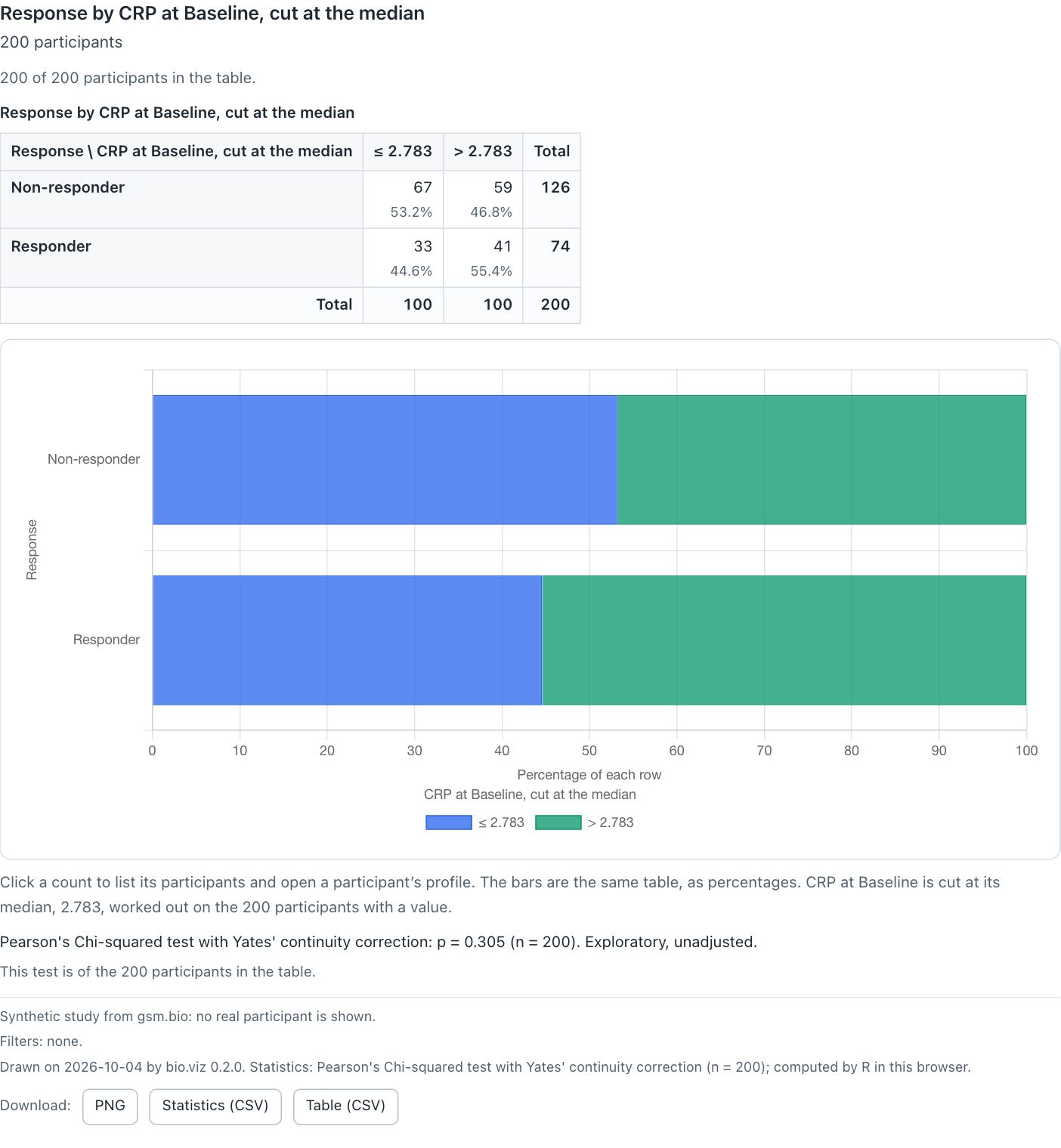
Response by CRP at Baseline, cut at its median of 2.783. The note under the bars says where the cut fell and on how many participants it was worked out. The last footnote is the chart’s own.
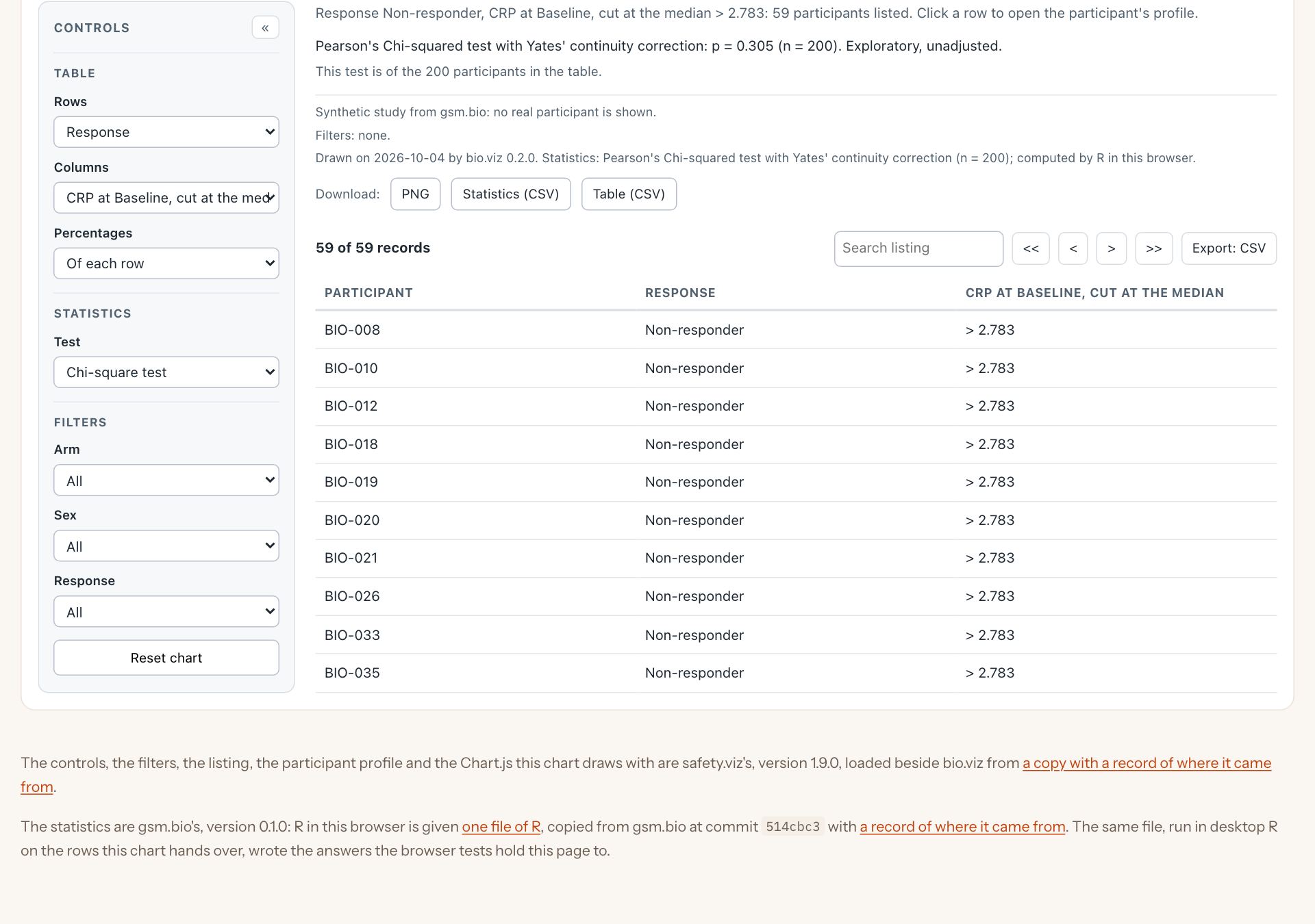
Clicking a count lists those participants, and a row of the listing opens the participant profile. This is safety.viz’s listing and profile, the same parts the other charts use.
What you should see
- It opens on Arm by Response: 66 and 34 on Placebo, 60 and 40 on Treatment, chi-square p = 0.464.
- Response by CRP at its median: non-responders 67 at or below 2.783 and 59 above (53.2% and 46.8%), responders 33 and 41. Chi-square p = 0.305.
- Fisher’s exact test: p = 0.305, odds ratio 1.408 (0.7617 to 2.619).
- The count of non-responders above the cut lists 59 participants.
Try it
Open the cross-tabulation- Wait for the first test: R starts when the table is first drawn, about 13 MB, once.
- Set Rows to Response and Columns to CRP at Baseline, cut at the median.
- Switch Test to Fisher’s exact test.
- Click the 59, then a participant in the listing.
- Set Percentages to Of each column and watch the bars redraw.
Stratified survival
Do participants with high and low levels of this biomarker have different outcomes? Kaplan–Meier curves for each group, with censor marks and the number at risk, above a histogram of the biomarker that shows where the cut falls and how many land each side. Under it are R’s log-rank test, each group’s median with its interval and, for two groups, the hazard ratio. The made-up study planted a survival effect in CRP at Baseline, and the demo opens there.
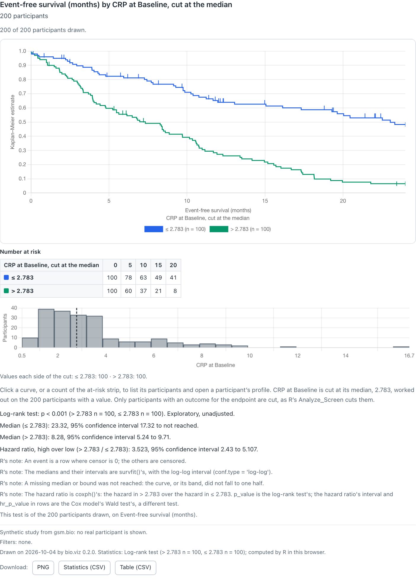
At the median: 100 participants each side. The two curves separate early and stay apart.
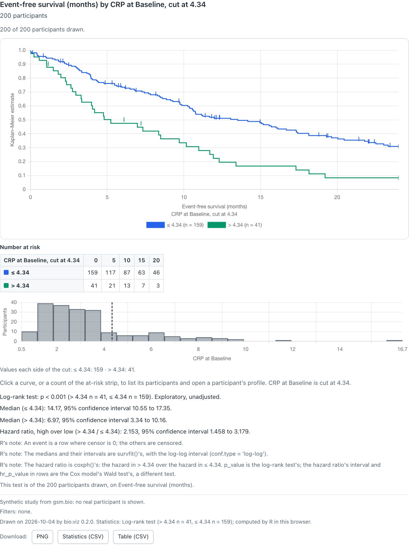
The cut line dragged to 4.34. While it moves the curves follow at once and the statistics line says R will be asked when it is let go; on release R answers for the new groups.
What you should see
- At the median, 2.783: median event-free survival 23.32 months (17.32 to not reached) at or below it, 8.28 (5.24 to 9.71) above. Hazard ratio, high over low, 3.523 (2.43 to 5.107). Log-rank p < 0.001.
- At risk at 0, 5, 10, 15 and 20 months: 100, 78, 63, 49, 41 at or below, and 100, 60, 37, 21, 8 above.
- At 4.34: 159 and 41 participants, medians 14.17 (10.55 to 17.35) and 6.97 (3.34 to 10.16), hazard ratio 2.153 (1.458 to 3.179), p < 0.001.
- R’s notes say what each number is: an event is a row whose censor flag is 0, the medians are
survfit()’s with the log-log interval, and the hazard ratio iscoxph()’s, a different test from the log-rank p-value.
Try it
Open stratified survival- Wait for R: this chart also installs R’s survival package, about 26 MB, once.
- Drag the dashed line on the histogram, or focus it and use the arrow keys.
- Set Groups to CRP at Baseline, cut at the tertiles, for three curves.
- Click a count in the at-risk table to list who was still at risk then.
Marked experimental
The curves are drawn by safety.viz’s Kaplan–Meier estimator, held step by step to R’s survfit(), and that estimator still awaits its clinical review, so the chart says it is experimental. Every test and interval printed under it is R’s; no confidence band is computed in the browser.
Hazard ratios in the biomarker screen
The screen runs one comparison across every biomarker, a row each. Given the study’s outcomes table it now offers a third comparison beside a difference and a correlation: each biomarker cut at its own median, and the hazard ratio of high against low on an endpoint, with log-rank p-values adjusted across the rows. A row opens that biomarker in the stratified survival chart, at the screen’s own cut.
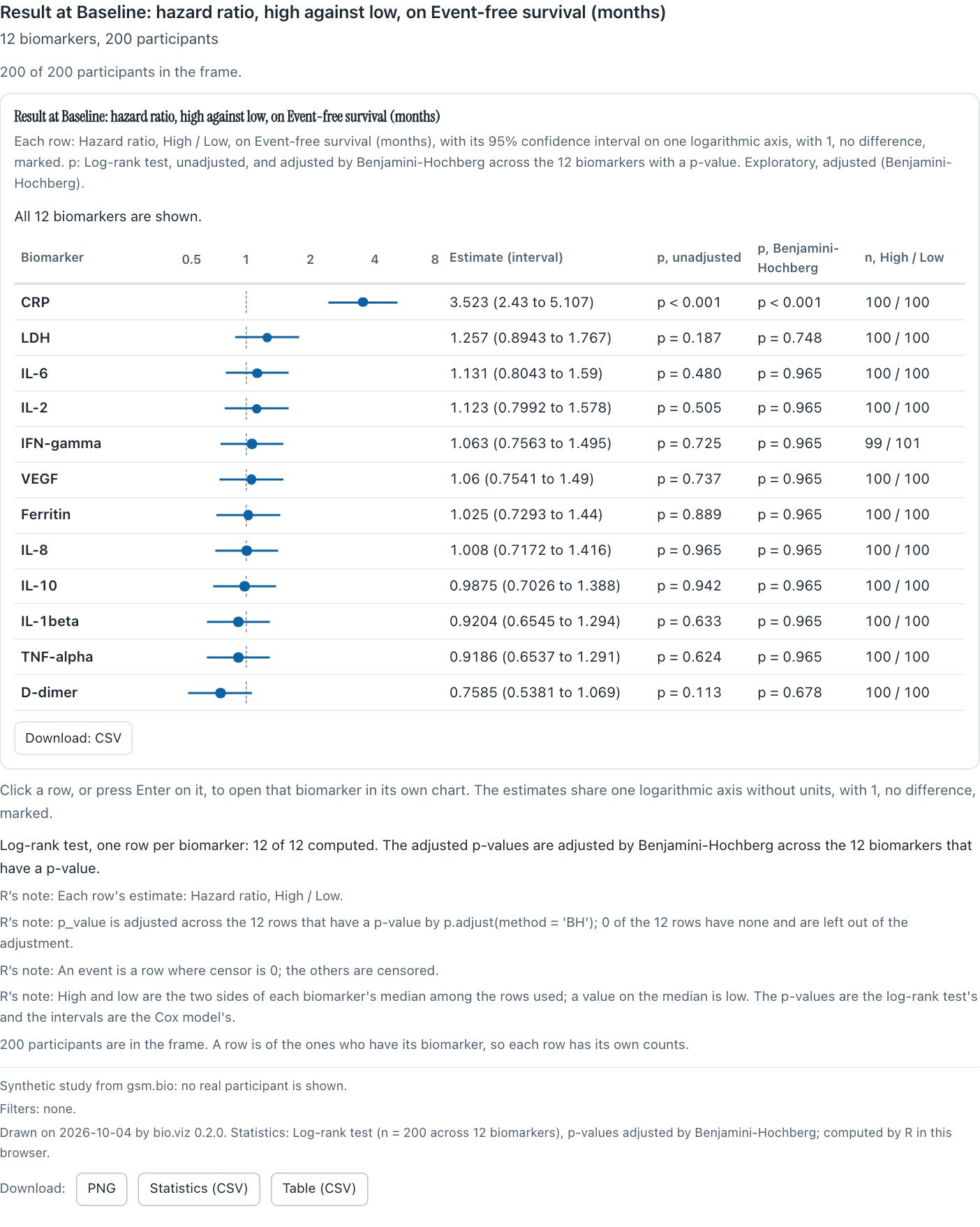
Hazard ratio, high against low, for every biomarker at Baseline. CRP is the only row whose interval clears 1.
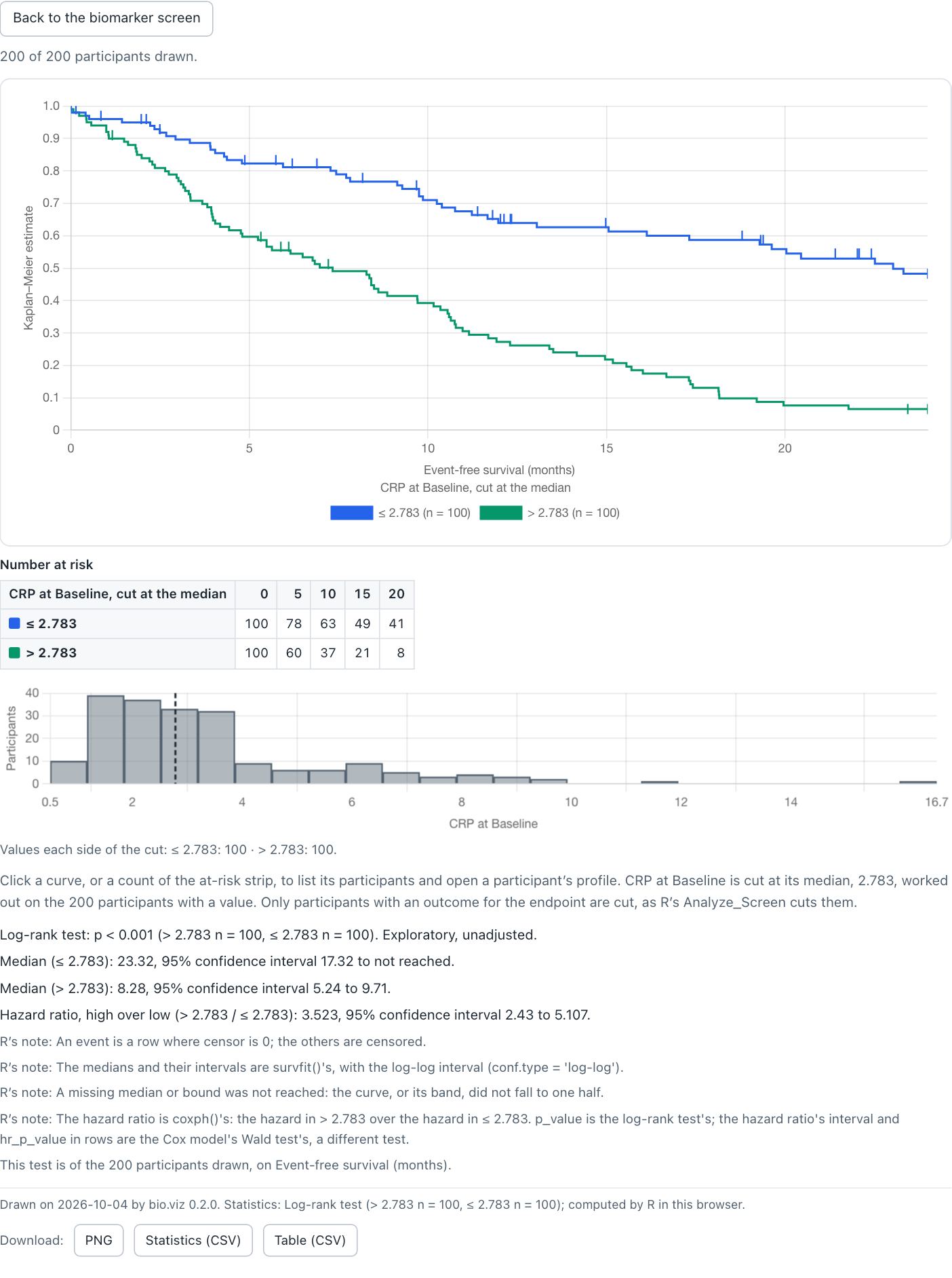
The CRP row opened: the same cut, the same curves and the same 3.523, with a way back to the screen.
What you should see
- CRP first: 3.523 (2.43 to 5.107), p < 0.001 unadjusted and after Benjamini-Hochberg, 100 high and 100 low.
- Second, LDH at 1.257 (0.8943 to 1.767): p = 0.187 unadjusted, 0.748 adjusted.
- IFN-gamma splits 99 and 101: a value on the median counts as low, and two participants sit on it.
- The CRP row opens to medians 23.32 and 8.28, the same as the survival demo.
Try it
Open the biomarker screen- Set Compare to Hazard ratio, high against low.
- Set Value to Result and Visit to Baseline, where the effect was planted: the screen keeps the value and visit it opened on.
- Click the CRP row, then Back to the biomarker screen.
Taking a chart away
Everything a chart shows can now leave the browser and still say what it is. Each of the six charts takes a title, a subtitle and footnotes, written with placeholders the chart fills from the view it draws, and always adds a footnote of its own last. Under the footnotes are three downloads, and behind them a specification: the chart’s settings and filters as plain data, which rebuilds the same chart in a browser or in R.

The chart’s own footnote names the date, the bio.viz version, every method R used with its counts, and which R computed it. A build that is not a release says “with development changes”, so the footnote never names a release for code that is not one.
The three downloads
- PNG: the chart from its title to its own footnote, without the controls, at twice the page’s resolution. The survival chart’s is 1,872 by 2,396 pixels, and the file carries its title, footnotes and the bio.viz version as text, so it still says what it is when it is separated from the page.
- Statistics (CSV): what R returned, a row for the result and a row for each estimate, every member a column. The log-rank p-value is in it at full precision, 2.0138756978103445e-12.
- Table (CSV): one row per participant drawn, 200 here, with the group, the CRP value the cut was made from, the time and whether it was an event, so the cut can be made again from the file.
The specification
A chart’s specification() returns its view as data: what it is, which chart, every setting as the controls now read (37 for this chart) and the filters in force. BioViz.fromSpecification() makes the same chart from it. Nothing in it is run: a title that looks like code is drawn as text, and anything that is not plain data is refused with a sentence that says why.
{
  "format": "bio.viz specification",
  "format_version": 1,
  "chart": "stratified-survival",
  "settings": {
    "endpoint": "EFS",
    "group_by": { "measure": "CRP", "visit": "Baseline",
                  "value": "raw", "cut": "median" },
    "title": "{endpoint} by {group}",
    …
  },
  "filters": []
}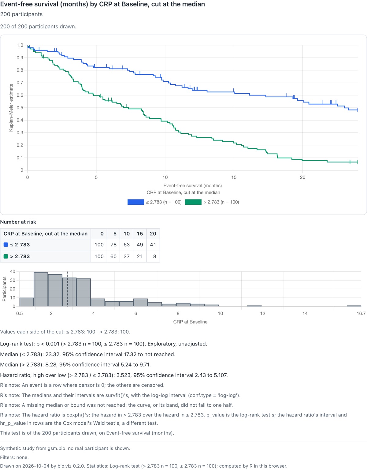
The PNG the button saved, as a file.
What you should see
- Under every chart: the page’s footnotes, then “Drawn on … by bio.viz …” with R’s method and counts.
- PNG, Statistics (CSV) and Table (CSV) buttons, each saving a file named for the chart and the view.
- Rebuilt from its own specification, the survival chart wrote the same specification again.
Try it
Open stratified survival- Set a filter, such as Sex to F: the footnote “Filters: none.” changes to name it.
- Press PNG and open the file.
- Press Table (CSV) and open it in R with
read.csv(). - In the browser console, run
JSON.stringify(BioVizDemo.chart.specification()).
The new charts from R
gsm.bio draws the two new charts from R as widgets, Widget_CrossTab and Widget_StratifiedSurvival, which take the study’s outcomes table. As with the first four, R computes every statistic the chart will ask for when the widget is made and stores it in the page, so a widget saved as one file needs no R and no network. Every widget now also takes the charts’ titles and footnotes, and its own footnote names the R and gsm.bio that computed what it stores.
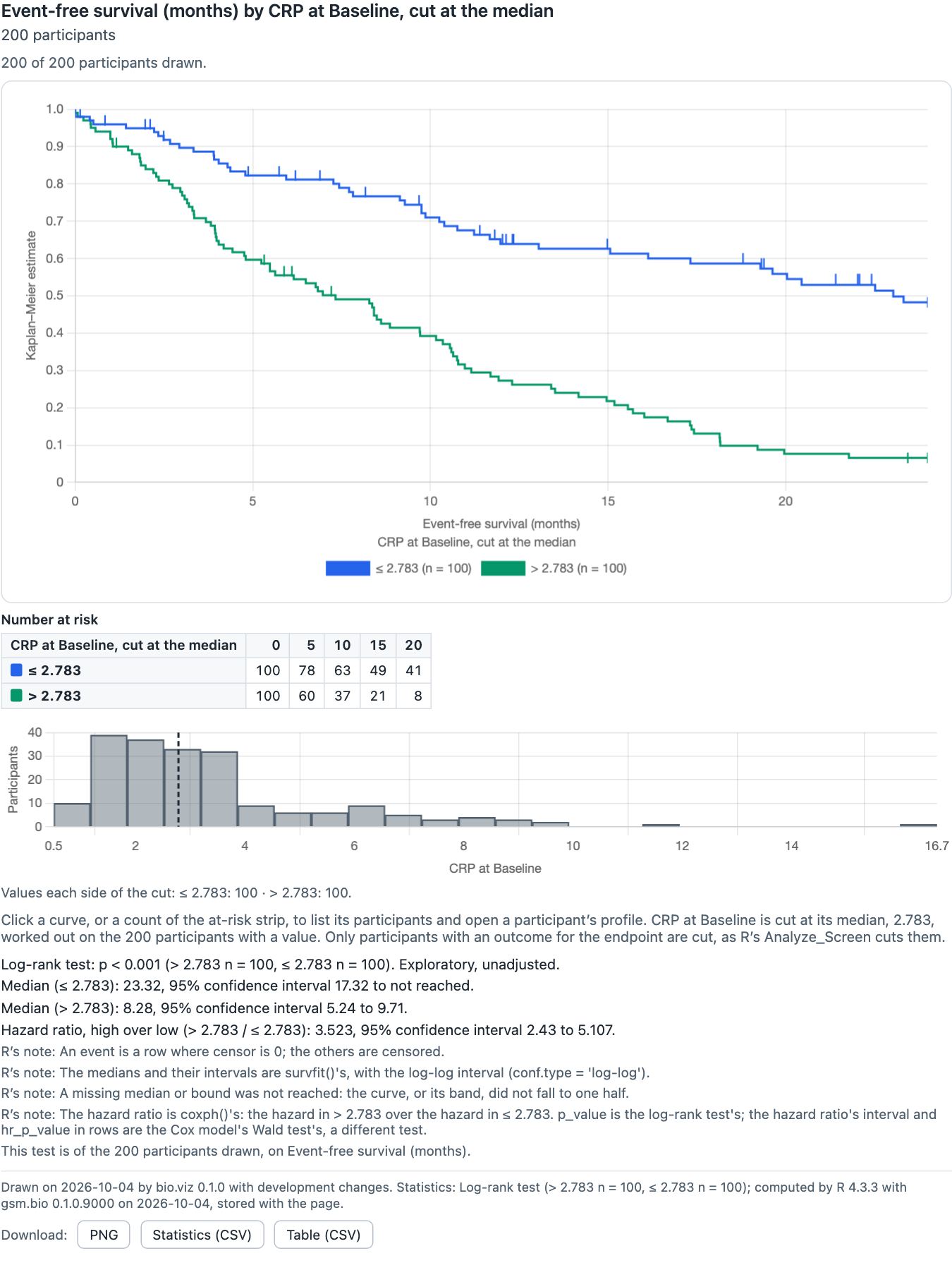
The survival widget, saved with htmlwidgets::saveWidget(selfcontained = TRUE) and opened alone from disk with the network off. The numbers are the live demo’s exactly, and the footnote says they were stored, not computed here.
A static figure for every chart
Six Visualize_*() functions, one per chart, return a ggplot2 figure of the view the chart opens on, from the same settings, with the same statistics printed under it and the same footnote rules. They are for documents: a vector figure, where the browser’s PNG is a picture of the page. The survival figure draws R’s own survfit() curves with their confidence bands.
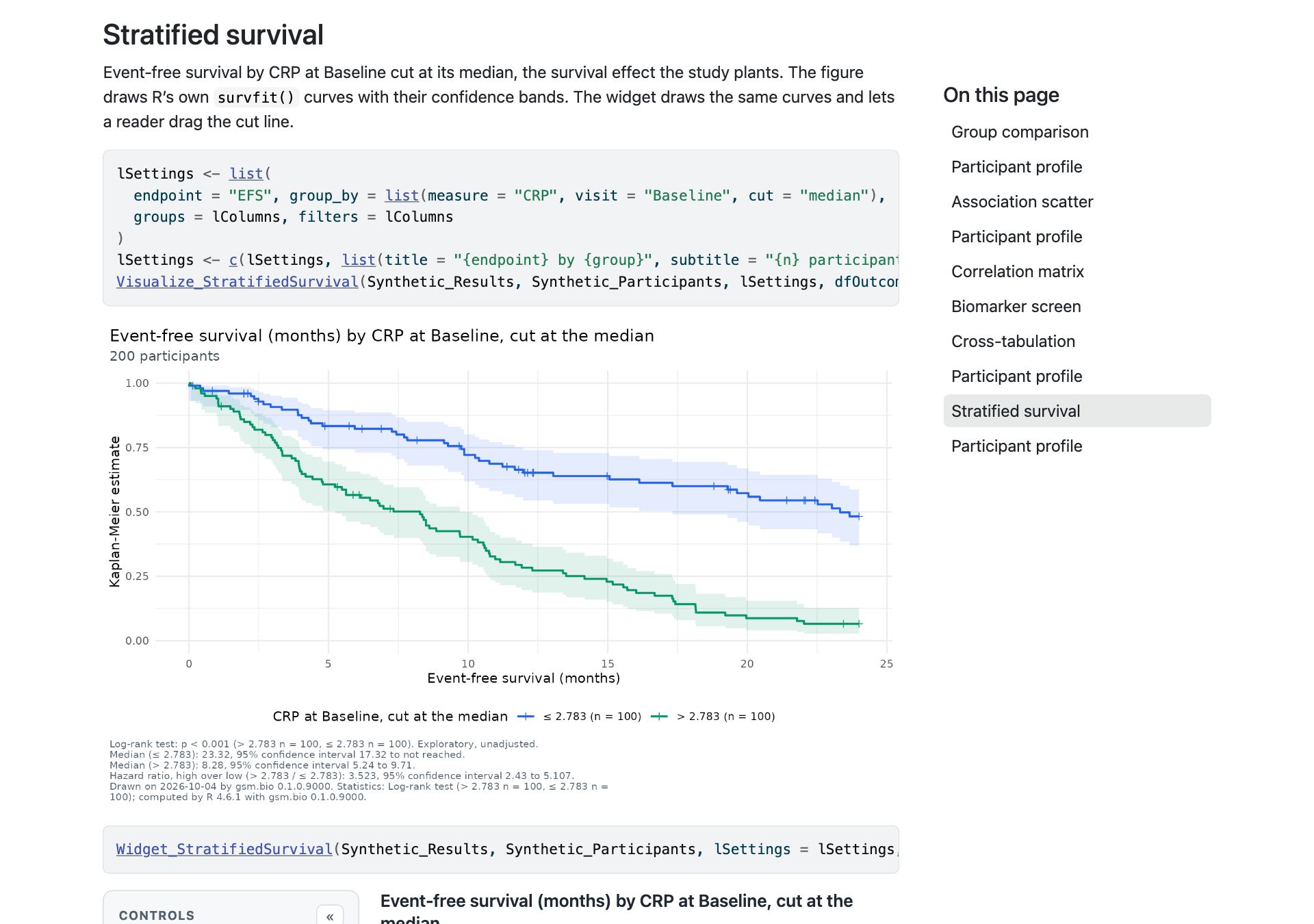
The gsm.bio gallery shows each of the six figures beside its widget, with the code that makes both. This is the survival pair.
What you should see
- The saved survival widget prints 3.523 (2.43 to 5.107) and the medians 23.32 and 8.28, and made no network request.
- The saved cross-tabulation widget of Response by CRP prints chi-square p = 0.305.
- Each saved page is one file of about 2.7 MB.
- The gallery has 6 figures and 6 widgets.
Try it in R
Open the gsm.bio gallery- Install what is on dev:
remotes::install_github("jwildfire/gsm.bio@dev"). - Run the code below, save it, turn the network off and open the file.
- Swap
Widget_forVisualize_to get the ggplot figure.
library(gsm.bio)
w <- Widget_StratifiedSurvival(
  Synthetic_Results, Synthetic_Participants,
  lSettings = list(
    endpoint = "EFS",
    group_by = list(measure = "CRP", visit = "Baseline", cut = "median")
  ),
  dfOutcomes = Synthetic_Outcomes
)
htmlwidgets::saveWidget(w, "survival.html", selfcontained = TRUE)Tables, RTF and batch runs from R
Six Table_*() functions return the statistics of a chart’s view as a data frame, one row per statistic, and Write_RTF() writes one, with its title and footnotes, to RTF for a document. Run_Specifications() takes the specifications bio.viz charts write and draws each one in R as a figure and an RTF table, into a folder, with a manifest of what it wrote. One specification can run across every biomarker.
From the browser to a folder of figures
The two specifications here were saved from the live demos above, the survival view and the cross-tabulation of Response by CRP, and handed to Run_Specifications() unchanged with bAcrossBiomarkers = TRUE. Each biomarker took CRP’s place, cut at its own median: 2 views times 12 biomarkers, all 24 written.
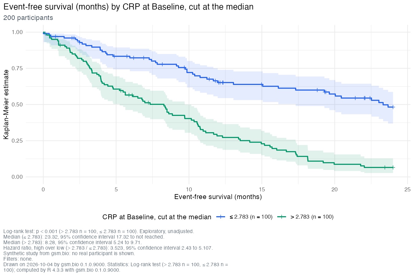
One of the 24 figures, 01-stratified-survival-crp.png, 9 by 6 inches.
  106,277  01-stratified-survival-crp.png
    6,070  01-stratified-survival-crp.rtf
  107,131  01-stratified-survival-d-dimer.png
    6,079  01-stratified-survival-d-dimer.rtf
      …    (10 more biomarkers)
   57,729  02-cross-tab-crp.png
    2,873  02-cross-tab-crp.rtf
      …    (11 more biomarkers)
   19,901  manifest.json
The whole folder: 49 files
  106,277  01-stratified-survival-crp.png
    6,070  01-stratified-survival-crp.rtf
  107,131  01-stratified-survival-d-dimer.png
    6,079  01-stratified-survival-d-dimer.rtf
  105,631  01-stratified-survival-ferritin.png
    6,070  01-stratified-survival-ferritin.rtf
  108,353  01-stratified-survival-ifn-gamma.png
    6,070  01-stratified-survival-ifn-gamma.rtf
  107,704  01-stratified-survival-il-10.png
    6,069  01-stratified-survival-il-10.rtf
  106,414  01-stratified-survival-il-1beta.png
    6,065  01-stratified-survival-il-1beta.rtf
  105,946  01-stratified-survival-il-2.png
    6,068  01-stratified-survival-il-2.rtf
  107,335  01-stratified-survival-il-6.png
    6,067  01-stratified-survival-il-6.rtf
  106,236  01-stratified-survival-il-8.png
    6,068  01-stratified-survival-il-8.rtf
  105,943  01-stratified-survival-ldh.png
    6,064  01-stratified-survival-ldh.rtf
  107,361  01-stratified-survival-tnf-alpha.png
    6,074  01-stratified-survival-tnf-alpha.rtf
  107,683  01-stratified-survival-vegf.png
    6,066  01-stratified-survival-vegf.rtf
   57,729  02-cross-tab-crp.png
    2,873  02-cross-tab-crp.rtf
   58,288  02-cross-tab-d-dimer.png
    2,877  02-cross-tab-d-dimer.rtf
   57,577  02-cross-tab-ferritin.png
    2,878  02-cross-tab-ferritin.rtf
   58,980  02-cross-tab-ifn-gamma.png
    2,879  02-cross-tab-ifn-gamma.rtf
   57,720  02-cross-tab-il-10.png
    2,875  02-cross-tab-il-10.rtf
   57,268  02-cross-tab-il-1beta.png
    2,878  02-cross-tab-il-1beta.rtf
   57,059  02-cross-tab-il-2.png
    2,874  02-cross-tab-il-2.rtf
   57,973  02-cross-tab-il-6.png
    2,874  02-cross-tab-il-6.rtf
   57,318  02-cross-tab-il-8.png
    2,874  02-cross-tab-il-8.rtf
   54,064  02-cross-tab-ldh.png
    2,805  02-cross-tab-ldh.rtf
   58,198  02-cross-tab-tnf-alpha.png
    2,879  02-cross-tab-tnf-alpha.rtf
   58,562  02-cross-tab-vegf.png
    2,874  02-cross-tab-vegf.rtf
   19,901  manifest.json
The RTF table for CRP, read back from the file
Under its title, “Event-free survival (months) by CRP at Baseline, cut at the median” and “200 participants”:
| Statistic | Method | Estimate | Counts | p-value | Note |
|---|---|---|---|---|---|
| Log-rank test | Log-rank test | > 2.783 n = 100, ≤ 2.783 n = 100 | p < 0.001 | Exploratory, unadjusted. | |
| Median (≤ 2.783) | Kaplan-Meier, survfit() with the log-log interval | 23.32, 95% confidence interval 17.32 to not reached | |||
| Median (> 2.783) | Kaplan-Meier, survfit() with the log-log interval | 8.28, 95% confidence interval 5.24 to 9.71 | |||
| Hazard ratio, high over low (> 2.783 / ≤ 2.783) | Cox proportional hazards, coxph() | 3.523, 95% confidence interval 2.43 to 5.107 |
Its footnotes follow the table: the page’s two, then “Drawn on 2026-10-04 by gsm.bio 0.1.0.9000. Statistics: Log-rank test (> 2.783 n = 100, ≤ 2.783 n = 100); computed by R 4.3.3 with gsm.bio 0.1.0.9000.” The p-value follows the same display rules as the charts: exploratory, the adjustment named, no stars.
What you should see
- 49 files, 2.1 MB in all: 24 figures, 24 RTF tables and the manifest, in 5.6 seconds on the Mac that made this page.
- The 12 survival figures carry the same 12 hazard ratios as the screen’s rows in section 03, CRP’s 3.523 among them, because both cut each biomarker at its own median.
- The CRP cross-tabulation prints the live demo’s p = 0.305.
- Every row of the manifest says “written”, with each view’s title, participants and statistics.
Try it in R
Run_Specifications reference- Save a specification from any demo as a JSON file.
- Run the code below. It needs ggplot2 and r2rtf, which gsm.bio suggests but does not require.
- Open
manifest.json, then a figure and its RTF table.
Run_Specifications(
  "survival.json",
  Synthetic_Results, Synthetic_Participants, Synthetic_Outcomes,
  strFolder = "figures",
  bAcrossBiomarkers = TRUE
)What is not in this release
- Stratified survival in safety.viz’s demo app: the chart list cannot yet name an outcomes table, so the chart is not listed there (bio.viz #63).
- Image snapshots of the static figures. Their tests record each figure’s labels and plotted data instead, which do not change with the locale or the ggplot2 version.
- Filed and not built: the survival footnote should name Cox’s model beside the log-rank test (gsm.bio #43); the log-rank counts in the legend’s order (bio.viz #72); a specification given as text is not checked for depth in the browser (bio.viz #74); the listing’s CSV export splits a heading that holds a comma (safety.viz #208).
- Also filed: a column’s groups drawn in the browser’s order but listed by R in code-point order (bio.viz #59); the cut rule differing from R at the far edges of a number’s range (bio.viz #60); widgets refusing a setting name they do not know (gsm.bio #32); and a check that every saved widget answers offline in CI (gsm.bio #33).
Where to look further
- The release notes as they will publish: bio.viz and gsm.bio.
- The bio.viz gallery: each chart’s evidence page traces its requirements to named tests.
- Getting results out: the footnote, download and specification rules in full.
- The v0.1.0 demo, for the first four charts.
- The design for the biomarker charts.