Each chart is shown twice, from one list of settings. First the
static figure, a ggplot that Visualize_*()
returns, for a report or a slide. Then the widget,
Widget_*(), which draws the same view in the browser and
lets a reader move it.
The two share one list of settings, the title and subtitle with them, and each writes its own footnote last: the widget’s says it was drawn by bio.viz, from results computed by R and stored with the page, and the figure’s that it was drawn by gsm.bio.
Both take their statistics from the same Analyze_*()
call on the same rows. The number printed under the figure is the one
stored in the widget, so the two say the same thing. The figure’s title,
subtitle and footnotes are written with the chart’s placeholders
({measure}, {n}, {filters} and
the rest), and the figure always writes its own footnote last: the date
it was drawn, by gsm.bio, and R’s method and counts behind each
statistic it printed. Everything here is the synthetic study,
Synthetic_Results, Synthetic_Participants and
Synthetic_Outcomes.
Group comparison
IL-6’s change from Baseline by arm, the difference the study plants, with Welch’s test of each visit.
lSettings <- list(
  start_value = "IL-6", visits = c("Week 4", "Week 8"), value_type = "change", baseline_visits = "Baseline",
  group_by = "ARM", groups = lColumns, filters = lColumns
)
lSettings <- c(lSettings, list(title = "{measure}: {value} by {group}", subtitle = "{n} participants, at {visits}"))
Visualize_GroupComparison(Synthetic_Results, Synthetic_Participants, lSettings)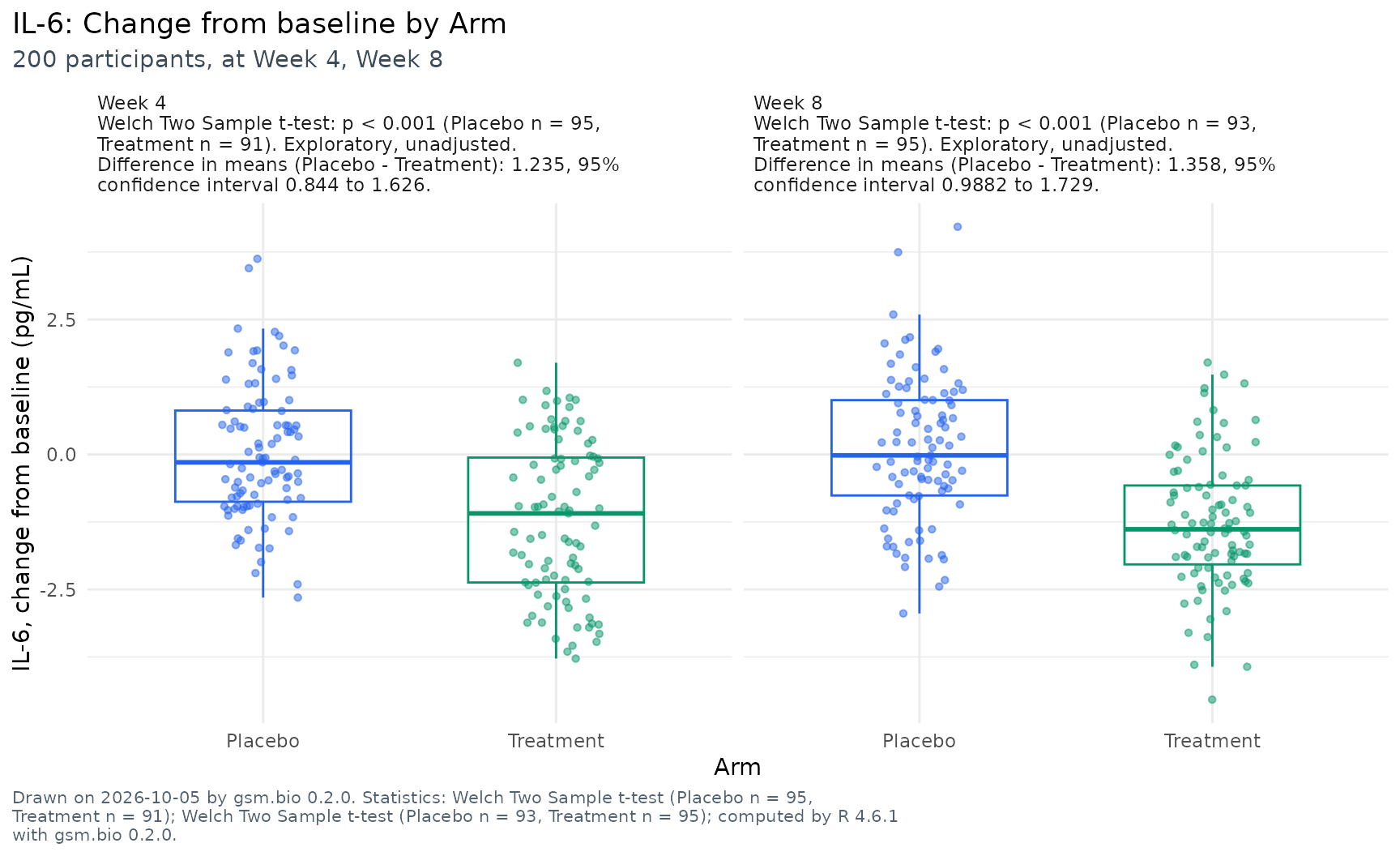
Widget_GroupComparison(Synthetic_Results, Synthetic_Participants, lSettings = lSettings)Association scatter
TNF-alpha against IL-10 at Baseline, the correlation the study plants, with R’s linear fit and its band.
lSettings <- list(
  x = list(measure = "TNF-alpha", visit = "Baseline"), y = list(measure = "IL-10", visit = "Baseline"),
  fit = "linear", filters = lColumns
)
lSettings <- c(lSettings, list(title = "{y} against {x}", subtitle = "{n} participants"))
Visualize_AssociationScatter(Synthetic_Results, Synthetic_Participants, lSettings)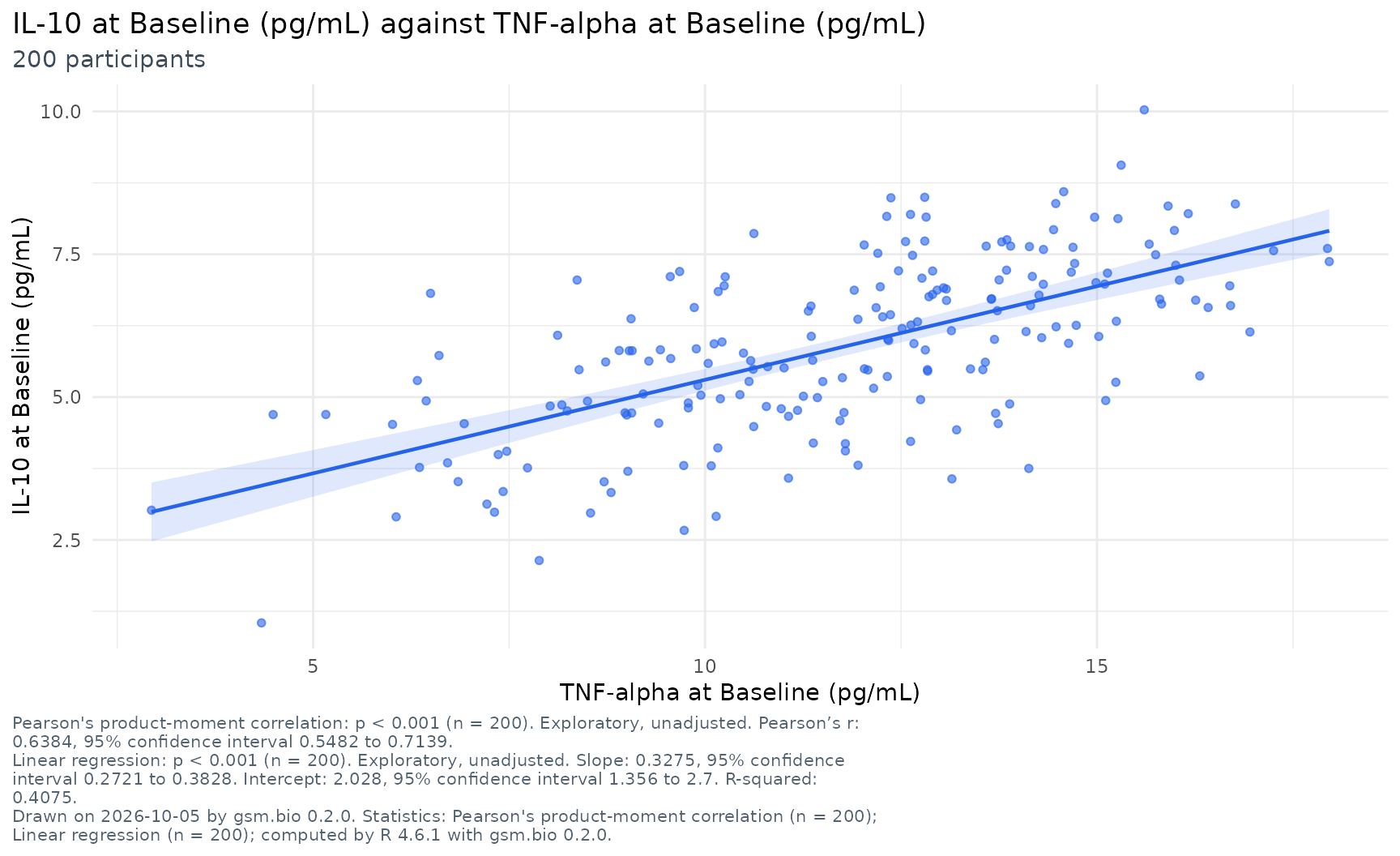
Widget_AssociationScatter(Synthetic_Results, Synthetic_Participants, lSettings = lSettings)Correlation matrix
Every biomarker against every other at Baseline. The figure writes each coefficient above the diagonal, to two decimals as the grid does.
lSettings <- list(visit = "Baseline", filters = lColumns)
lSettings <- c(lSettings, list(title = "{heading}", subtitle = "{variables} biomarkers, {n} participants"))
Visualize_CorrelationMatrix(Synthetic_Results, Synthetic_Participants, lSettings)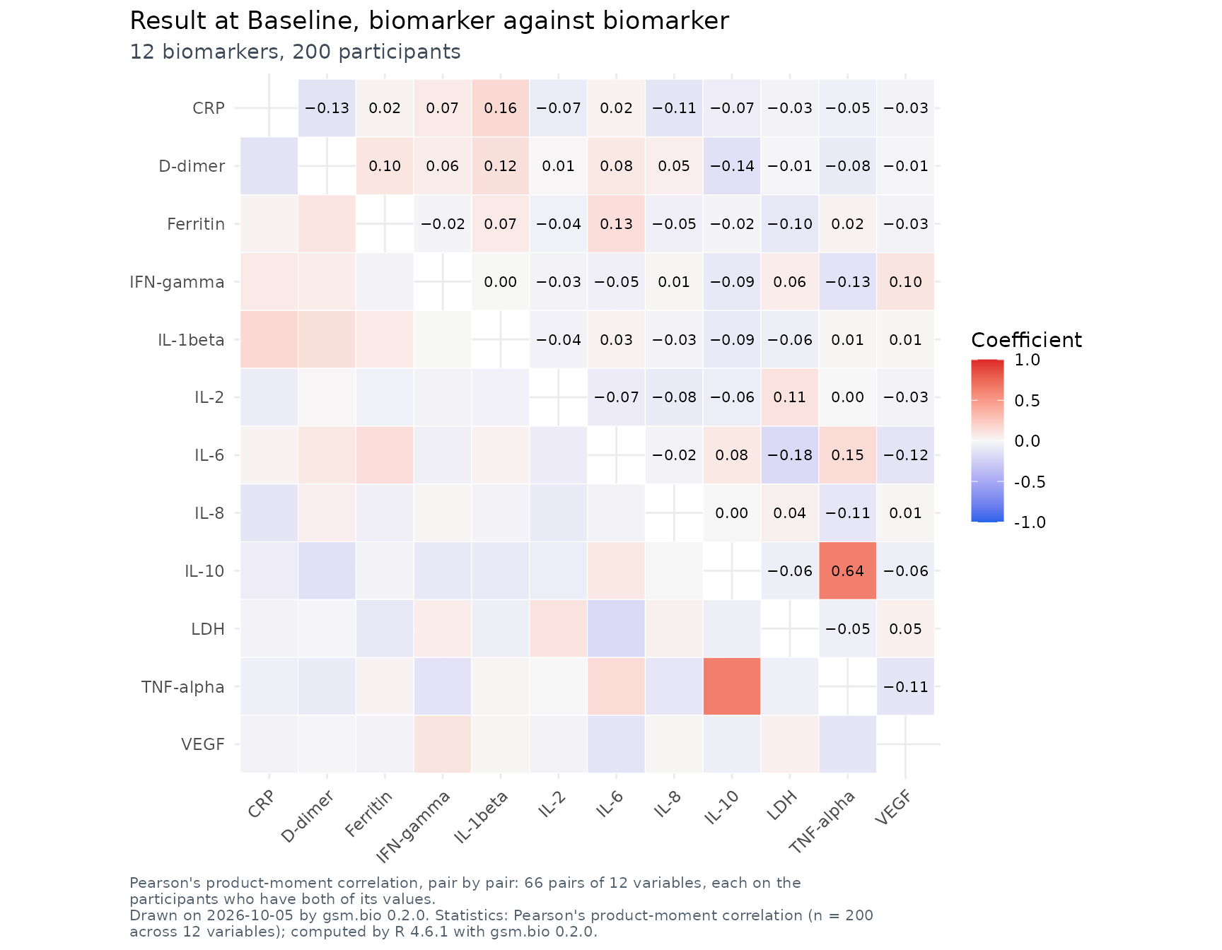
Widget_CorrelationMatrix(Synthetic_Results, Synthetic_Participants, lSettings = lSettings)Biomarker screen
Every biomarker’s change to Week 4, Placebo against Treatment, as a standardised difference with both p-values. The widget opens any row in its group comparison.
lSettings <- list(
  visit = "Week 4", value_type = "change", group_by = "ARM", baseline_visits = "Baseline",
  groups = lColumns, filters = lColumns, group_comparison = list(groups = lColumns)
)
lSettings <- c(lSettings, list(title = "{heading}", subtitle = "{biomarkers} biomarkers, {n} participants"))
Visualize_BiomarkerScreen(Synthetic_Results, Synthetic_Participants, lSettings)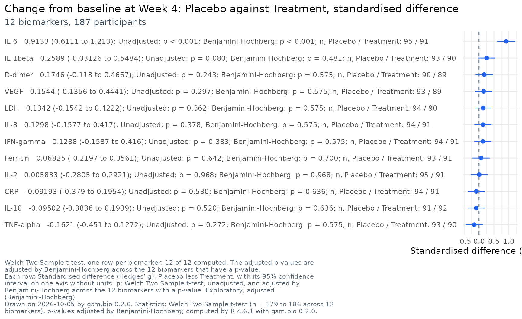
Widget_BiomarkerScreen(Synthetic_Results, Synthetic_Participants, lSettings = lSettings)Cross-tabulation
Response by CRP at Baseline cut at its median, with R’s chi-square test.
lSettings <- list(
  row_by = "RESPONSE", col_by = list(measure = "CRP", visit = "Baseline", cut = "median"),
  groups = lColumns, filters = lColumns
)
lSettings <- c(lSettings, list(title = "{rows} by {columns}", subtitle = "{n} participants"))
Visualize_CrossTab(Synthetic_Results, Synthetic_Participants, lSettings)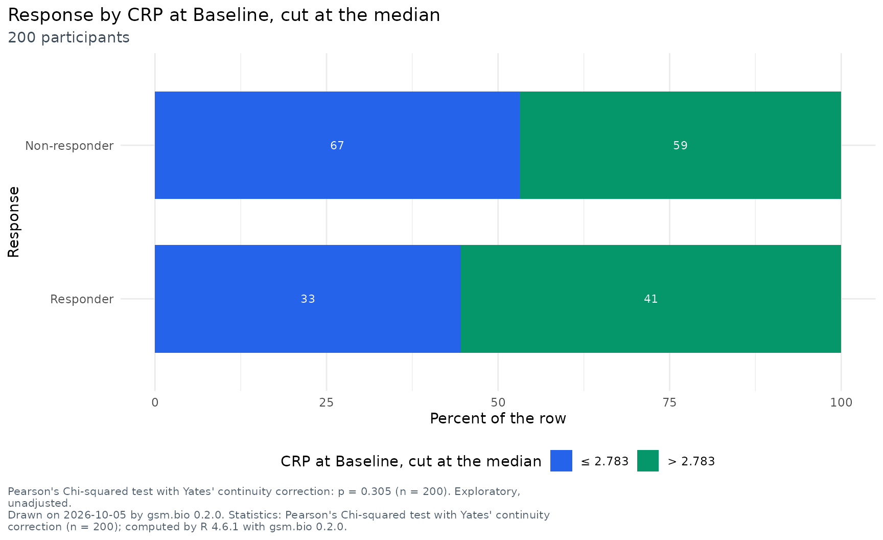
Widget_CrossTab(Synthetic_Results, Synthetic_Participants, lSettings = lSettings)Stratified survival
Event-free survival by CRP at Baseline cut at its median, the
survival effect the study plants. The figure draws R’s own
survfit() curves with their confidence bands. The widget
draws the same curves and lets a reader drag the cut line.
lSettings <- list(
  endpoint = "EFS", group_by = list(measure = "CRP", visit = "Baseline", cut = "median"),
  groups = lColumns, filters = lColumns
)
lSettings <- c(lSettings, list(title = "{endpoint} by {group}", subtitle = "{n} participants"))
Visualize_StratifiedSurvival(Synthetic_Results, Synthetic_Participants, lSettings, dfOutcomes = Synthetic_Outcomes)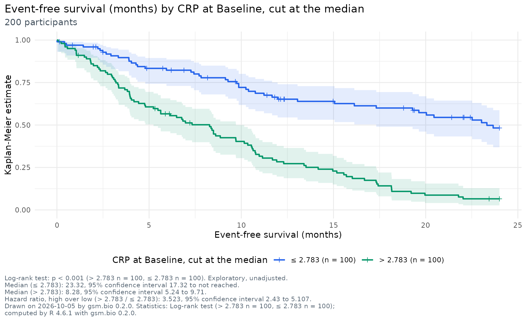
Widget_StratifiedSurvival(Synthetic_Results, Synthetic_Participants, lSettings = lSettings, dfOutcomes = Synthetic_Outcomes)