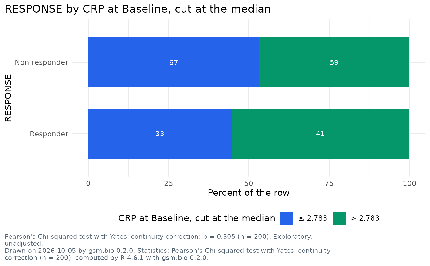
A static ggplot2 figure of the table the cross-tabulation opens on: a bar
per row of the table, stacked by its columns as the chart's bars are, each
segment labelled with its count, and R's test of the table printed under the
figure. With percent = "row" (the default) a bar is the row's percentages;
with "col" a bar is a column's; with "none" the counts themselves. It is
the table Widget_CrossTab() draws in the browser, from the same settings,
and its test is Analyze_Contingency()'s on the same rows.
Usage
Visualize_CrossTab(dfResults, dfParticipants = NULL, lSettings = list())Arguments
- dfResults
data.frameLong-format results, one row per participant, biomarker and visit. Column names are supplied bylSettings; the defaults expectUSUBJID/TEST/STRESN/VISIT/VISITNUM/STRESU, the columns of Synthetic_Results.- dfParticipants
data.frameOne row per participant, orNULL. With it the chart has filters, offers its category columns to the Rows and Columns controls, and its numbers can be cut. Default:NULL.- lSettings
listbio.viz cross-tabulation settings, asWidget_CrossTab()takes them, andtitle,subtitleandfootnotes. Default:list().
Titles and footnotes
The settings title, subtitle and footnotes are text with named
placeholders, as for Visualize_GroupComparison(). This figure fills
{rows} and {columns} (what they are, as the controls name them), {n}
(the participants in the table), {filters}, {date} and {version}.
See also
Widget_CrossTab(), its interactive twin.
Other figures:
Run_Specifications(),
Visualize_AssociationScatter(),
Visualize_BiomarkerScreen(),
Visualize_CorrelationMatrix(),
Visualize_GroupComparison(),
Visualize_StratifiedSurvival()
Examples
if (requireNamespace("ggplot2", quietly = TRUE)) {
  Visualize_CrossTab(
    Synthetic_Results,
    Synthetic_Participants,
    lSettings = list(
      row_by = "RESPONSE",
      col_by = list(measure = "CRP", visit = "Baseline", cut = "median"),
      title = "{rows} by {columns}"
    )
  )
}