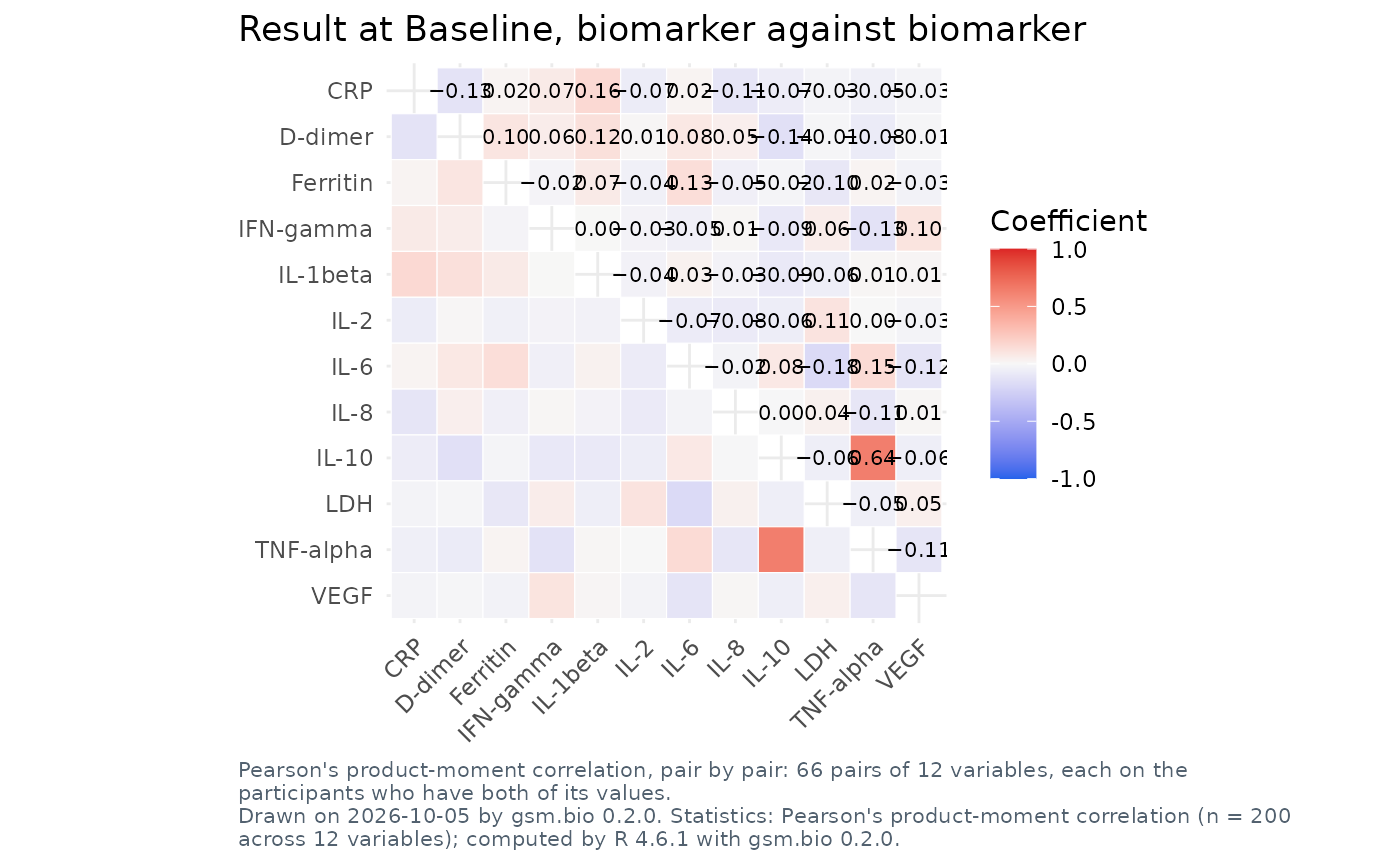
A static ggplot2 figure of the grid the correlation matrix opens on: one
cell per pair of variables, coloured by R's coefficient and labelled with it,
across biomarkers at one visit or across the visits of one biomarker. It is
the grid Widget_CorrelationMatrix() draws in the browser, from the same
settings, and its coefficients are Analyze_CorrelationMatrix()'s on the same
frame. A cell R did not compute, too few pairs among them, is left blank.
Usage
Visualize_CorrelationMatrix(
  dfResults,
  dfParticipants = NULL,
  lSettings = list()
)
Arguments
- dfResults
data.frameLong-format results, one row per participant, biomarker and visit. Column names are supplied bylSettings; the defaults expectUSUBJID/TEST/STRESN/VISIT/VISITNUM/STRESU, the columns of Synthetic_Results.- dfParticipants
data.frameOne row per participant, orNULL. With it the chart has filters; it also says who the participants are. Default:NULL.- lSettings
listbio.viz correlation matrix settings, asWidget_CorrelationMatrix()takes them, andtitle,subtitleandfootnotes. Default:list().
Titles and footnotes
The settings title, subtitle and footnotes are text with named
placeholders, as for Visualize_GroupComparison(). This figure fills
{heading} (what the grid is of), {variables} (how many), {visit},
{value}, {n} (the participants in the frame), {filters}, {date} and
{version}.
See also
Widget_CorrelationMatrix(), its interactive twin.
Other figures:
Run_Specifications(),
Visualize_AssociationScatter(),
Visualize_BiomarkerScreen(),
Visualize_CrossTab(),
Visualize_GroupComparison(),
Visualize_StratifiedSurvival()
Examples
if (requireNamespace("ggplot2", quietly = TRUE)) {
  Visualize_CorrelationMatrix(
    Synthetic_Results,
    Synthetic_Participants,
    lSettings = list(visit = "Baseline", title = "{heading}")
  )
}