safety.viz release candidate review 10 October 2026
What v1.11.0 changes, annotated
Release 1.11 makes the demo app ready to show at the keynote on 21 October 2026: a first screen that says where you are, one label for how far to trust it, one control that starts R, an RBQM tab that reads like the other tabs, and one place to load files. It adds no chart and no metric, and nothing the app computes changes.
Released as safety.viz v1.11.0 on 10 October 2026. This page is the review of its release candidate (safety.viz #306), as captured before the release: where it says “the released site” it means release 1.10, and “the dev site” is what became release 1.11.
118 of 118 things this page says, held to the live site by a script captured 10 October 2026 from the dev site public pilot study: 254 participants synthetic RBQM study: 765 enrolled, 150 sites
Yours to rule on at this review
Three things from the build, and five seen while this page was captured. None holds the release. The words in the white boxes are the comments’ own.
1. The status words are drafts
You said the drafted words would ship and that you would correct them here. The disclaimer, the four rungs and the six reasons are printed in full in section 02.
2. Three questions about status
From the requirement for the status ladder (the three questions, obot.roadmap #403).
- The Hepatic Explorer's migration view loses its mark. The design retires the banner drawn inside that view, and the chart as a whole is Exploratory, so in the app and on the docs site nothing now says the view is still moving. Its clinical guide still calls the view Experimental. If you want it marked: the Hepatic Explorer can show the status label, Experimental, while that view is open. That would be a seventh thing below Exploratory.
- The Time-to-Event Explorer's reason is one sentence, from the design's table: "Experimental until an external clinical review confirms its Kaplan–Meier estimates." The mockup's panel shows a second sentence, "Its curves, intervals and at-risk counts may change after that review." I shipped the table's, since the requirement names the table. Say if you want the second sentence back.
- The Participant Profile carries its label on its own page in the app, but not when it opens in the rail beside another chart, where the open chart's card is Exploratory and shows none. That is unchanged from today, when the profile carried no mark anywhere in the app. If you want it marked there, the rail's heading can carry the label.
One wording change of mine: a Prototype's panel is headed "Patient Journey Explorer is a prototype", not "is prototype".
3. The order of the keynote’s demo path
A new test walks these eight steps on the deployed demo, in this order, which is yours to change (the test’s task, safety.viz #287; its passing run).
- the app opens on the pilot study
- the Adverse Event Explorer is opened
- the app's status label is opened and closed
- the Hepatic ALT Waterfall's Experimental label is opened
- the Cross-tabulation starts R and shows a statistic
- the RBQM tab runs 3 of 8 metrics on the pilot study
- the RBQM demo study is chosen on the Data tab, whose card reads "This data supports 8 of 8 metrics."
- the RBQM tab runs its eight metrics with no second press, and one metric's page is opened
4. Seen while capturing, yours to rule on
- The first screen gives two counts: the welcome line says “254 participants” and the histogram under it “364 of 364 participants shown (100.0%).” The labs file carries 110 synthetic liver and kidney participants, which the Data tab says and the first screen does not (the picture).
- The Qualified rung’s meaning uses the word “Validated”: “Validated for regulated use. Nothing in safety.viz is, yet.” (the picture).
- The RBQM tab’s reason still says “new in 1.10”: “Experimental: new in 1.10. R runs in the browser, and what the tab shows may still change.” (the picture).
- A chart below Exploratory shows its label twice on its docs demo page, at the title and on the chart. That is as built: the chart still draws its own label there, as it would embedded elsewhere (requirement row APP-TIER-025; the picture).
- The Hepatic ALT Waterfall’s active arm on the pilot study is named “CLD: Study Drug, CLD: Placebo, Xanomeline Low Dose, Xanomeline High Dose”. The name is the pilot data’s, and it will show on a shared screen (the picture).
Try it: seven steps, each under a minute
- Open the demo app and read the first screen.A welcome line names the study, no tab is grey, and the Data tab reads “Pilot study”.
- Hover the label at the top right, then click it.On hover: “Nothing in this app is qualified. Confirm every result.” On a click: a panel headed “This app is exploratory”, with the four rungs.
- Open the Hepatic ALT Waterfall and click the label on the corner of its card.Its reason, and titles over the chart that no longer print on each other.
- Open the Cross-tabulation and press Start R, at the right end of the chart names.In a few seconds the control is a chip, “R ready”, and under the chart R’s test reads “Pearson's Chi-squared test: p < 0.001 (n = 254).”
- Open the RBQM tab and press Start R, once.The control counts six steps. About half a minute later: “R ran 3 of 8 metrics on the Pilot study in a few seconds.” Click a cell to open that metric.
- Open the Data tab, choose “RBQM study” from the menu, then press “Open RBQM”.The card reads “This data supports 8 of 8 metrics.” With R running from step 5, all eight run with no second press, at 150 sites.
- On a phone, open the link to the RBQM tab.The RBQM tab is in view in the row of tabs, and nothing scrolls sideways.
How to read this page
- Where the app changed its look, a switch above the picture swaps release 1.10 and release 1.11 in place. Release 1.10 is the released site; release 1.11 is the dev site.
- A numbered marker on a picture is explained by the same number under it. Tap a picture to open it at full size.
- Every sentence quoted from the app, and every number, was read from the live page by the script beside this page (what it read).
The first screen says where you are
Someone opening the app for the first time is told whose data this is, how much is here and where to go. In release 1.10 two of the tabs were grey and read as switched off, and nothing on screen named the study.
Requirement: every tab has a colour, and the first screen says where you are (obot.roadmap #402) Pull request: tab colours, the first screen, wordmark and title (safety.viz #290) As drawn in mockup 1
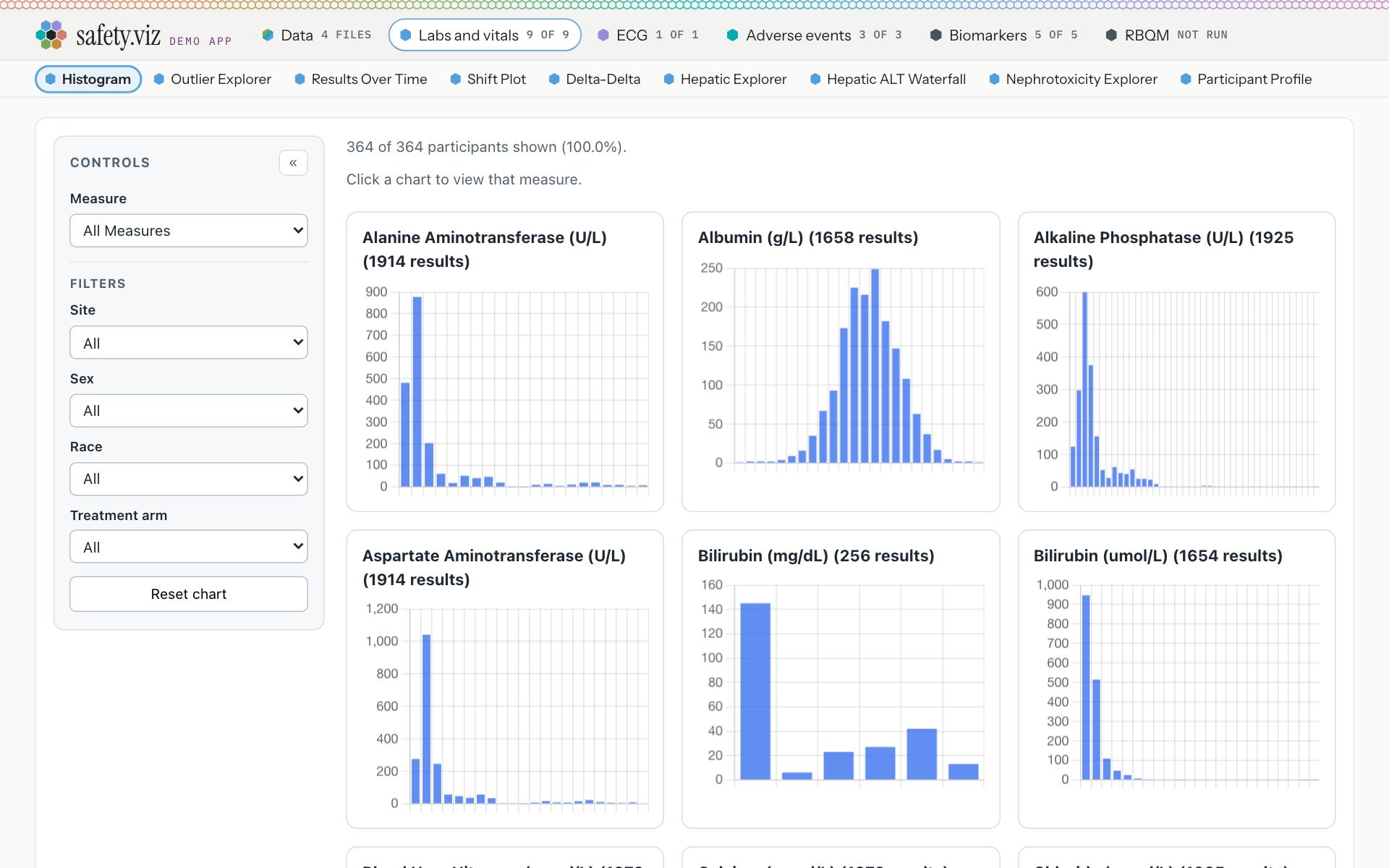
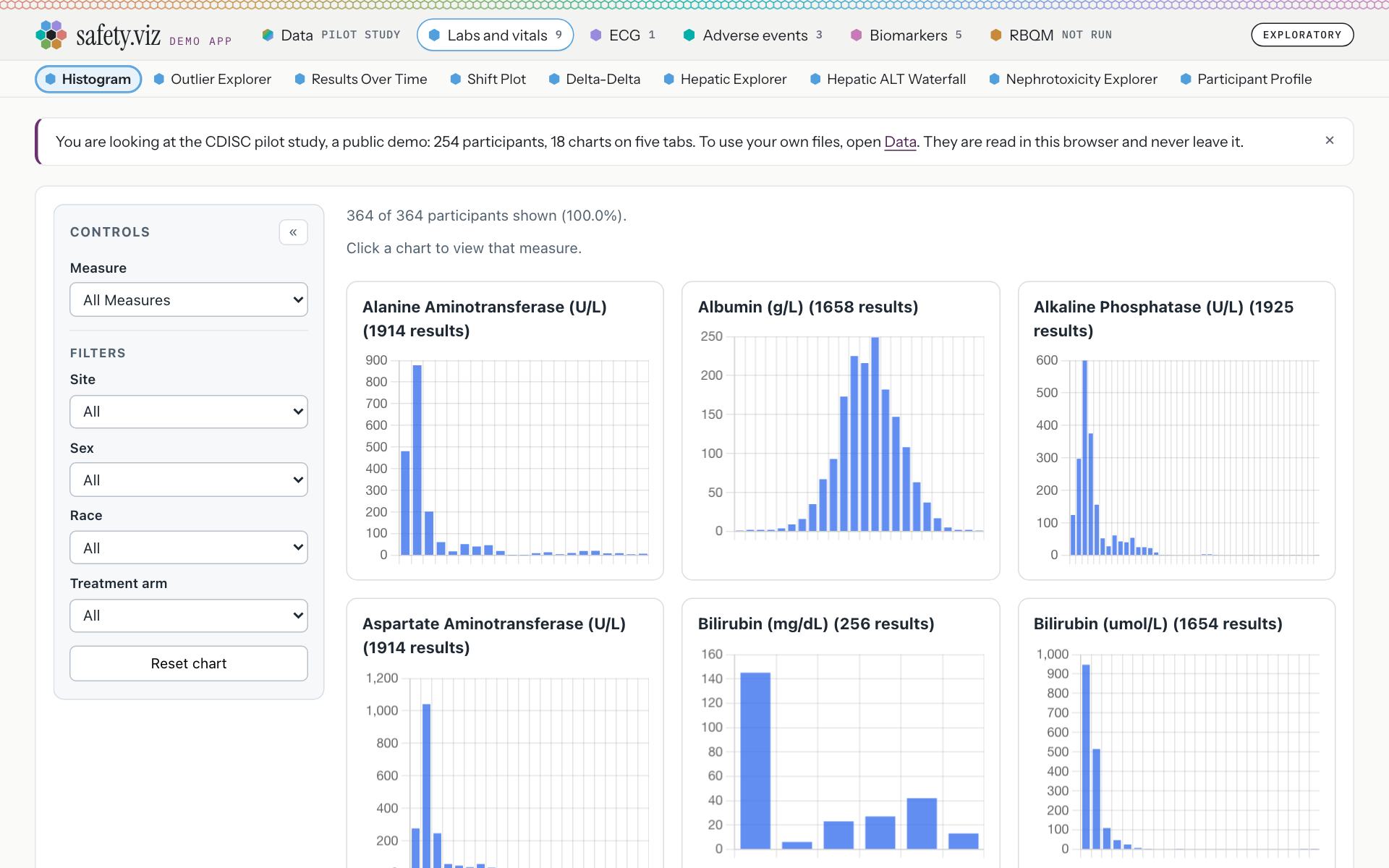
The app as it opens, on the pilot study.
Release 1.10. The Data tab reads “4 files”, a tab reads “9 of 9”, and Biomarkers and RBQM share one grey. There is no welcome line and no label, and the wordmark is not a link.
- The Data tab names the loaded study: “Pilot study”, where it read “4 files”.
- A tab shows one number when every chart draws: “9”, where it read “9 of 9”.
- Biomarkers has a colour of its own, pink, and its chart names take it.
- RBQM is amber. Both were grey, and read as switched off.
- The welcome line, on first open: “You are looking at the CDISC pilot study, a public demo: 254 participants, 18 charts on five tabs. To use your own files, open Data. They are read in this browser and never leave it.” The cross closes it, and it stays closed for the visit.
- The wordmark is a link back to the docs site (“safety.viz: docs and chart gallery”).
- The app’s status label, the subject of section 02.
- The browser tab names the open view: “Histogram · safety.viz demo”, then “Adverse Event Explorer · safety.viz demo”, then “RBQM · safety.viz demo”. Release 1.10 read “safety.viz demo” on every view.
- The app and the docs site share one favicon, the hex mark.
- The colours come from a rule, not a list of tabs. A module names its own colour or is given the first open one of pink, amber and green; none is ever grey, and red is never given out because it means missing. Biomarkers and RBQM name none, so the rule gave them #c67bb6 and #c78a3b.
On a phone
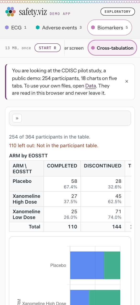
A link to a tab now opens with that tab in view, and every tab and chart name is tall enough to press.
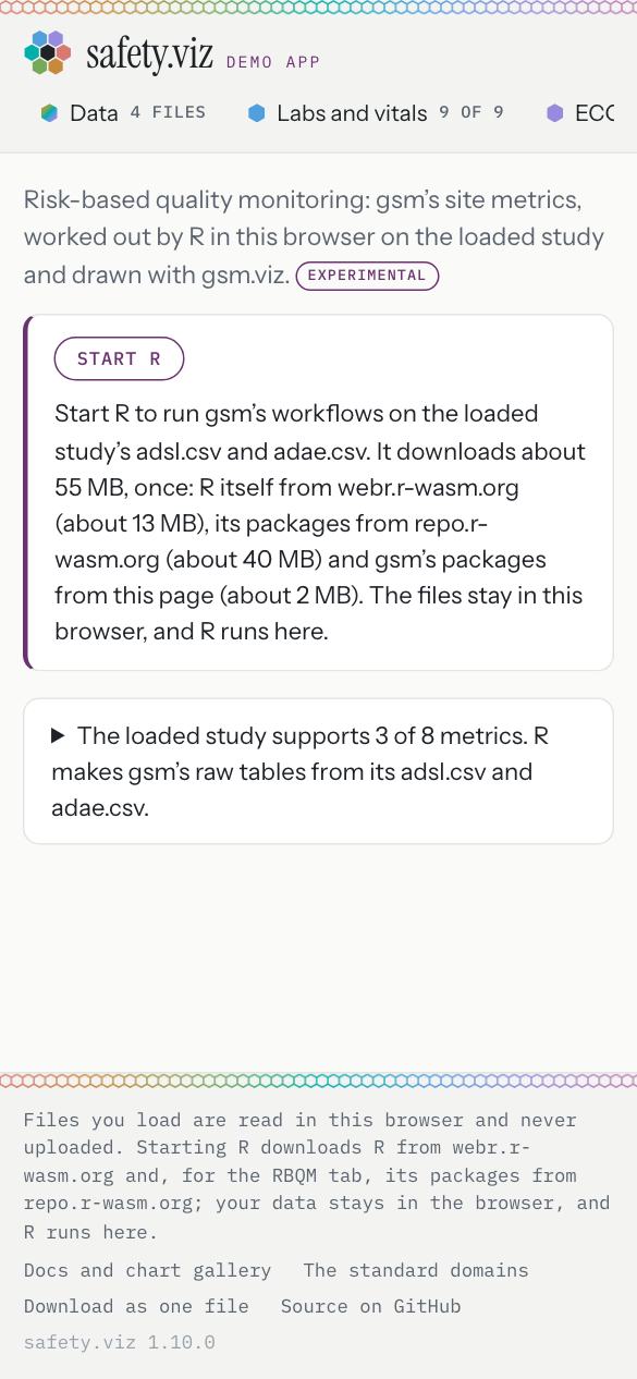
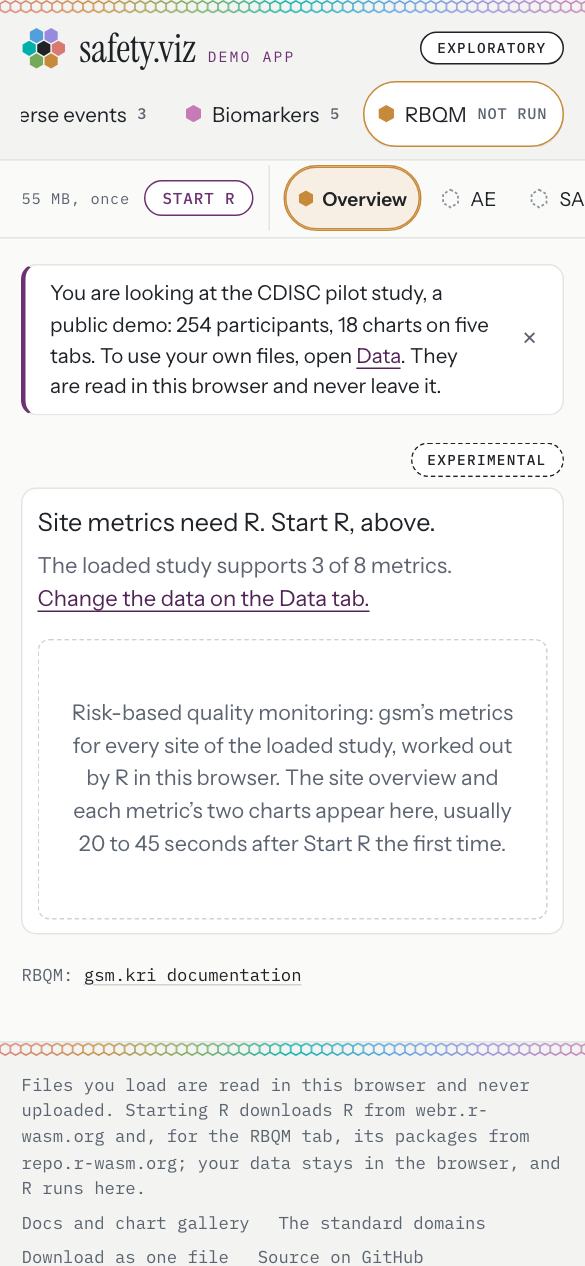
A link to the RBQM tab, opened at 390 pixels wide.
Release 1.10. The RBQM tab sits 792 pixels from the left of a 390-pixel screen, out of sight, and the shortest name is 30 pixels tall.
- The RBQM tab is in view, and every tab and name is at least 44 pixels tall.
The RBQM tab’s footnote
- Asked during the build: “what should the two links of the RBQM tab's footnote open?” (the question, with its four choices, safety.viz #271).
- You chose, in the session on 10 October 2026: “One link, gsm.kri docs” (the answer, on the same task).
- What it is: the RBQM tab ends with “RBQM: gsm.kri documentation”, a link to gsm.kri’s documentation site that opens in a new tab, in the same line a chart’s footnote uses.
- A page on the docs site for the RBQM tab, the third choice, is filed as a follow-up (the requirement, obot.roadmap #415).
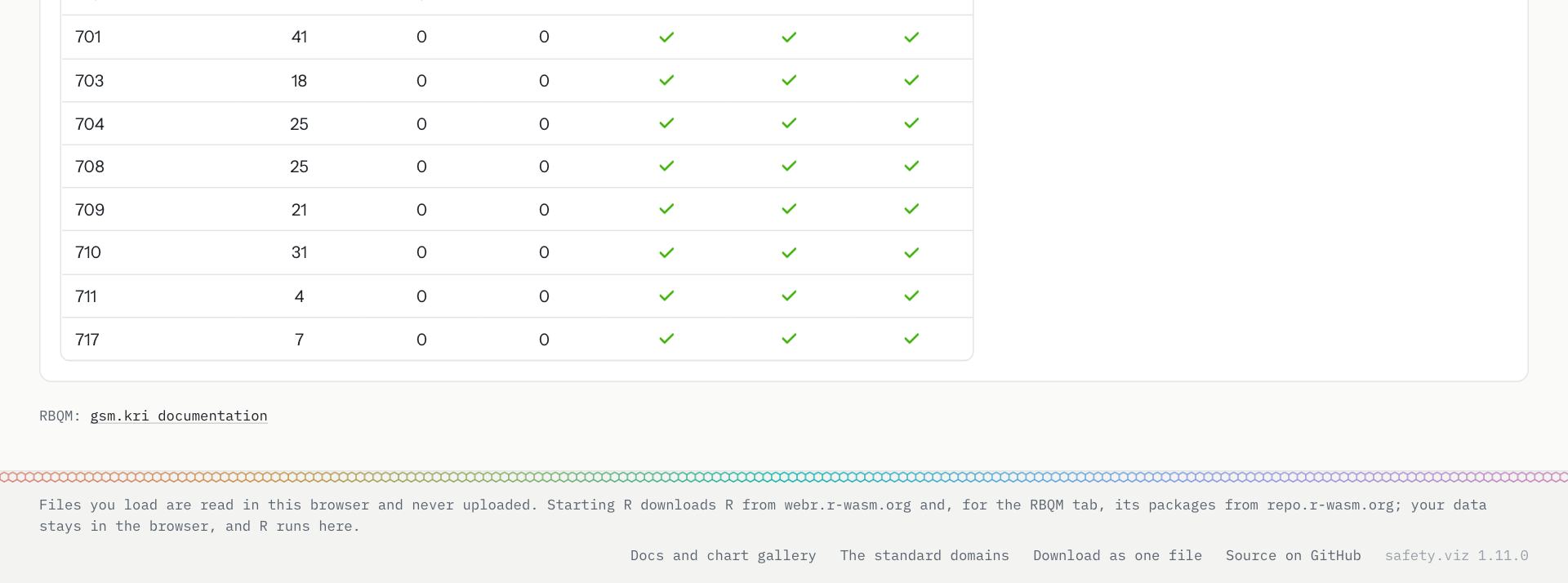
The foot of the RBQM tab, after a run on the pilot study. The app’s footer under it reads “safety.viz 1.11.0”.
- The footnote: “RBQM: gsm.kri documentation”, one link, to gilead-public.github.io/gsm.kri/, opening in a new tab. It sits under the tab’s page before R is started, after a run and on a metric’s page, and at 390 pixels it is on the page with nothing scrolling sideways.
One label says how far to trust it
The ladder has four rungs: Qualified, Exploratory, Experimental and Prototype. Nothing is Qualified. The app carries one label, Exploratory, and a chart or tab carries its own only when it is below that rung.
Requirement: one status ladder, with one label for the app and one for anything below it (obot.roadmap #403) Pull request: the status ladder (safety.viz #296) As drawn in mockup 1 and mockup 2
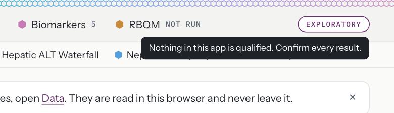
On hover, one line: “Nothing in this app is qualified. Confirm every result.”
- The label is a button: it takes focus from the keyboard, opens on Enter and closes on Escape.
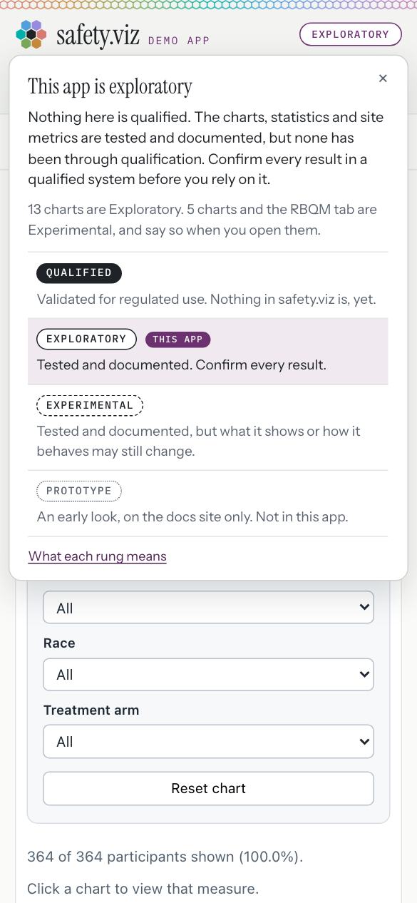
On a phone the same panel opens on a tap, inside the screen: it sits 8 pixels in from each edge of a 390-pixel screen.
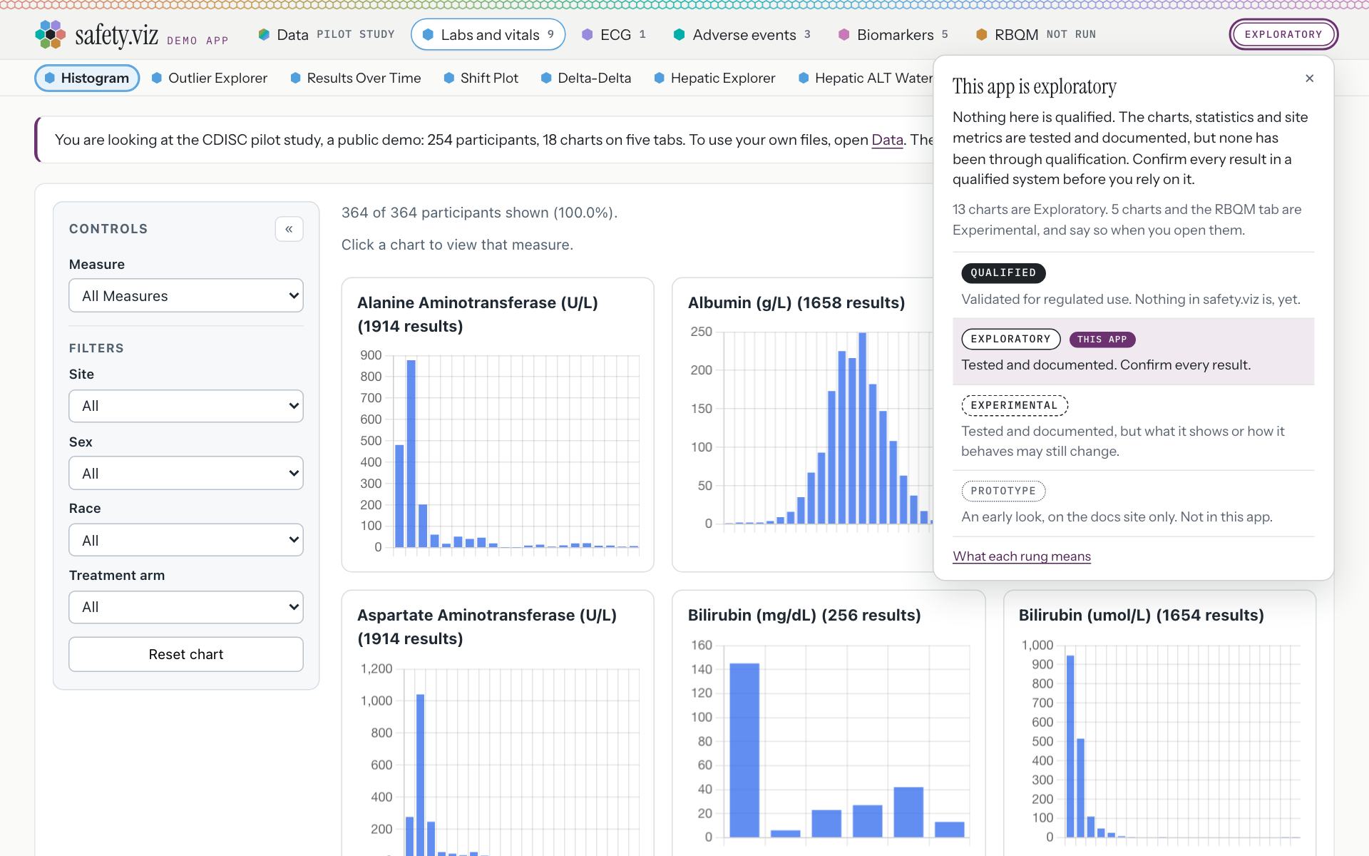
On a click, a panel headed “This app is exploratory”.
- The one label in the header.
- The disclaimer: “Nothing here is qualified. The charts, statistics and site metrics are tested and documented, but none has been through qualification. Confirm every result in a qualified system before you rely on it.”
- What is on each rung: “13 charts are Exploratory. 5 charts and the RBQM tab are Experimental, and say so when you open them.”
- The four rungs, with the app’s marked. A link under them leads to what each rung means, in the hub’s developer guidelines.
A chart below Exploratory says so on its card
Five charts and the RBQM tab are Experimental. Each carries the label on the corner of its card, with its reason one click away. The other 13 charts carry no second label.
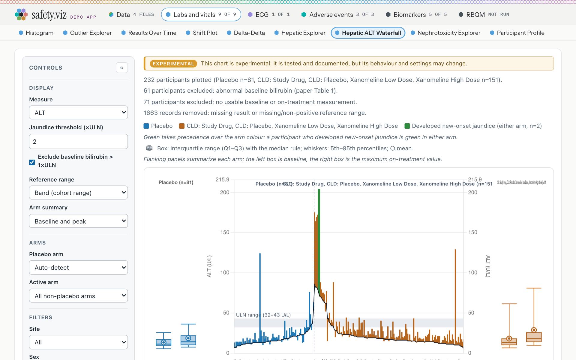
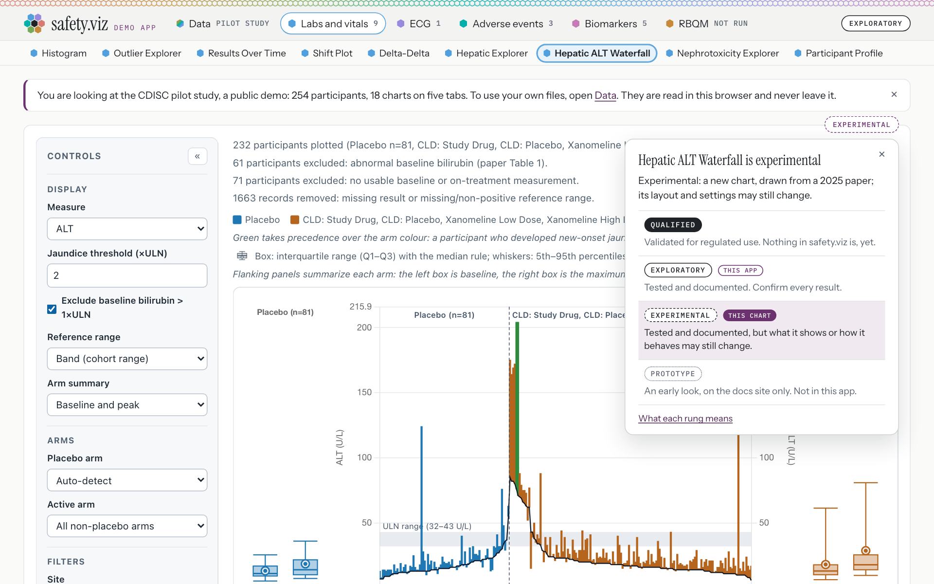
The Hepatic ALT Waterfall, with its label open.
Release 1.10. An amber banner inside the chart said “This chart is experimental: it is tested and documented, but its behaviour and settings may change.” The header carried no label at all.
- The label sits on the corner of the card, outside the chart. The banner inside the chart is gone.
- The chart’s own reason: “Experimental: a new chart, drawn from a 2025 paper; its layout and settings may still change.”
- The same four rungs, with this chart’s marked and the app’s beside it.
| Experimental | The reason on its label, as shipped |
|---|---|
| Hepatic ALT Waterfall | “Experimental: a new chart, drawn from a 2025 paper; its layout and settings may still change.” |
| Nephrotoxicity Explorer | “Experimental until its kidney-injury staging has had a clinical review.” |
| Participant Profile | “Experimental: what it lists for a participant, and how, may still change.” |
| QT Safety Explorer | “Experimental: its settings and its table may still change.” |
| Time-to-Event Explorer | “Experimental until an external clinical review confirms its Kaplan–Meier estimates.” |
| The RBQM tab | “Experimental: new in 1.10. R runs in the browser, and what the tab shows may still change.” |
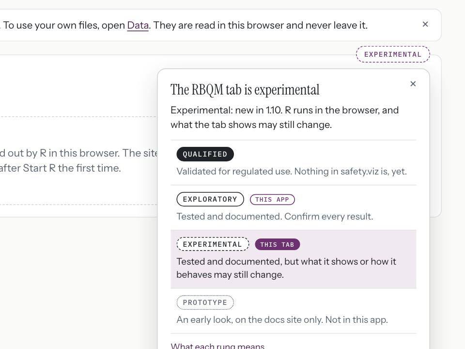
A tab carries the same label as a chart: “The RBQM tab is experimental”.
- The tab’s reason: “Experimental: new in 1.10. R runs in the browser, and what the tab shows may still change.”
- No chart draws a status banner inside itself any more: the script opened all 18 charts and found 0.
- The RBQM tab’s pill, and the one in its opening sentence, are gone. The tab carries the same label as a chart.
- A build stops with a sentence if any chart is marked Qualified. That is held by a unit test, not by this page (the requirement’s closing comment).
The status words, in full, for you to correct
These are drafts. You said they would ship and that you would correct them at the release candidate. All of them, as the live app prints them:
- The label’s line on hover
- “Nothing in this app is qualified. Confirm every result.”
- The disclaimer, in the panel
- “Nothing here is qualified. The charts, statistics and site metrics are tested and documented, but none has been through qualification. Confirm every result in a qualified system before you rely on it.”
- The count under it
- “13 charts are Exploratory. 5 charts and the RBQM tab are Experimental, and say so when you open them.”
- Qualified
- “Validated for regulated use. Nothing in safety.viz is, yet.”
- Exploratory
- “Tested and documented. Confirm every result.”
- Experimental
- “Tested and documented, but what it shows or how it behaves may still change.”
- Prototype
- “An early look, on the docs site only. Not in this app.”
- Hepatic ALT Waterfall
- “Experimental: a new chart, drawn from a 2025 paper; its layout and settings may still change.”
- Nephrotoxicity Explorer
- “Experimental until its kidney-injury staging has had a clinical review.”
- Participant Profile
- “Experimental: what it lists for a participant, and how, may still change.”
- QT Safety Explorer
- “Experimental: its settings and its table may still change.”
- Time-to-Event Explorer
- “Experimental until an external clinical review confirms its Kaplan–Meier estimates.”
- The RBQM tab
- “Experimental: new in 1.10. R runs in the browser, and what the tab shows may still change.”
Two things to notice as you read. The Qualified rung is described with the word “validated”, a word the standards keep for nothing here; the sentence does go on to say nothing is. The RBQM tab’s reason says “new in 1.10”, which now reads one release old.
The same label on the docs site
Every gallery card and every chart page’s title says its rung with the same component: 8 Exploratory, 5 Experimental and 1 Prototype. A Prototype is shown on the docs site only.
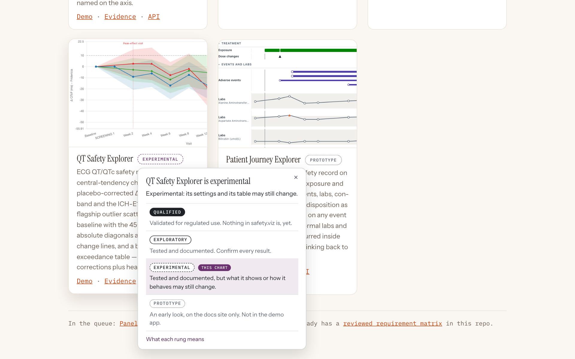
The gallery, with one card’s label open: “QT Safety Explorer is experimental”, “Experimental: its settings and its table may still change.”
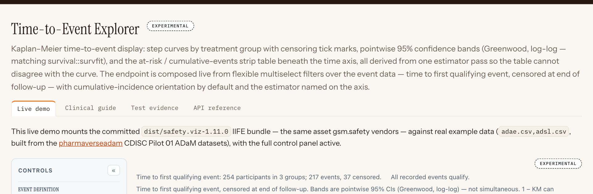
A chart’s page: “Time-to-Event Explorer”, with “Experimental” beside the title.
- The label beside the title. The page shows 2 labels: the chart beneath draws its own as well, at its top right.
One control starts R, then gets out of the way
R is started from one control at the right end of the chart names, the same on the Biomarkers tab and the RBQM tab. Once R is running the control is a small chip that opens R’s details. R still starts only when you ask.
Requirement: one R control, in the same place on both tabs that use R (obot.roadmap #404) Pull request: one R control, one set of sentences, and a limit on waiting for R (safety.viz #297) As drawn in mockup 3
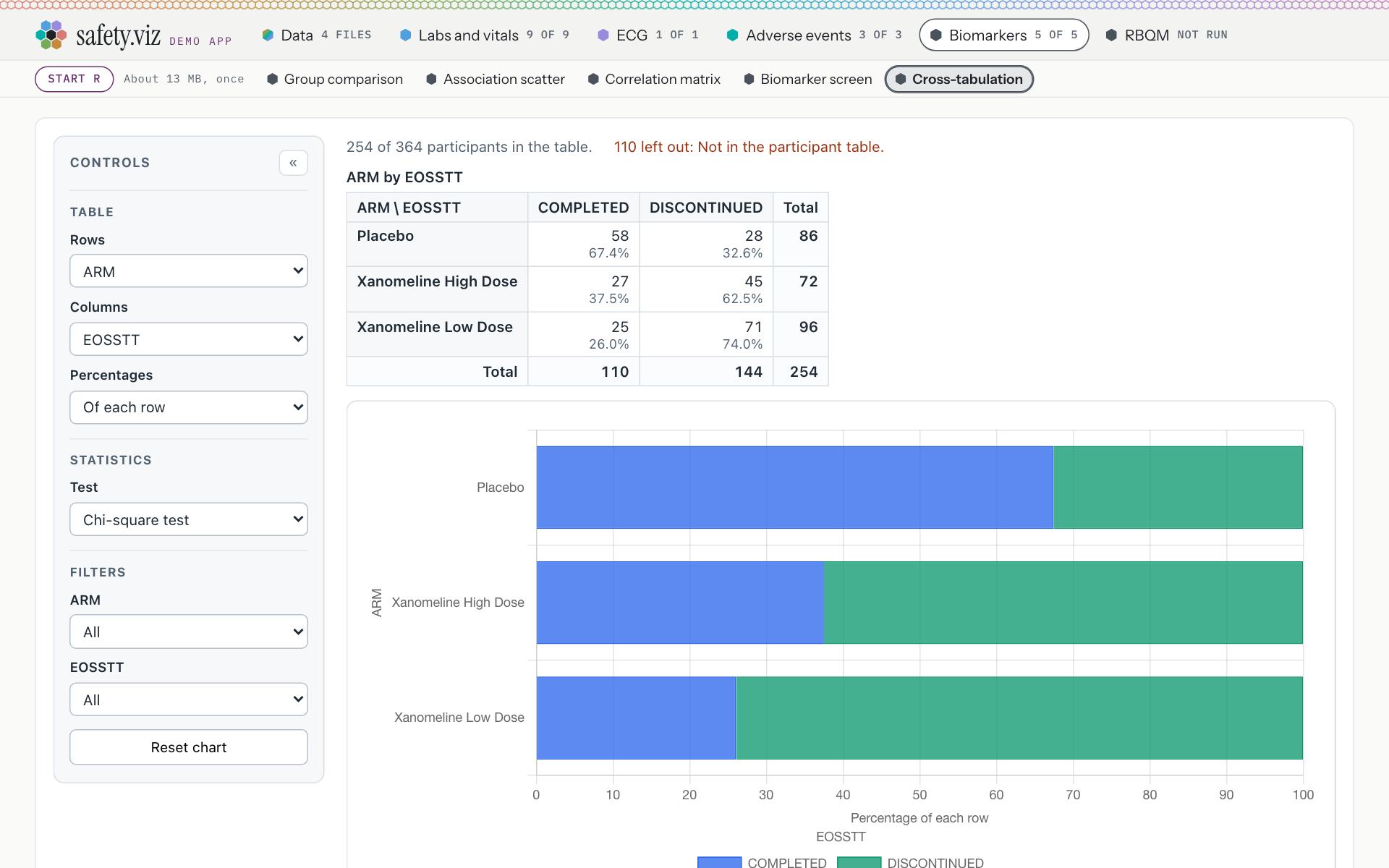
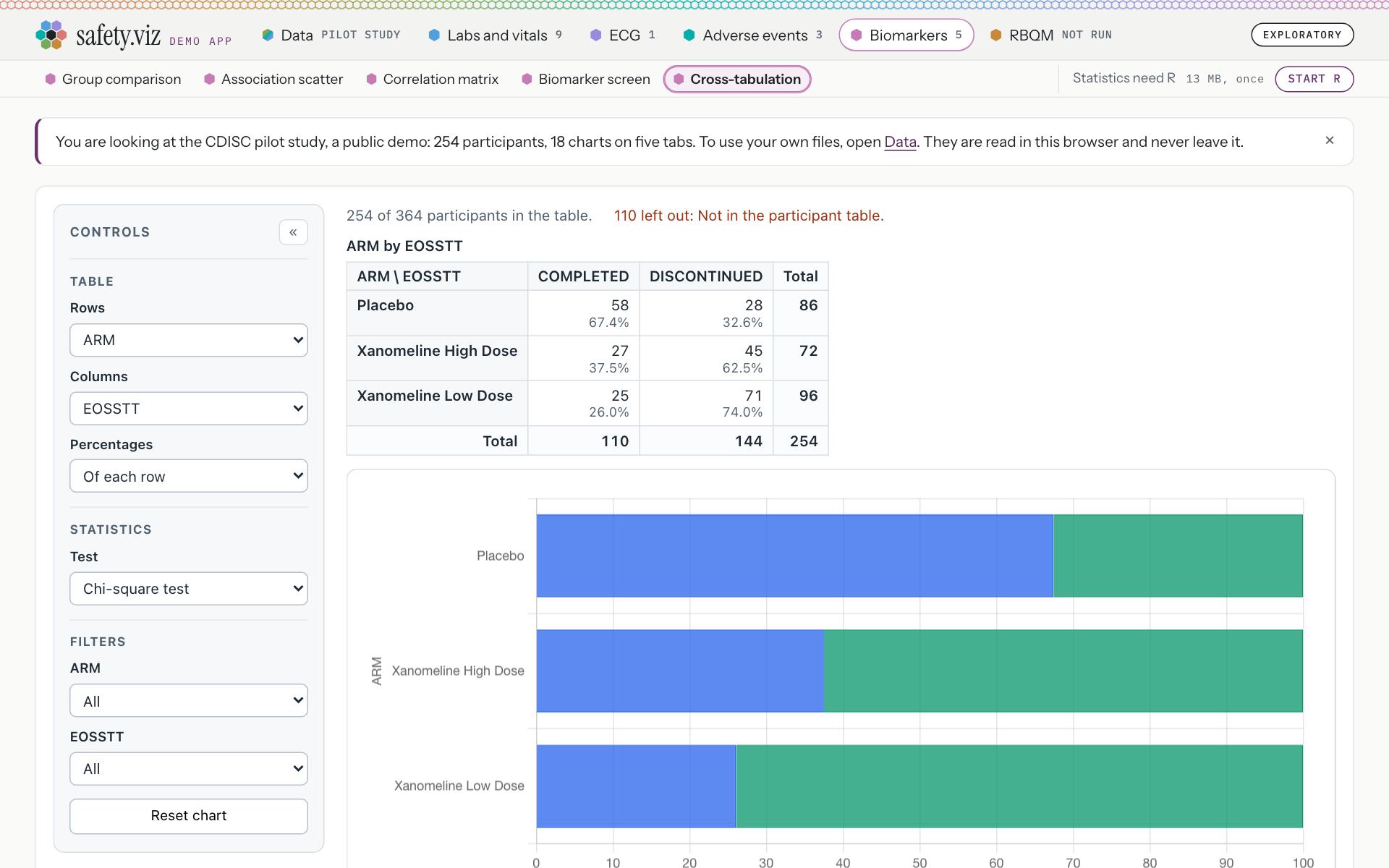
A biomarker chart before R is started.
Release 1.10. The Start R pill is at the front of the row, ahead of the chart names, and the line inside the chart is a long sentence: “Statistics need R. Start R to compute them: it downloads about 13 MB, once, from webr.r-wasm.org, and the study’s data stays in this browser.”
- The control, at the right end of the row and outside the list of names that scrolls: “Statistics need R · 13 MB, once · Start R”. Its whole sentence is on hover: “Statistics need R. Start R to compute them: about 13 MB, downloaded once from webr.r-wasm.org. The study’s data stays in this browser.”
- The chart names come first, in their tab’s colour.
Its four states
Before a press

“Statistics need R · 13 MB, once” and one button. Until it is pressed the page asks nothing of R’s addresses (0 requests).
Starting

“Starting R”, with the seconds counting. On this capture R’s test was on the chart 2.4 seconds after the press.
Ready
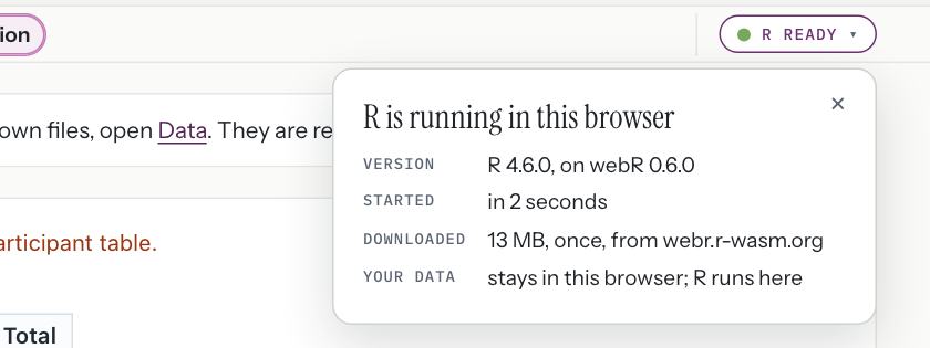
A chip, “R ready”. A click opens “R is running in this browser”: version, “R 4.6.0, on webR 0.6.0”; started, “in 2 seconds”; downloaded, “13 MB, once, from webr.r-wasm.org”; your data, “stays in this browser; R runs here”.
Did not start
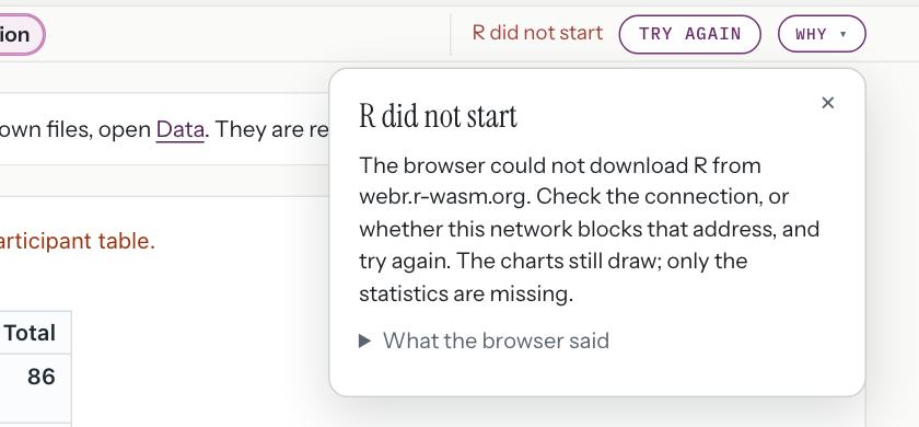
With R’s addresses blocked: “R did not start”, “Try again” beside it, and the reason one click away. The browser’s own message is folded under “What the browser said”.
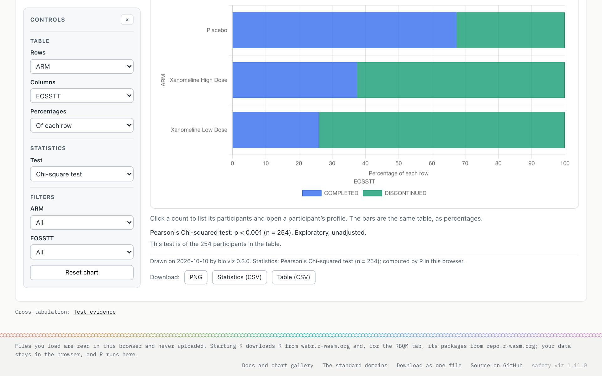
After the press, R’s test appears under the chart with nothing drawn again.
- “Pearson's Chi-squared test: p < 0.001 (n = 254). Exploratory, unadjusted.” Before the press the same line read “Statistics need R. Start R, at the top right.”
- Both tabs say the same thing when R cannot start. On the Biomarkers tab the chart’s line reads “R did not start, so there is no test. Try again, at the top right.” On the RBQM tab the body reads “R did not start, so no metric was run. Try again, at the top right.”
- The reason is in plain words: “The browser could not download R from webr.r-wasm.org. Check the connection, or whether this network blocks that address, and try again. The charts still draw; only the statistics are missing.”
- Starting R on the Biomarkers tab downloaded 12.6 MB on this capture; the control says 13 MB.
- The RBQM tab now gives up on an R that stops answering: after ten minutes to start, three to load gsm’s packages or five to run, it says R stopped answering, closes that R and offers Try again. That is held by unit tests, since a browser test would have to wait a limit out (the requirement’s closing comment).
- Not in this release: one R shared by both tabs. Each tab still starts its own, so a visitor who uses both downloads R twice (the follow-up requirement, obot.roadmap #414).
The RBQM tab reads like the other tabs
The tab has the same row of names every other tab has, with Overview first and then the eight site metrics, each marked with its state. One press of the R control runs everything. The result comes first, and the run’s details are folded behind the chip.
Requirement: the RBQM tab reads at a glance (obot.roadmap #405) Pull request: a row of metrics, the app’s R control, one page at a time (safety.viz #298) As drawn in mockup 4 and mockup 5
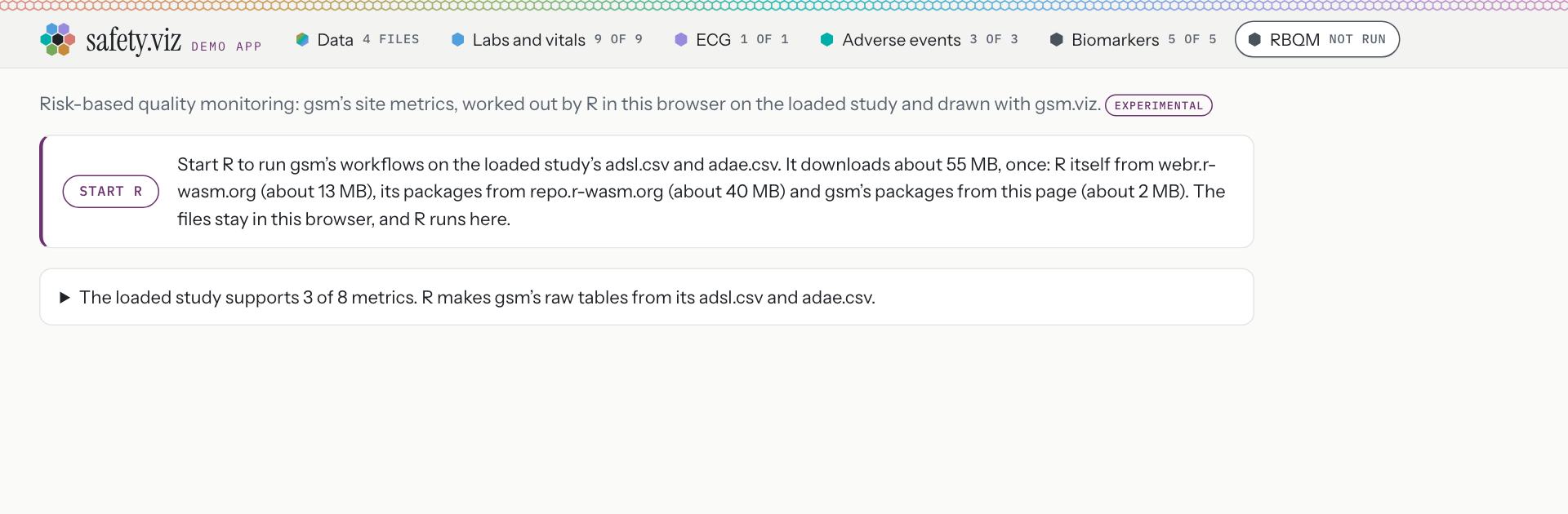
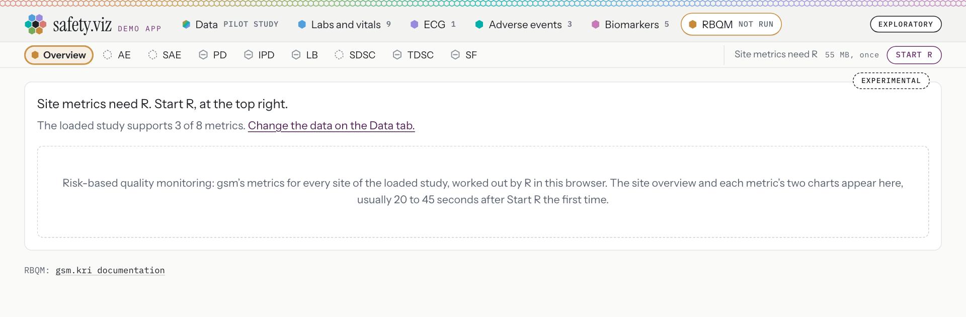
The RBQM tab on the pilot study, before R is started.
Release 1.10. The tab has no row of names, so it looks like a different kind of page. It opens on a paragraph and a box: “Start R to run gsm’s workflows on the loaded study’s adsl.csv and adae.csv. It downloads about 55 MB, once: R itself from webr.r-wasm.org (about 13 MB), its packages from repo.r-wasm.org (about 40 MB) and gsm’s packages from this page (about 2 MB). The files stay in this browser, and R runs here.”
- The row: Overview, then the eight metrics. A dashed hex is not started; a grey hex with a bar cannot run, because the study has no data for it. Each item’s name for a screen reader carries the state in words, such as “Adverse Event Rate: not started”.
- The same control as on the Biomarkers tab: “Site metrics need R · 55 MB, once · Start R”.
- One line in the body, “Site metrics need R. Start R, at the top right.”, and what the study supports: “The loaded study supports 3 of 8 metrics. Change the data on the Data tab.”
- The tab’s status label, on the corner of its card.
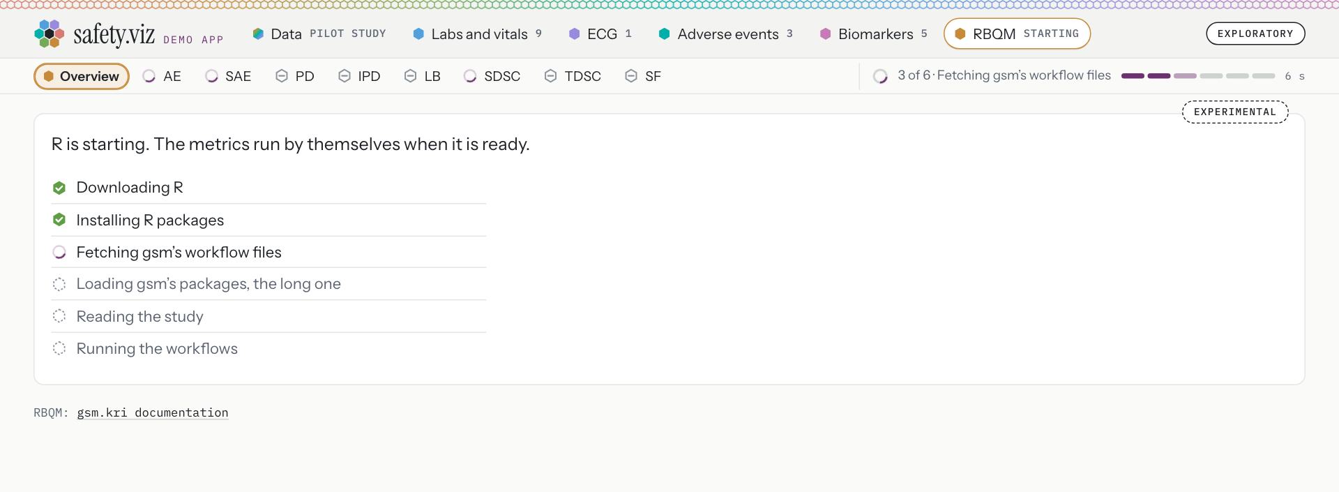
After one press: “R is starting. The metrics run by themselves when it is ready.”
- The control names the step and counts it: “3 of 6 · Fetching gsm’s workflow files”, with six segments and the seconds.
- The body ticks six steps off: Downloading R; Installing R packages; Fetching gsm’s workflow files; Loading gsm’s packages, the long one; Reading the study; Running the workflows. Only one is called the long one.
- Each metric that will run turns in the row.
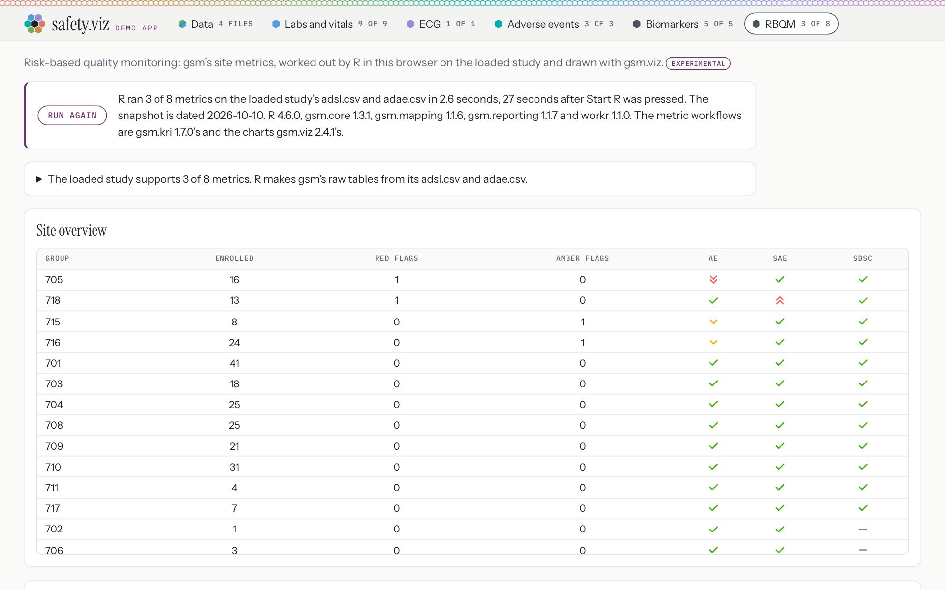
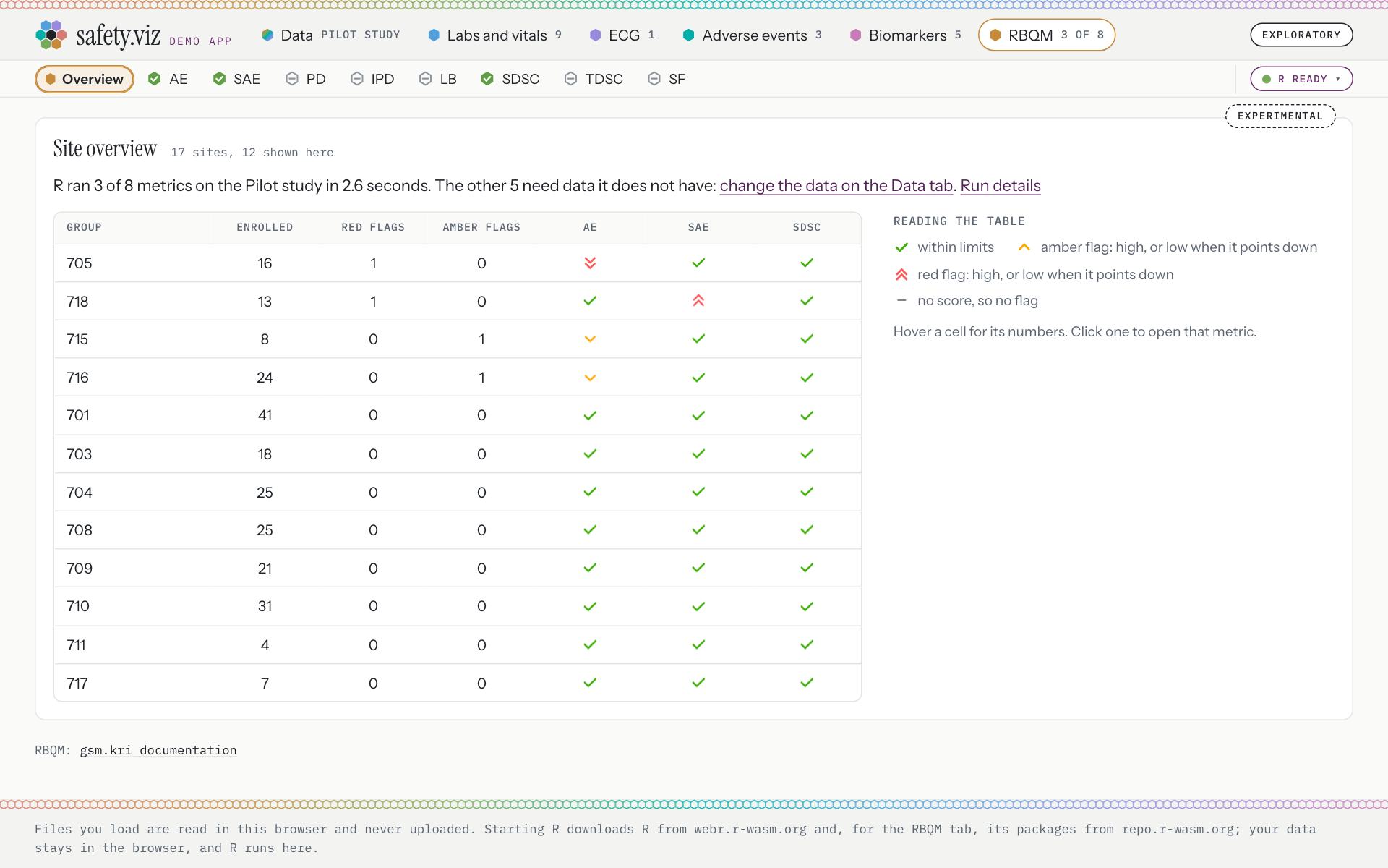
After the run, on the pilot study.
Release 1.10. The run box outweighs the result: “R ran 3 of 8 metrics on the loaded study’s adsl.csv and adae.csv in 2.6 seconds, 27 seconds after Start R was pressed. The snapshot is dated 2026-10-10. R 4.6.0, gsm.core 1.3.1, gsm.mapping 1.1.6, gsm.reporting 1.1.7 and workr 1.1.0. The metric workflows are gsm.kri 1.7.0’s and the charts gsm.viz 2.4.1’s.” The table is 1180 pixels wide, with a column as wide as 274 pixels, and its last row is cut through.
- Three metrics ran, each with a green tick; five did not, each with a grey bar. Grey, because missing data is not an error.
- The control is now a chip, “R ready”.
- One line says what ran: “R ran 3 of 8 metrics on the Pilot study in 2.6 seconds. The other 5 need data it does not have: change the data on the Data tab.” It ends with a link to Run details.
- The heading counts the sites: “17 sites, 12 shown here”. The last row in view is whole.
- No number or flag column is wider than 100 pixels, so the table is 744 pixels wide in a card of 1216.
- A key to the flags: within limits; amber flag: high, or low when it points down; red flag: high, or low when it points down; no score, so no flag. “Hover a cell for its numbers. Click one to open that metric.”
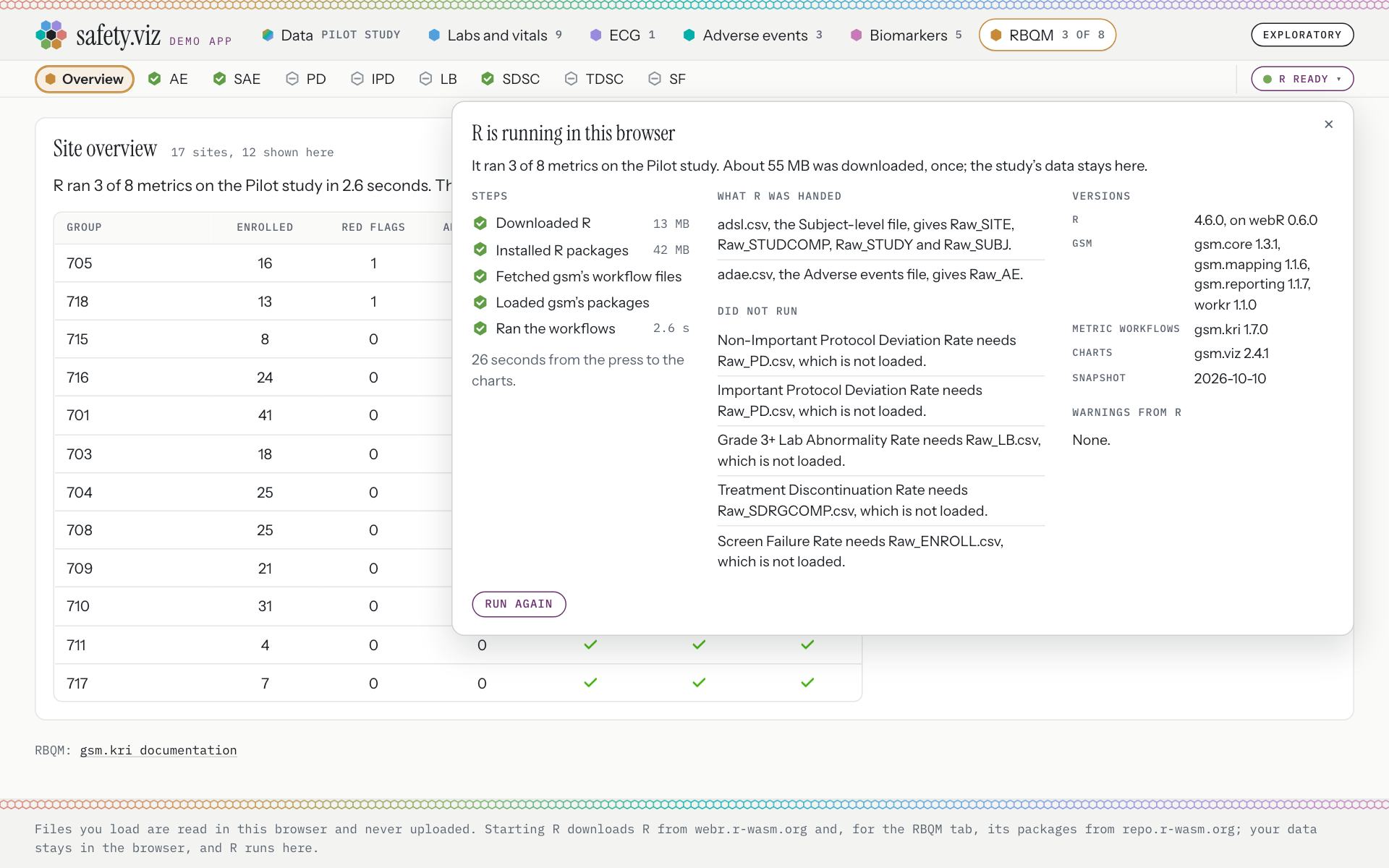
Run details, behind the chip and closed until asked for: “It ran 3 of 8 metrics on the Pilot study. About 55 MB was downloaded, once; the study’s data stays here.” “26 seconds from the press to the charts.”
- The panel’s headings are “Steps”, “What R was handed”, “Did not run”, “Versions”, “Warnings from R”. “Run again” sits at its foot.
One page at a time
The body shows the site overview or one metric’s two charts, never both. A metric opens from the row or from a cell of the overview, and has an address of its own.
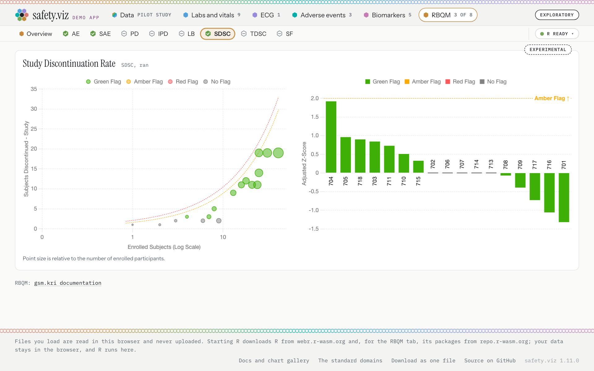
A click on a cell of the SDSC column opened “Study Discontinuation Rate” at the address “#rbqm/kri0006”: 2 charts and no table.
- The metric’s item is marked in the row.
- Its name and state: “SDSC, ran”.
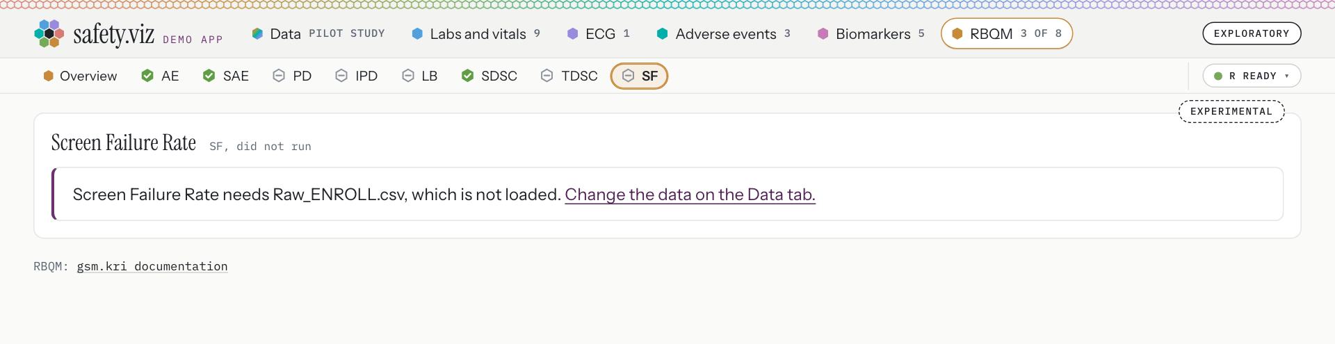
A metric that did not run has a page too (“SF, did not run”).
- Its item carries the grey bar.
- R’s own sentence, and where to go: “Screen Failure Rate needs Raw_ENROLL.csv, which is not loaded.” “Change the data on the Data tab.”
All eight metrics, at 150 sites
With the RBQM study chosen on the Data tab and R already running, the tab ran by itself: “R ran 8 of 8 metrics on the 9 loaded files in 3.7 seconds. To use other files, change the data on the Data tab.”
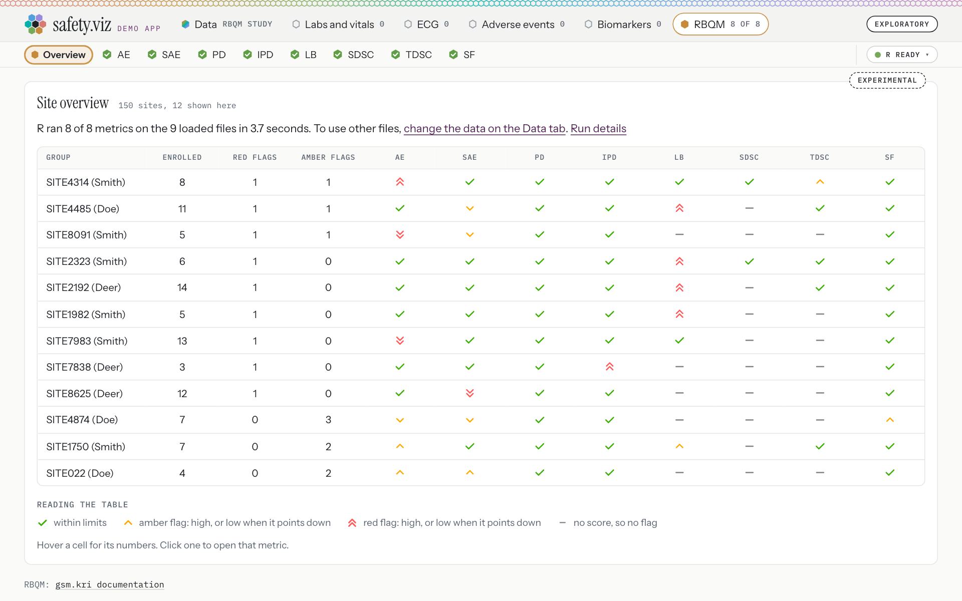
The RBQM study: nine raw files in gsm’s format, for a synthetic study of 765 enrolled participants.
- All eight ran, and the row still fits beside the control.
- “150 sites, 12 shown here”. With eight metrics the columns share the card evenly, the widest 98 pixels, and nothing scrolls sideways.
- The Data tab names the study: “RBQM study”.
On a phone
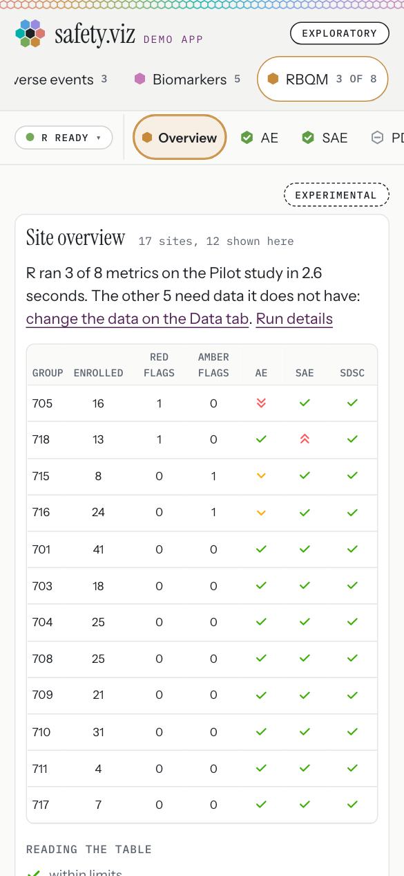
The overview at 390 pixels wide. Nothing scrolls sideways, and the table’s headings are 10 pixels.
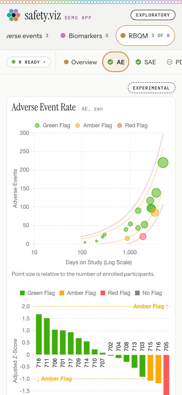
A metric’s page, opened from a cell.
All files come in on the Data tab
There is now one place to load files. The Data tab recognises raw files in gsm’s format and keeps them as they are, one card says how many RBQM metrics the loaded data supports, and the RBQM tab’s own file box is gone.
Requirement: all files come in on the Data tab (obot.roadmap #406) Pull request: gsm raw files recognised there, one RBQM card, the file box gone (safety.viz #299) As drawn in mockup 6
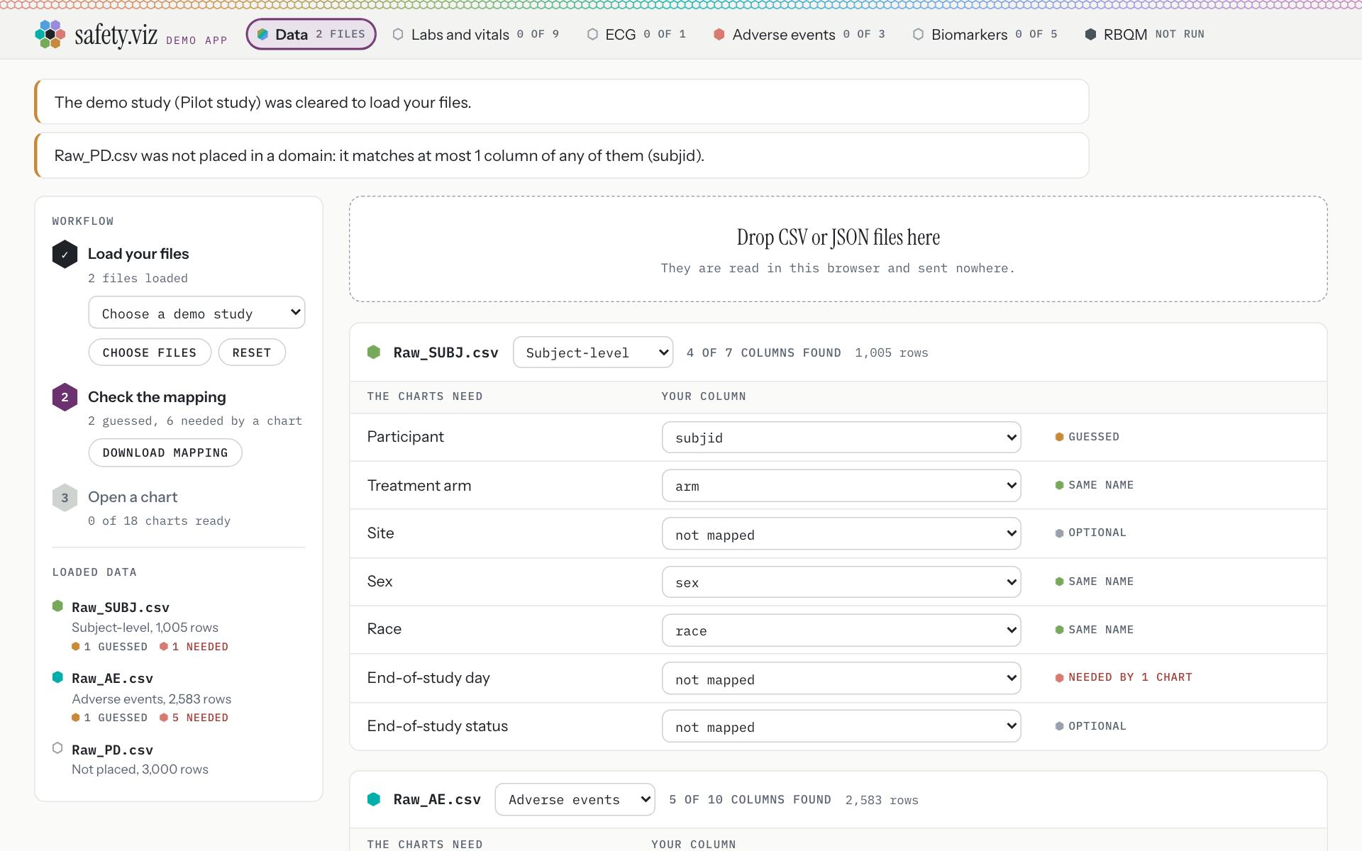
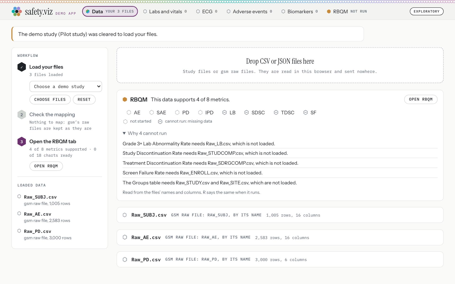
Three raw files dropped on the Data tab: Raw_SUBJ.csv, Raw_AE.csv and Raw_PD.csv.
Release 1.10, with the same three files. They are taken for a study’s standard files: “Raw_SUBJ.csv: Subject-level, 1,005 rows”, “Raw_AE.csv: Adverse events, 2,583 rows”, “Raw_PD.csv: Not placed, 3,000 rows”. The RBQM tab then said “The loaded study supports 0 of 8 metrics. R makes gsm’s raw tables from its Raw_SUBJ.csv and Raw_AE.csv.”
- The Data tab names what is loaded: “Your 3 files”.
- Said once: “The demo study (Pilot study) was cleared to load your files.”
- The RBQM card: “This data supports 4 of 8 metrics.” Its button, “Open RBQM”, opens the tab.
- An icon for each metric, the same icons as the tab’s row.
- “Why 4 cannot run”, in R’s own words: “Grade 3+ Lab Abnormality Rate needs Raw_LB.csv, which is not loaded.” “Study Discontinuation Rate needs Raw_STUDCOMP.csv, which is not loaded.” “Treatment Discontinuation Rate needs Raw_SDRGCOMP.csv, which is not loaded.” “Screen Failure Rate needs Raw_ENROLL.csv, which is not loaded.” “The Groups table needs Raw_STUDY.csv and Raw_SITE.csv, which are not loaded.”
- Step three now reads “Open the RBQM tab” (“4 of 8 metrics supported · 0 of 18 charts ready”), and step two says “Nothing to map: gsm’s raw files are kept as they are”.
- Each raw file keeps a card of its own, with the raw domain it was read as: “gsm raw file: Raw_SUBJ, by its name”.
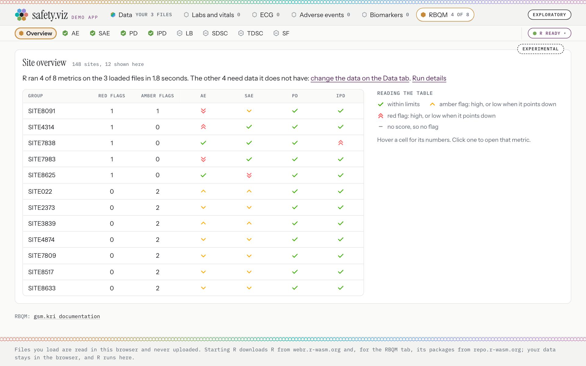
The card’s button opens the RBQM tab, and one press runs the four metrics the files support.
- “R ran 4 of 8 metrics on the 3 loaded files in 1.8 seconds. The other 4 need data it does not have: change the data on the Data tab.”
- The four that ran are ticked. The tab has no drop zone and no file box (0 found); its line links to the Data tab.
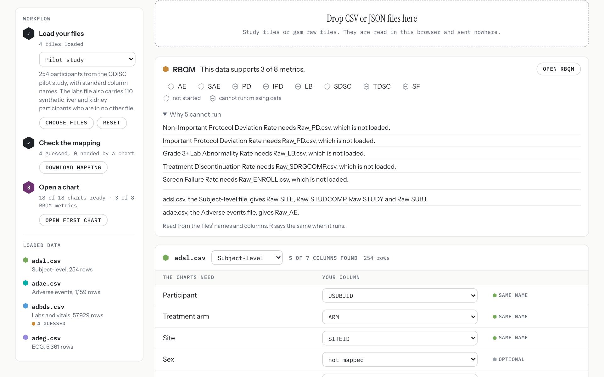
On a study of standard files, the same card says which of gsm’s raw tables R makes from which file.
- “This data supports 3 of 8 metrics.” “adsl.csv, the Subject-level file, gives Raw_SITE, Raw_STUDCOMP, Raw_STUDY and Raw_SUBJ.” “adae.csv, the Adverse events file, gives Raw_AE.”
- “Open RBQM” opens the tab.
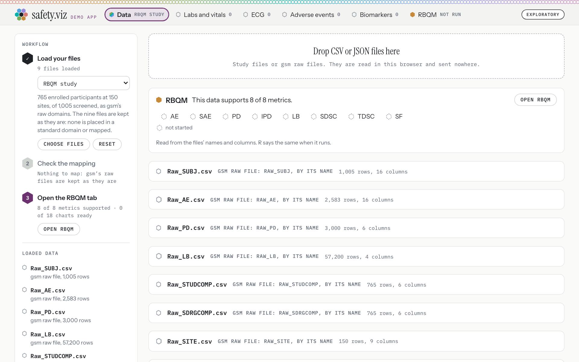
The RBQM study, chosen from the study menu: 9 raw file cards.
- “This data supports 8 of 8 metrics.”
- A file is taken for a gsm raw file only when its name starts with “Raw_” or its columns match exactly one raw domain. Everything else is read as a study file, as before.
- The “Renamed columns” demo study has a file called ae.csv. It is still read as the adverse events file, and that study’s tabs count what they counted in release 1.10: Labs and vitals 6 of 9, ECG 0, Adverse events 1 of 3, Biomarkers 5, RBQM not run.
- A raw file that is not CSV is refused with a sentence: “Raw_AE.json is not a CSV file: the RBQM tab reads gsm’s raw files as CSV.”
- The drop zone says it takes both: “Study files or gsm raw files. They are read in this browser and sent nowhere.”
- Reading gsm raw files in the app is an interim path, so this is the least that moving the loading needed. Your words on 9 October 2026: “I’m hoping to move to RAW -> SDTM -> ADaM for everything. Not in this releases though”.
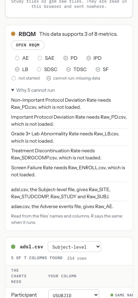
The RBQM card at 390 pixels wide. Nothing scrolls sideways.
Nothing looks broken
The review of release 1.10 found defects that were not matters of taste. Each is fixed in the chart or the site file that caused it, and a new browser test walks the path the keynote will take.
Requirement: nothing looks broken (obot.roadmap #407) Pull requests: the docs home page’s count (safety.viz #289), the waterfall’s titles and three phone-width defects (safety.viz #294), the demo path’s test (safety.viz #301), and the count again (safety.viz #303) Found in the design review of release 1.10
The Hepatic ALT Waterfall’s titles fit a long arm name


The titles over the chart, on the pilot study. The long name is cut short with its count kept whole, and hovering shows all of it: “CLD: Study Drug, CLD: Placebo, Xanomeline Low Dose, Xanomeline High Dose (n=151)”
Release 1.10. The active arm’s title is every arm that is not placebo, joined together. It prints across the placebo title, and at the right it is squeezed too small to read.
On a phone, a wide table scrolls inside its own box
In release 1.10 a table wider than the screen pushed the whole page sideways, or was cut off where it could not be reached. Each page now lays out at the screen’s width.
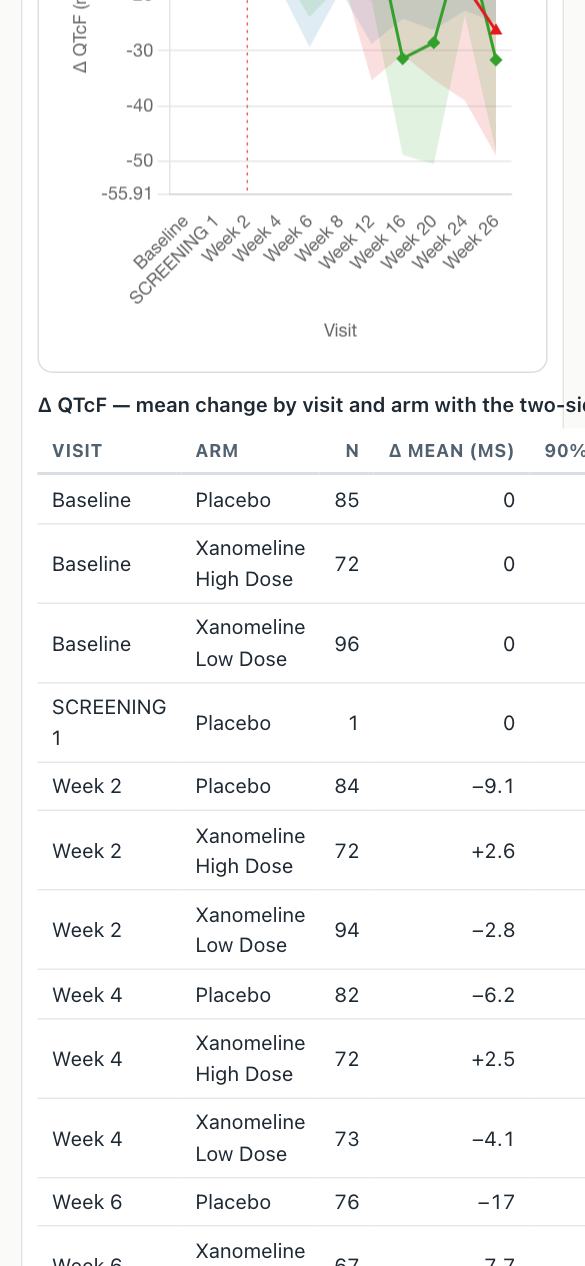
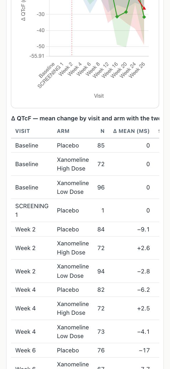
The QT Explorer’s table, in the demo app.
Release 1.10. The page is laid out 554 pixels wide on a 390-pixel screen.
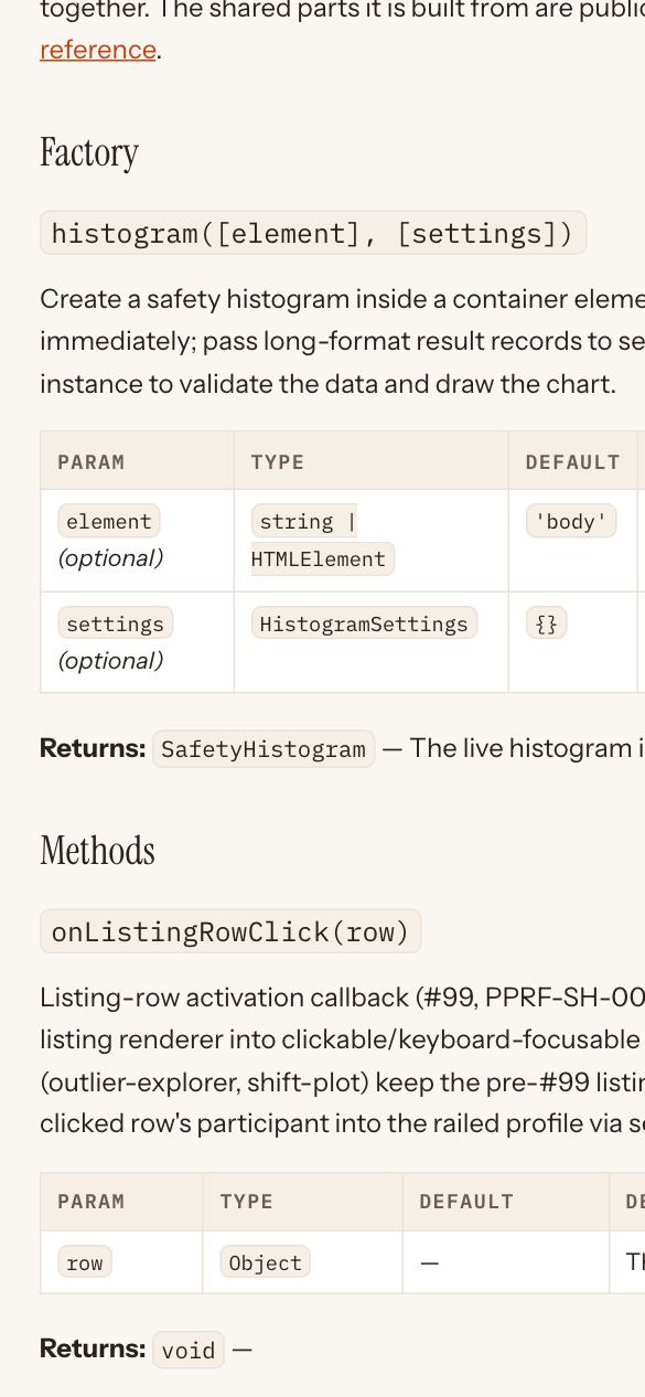
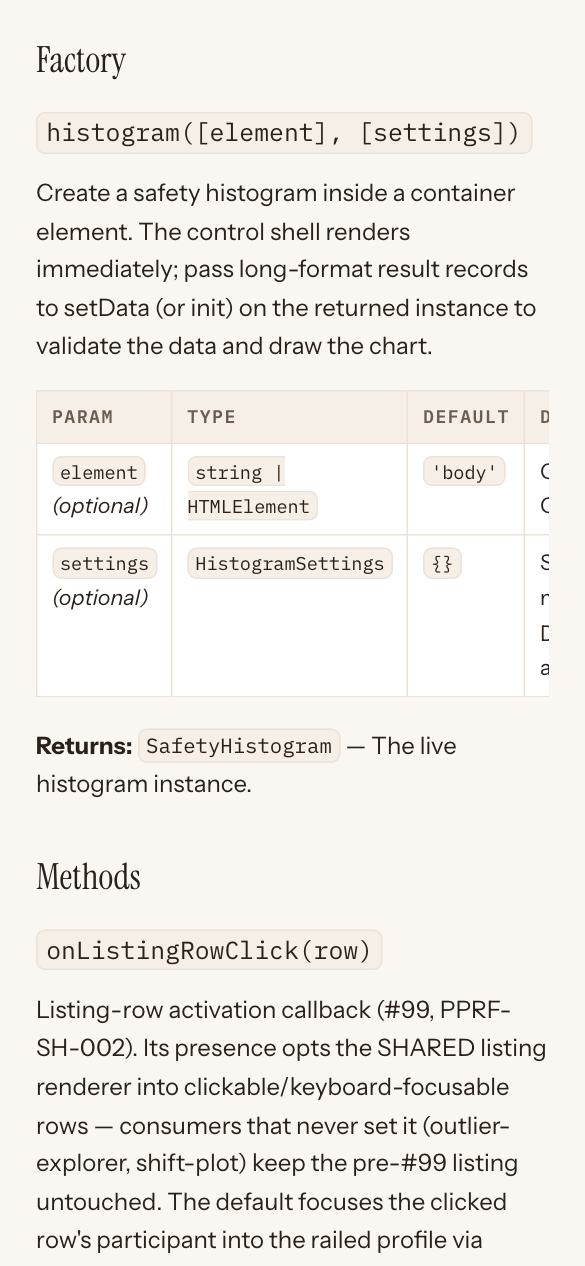
A chart’s API reference page, on the docs site.
Release 1.10. The page is laid out 669 pixels wide on a 390-pixel screen.
| Page, at 390 pixels wide | Laid out, 1.10 | Laid out, 1.11 | Its widest table | The box it scrolls in |
|---|---|---|---|---|
| The QT Explorer, in the demo app | 554 px | 390 px | 529 px | 340 px |
| The QT Explorer’s page on the docs site | 555 px | 390 px | 531 px | 342 px |
| The Hepatic Explorer’s page on the docs site | 544 px | 390 px | 520 px | 342 px |
| A chart’s API reference page | 669 px | 390 px | 645 px | 342 px |
The docs home page’s count
- The docs home page’s description counts the site’s charts from its configuration. It begins “Thirteen classic clinical-safety graphics”, where release 1.10’s began “Nine classic clinical-safety graphics”. A Prototype is not counted.
- The capture for this page found the count wrong again: the dev site read “Fourteen classic clinical-safety graphics”, with the Prototype counted. It was fixed the same day, 10 October 2026 (the fix, safety.viz #303), and the script now holds the page to “Thirteen”.
A test walks the keynote’s demo path
- A browser test now walks the path the keynote will take, on the deployed dev site at the size of a shared screen, with real R. It fails on any console error or failed request. Its task is closed (safety.viz #287; its pull request, safety.viz #301).
- It is run with
npm run demo-path. Its run on GitHub passed (the run), and its nine screenshots are kept with the app’s evidence (the screenshots). - The eight steps it walks, and their order, are yours to change: they are listed in the box at the top.
The standards this release set are written down
What the release decided about how an app should look and read is now written where the next session will read it, so that the next chart or tab is built the same way. Documents and one skill; nothing in the app.
Requirement: the standards are written into the scaffold (obot.roadmap #408)
- The hub’s developer guidelines carry the status ladder and how anything a person looks at is designed and checked (the status ladder; designing and checking what people look at). The label’s panel in the app links the first.
- safety.viz’s contributing guide has a new section, “Demo app conventions”, and its porting skill carries the same (the section; merged in safety.viz #301; the task, safety.viz #288).
- The session skill tells a session to build a visible change from its mockup and look at it in a browser before the task closes (the task, obot.agent #361).
- All seven requirements are closed (the table at the foot of this page).
What did not change
Release 1.11 changes how the app reads. It does not change what the app works out.
- No chart is added and no metric is added. The app still has 18 charts on five tabs and eight site metrics.
- Nothing computed changes. safety.viz has a browser test that holds every row R returns for the eight metrics on the RBQM study to the rows desktop R returns, to eight decimal places. It is in the check every pull request must pass before it merges, and it passed at each merge of this release with desktop R’s rows untouched (the R control’s closing comment says so for its merge).
- That check still runs every test. During this release it was split into four jobs, and it now answers in about seven minutes where it took 22 (the task that split it, safety.viz #292; safety.viz #291; safety.viz #316).
- What that test rests on is release 1.10’s. Of the 332 files added, changed or removed since the release 1.10 tag, one is among desktop R’s stored rows, the R that runs the metrics and gsm’s copied workflow files: the tab’s file of expected rows gained 154 lines, the case for the three files dropped on the Data tab, and lost none.
- The versions are the same on both sites: R: 4.6.0, on webR 0.6.0; gsm’s packages: gsm.core 1.3.1, gsm.mapping 1.1.6, gsm.reporting 1.1.7, workr 1.1.0; metric workflows: gsm.kri 1.7.0; charts: gsm.viz 2.4.1. Release 1.10’s run box named the same ones.
- The pilot study gives the same answer on both sites: 17 sites, with site 705 first at 16 enrolled and 1 red flag.
- Starting R for the RBQM tab still downloads about 55 MB, once: 55.2 MB on this capture, of which 13 MB is R, 40 MB its packages and 2.2 MB gsm’s packages from the page’s own address.
- Files still never leave the browser, and the footer’s sentence is word for word release 1.10’s: “Files you load are read in this browser and never uploaded. Starting R downloads R from webr.r-wasm.org and, for the RBQM tab, its packages from repo.r-wasm.org; your data stays in the browser, and R runs here.”
Where the seven requirements stand
| Requirement | On this page | On the hub, as captured |
|---|---|---|
| The first screen (obot.roadmap #402) | section 01 | closed |
| The status ladder (obot.roadmap #403) | section 02 | closed |
| The R control (obot.roadmap #404) | section 03 | closed |
| The RBQM tab (obot.roadmap #405) | section 04 | closed |
| Files on the Data tab (obot.roadmap #406) | section 05 | closed |
| Nothing looks broken (obot.roadmap #407) | section 06 | closed |
| The standards written down (obot.roadmap #408) | section 07 | closed |
What is not in this release
- One R shared by the Biomarkers tab and the RBQM tab (the follow-up requirement, obot.roadmap #414).
- A page on the docs site for the RBQM tab, which its footnote would then link (the follow-up requirement, obot.roadmap #415).
- More RBQM metrics, country-level metrics, the time series chart and the report: on the backlog, and no part of this objective.
- One set of treatment-arm colours across charts, and one casing for chart names: left out by the objective.
Where to look further
- The demo app on the dev site, and the docs site.
- The release notes, which are short; this page carries the detail.
- The objective: a demo app ready to show, with its seven requirements.
- The design the release was built to: six mockups, approved on 9 October 2026.
- The demo page of release 1.10, for what the RBQM tab computes and whose code runs in R.